Supply and demand zones are essential concepts in trading, based on the idea that the prices of financial instruments are driven by the balance between sellers (supply) and buyers (demand). These zones mark price levels where significant buying or selling activity is expected, potentially influencing price movement in a big way.
While it might seem simple to view price movement as a product of demand and supply interaction, identifying these zones on a chart can be challenging. This article will help traders master this skill.
Learn more:
What Are Supply and Demand Zones?
Understanding supply and demand zones in trading relies on basic economic principles:
✔ When demand outpaces supply, prices generally increase.
✔ When supply outpaces demand, prices tend to decrease.
Example: The screenshot below shows a segment of a market chart (left) alongside a visual interpretation of supply and demand principles (right).
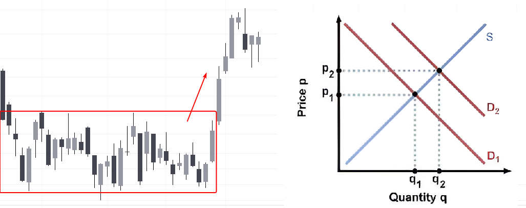
The chart illustrates that when the supply of a market asset (line S-Supply) stayed the same, but demand (line D-Demand) increased (shifting from D1 to D2), the asset’s price rose (from Price1 to Price2) alongside a rise in trading volume (from Q1 to Q2).
In short:
- Demand zone: an area on the chart where demand strengthened, driving prices upward. The red rectangle on the chart highlights an example of a demand zone.
- Supply zone: an area where selling interest was high, leading to a price decrease.
While the concept of supply and demand zones may seem straightforward, applying it in real trading scenarios involves many subtleties and complexities.
How to Identify Supply and Demand Zones?
Identifying supply and demand zones is a task that does not have a single right answer.
To support the idea that a chosen area on the chart is a significant support or resistance zone, traders can use:
- Non-standard chart types. For example, ATAS range charts. These charts ignore the influence of time, helping to minimize noise and the effects of uneven intraday volatility.
- Indicators for identifying support and resistance zones: This includes tools like the ATAS Market Profile indicator, the ATAS Stacked Imbalance indicator, vertical volume indicators (including delta), and others.
Let’s explore seven methods that can be combined to accurately identify supply and demand zones.
Method 1. Order Block
The Order Block pattern, part of the ICT Smart Money Concept methodology, typically appears at swing reversals (see more on swing trading). It is believed that large players actively engage in these reversals, capitalizing on the available liquidity and favorable prices to carry out their strategies.
The Order Block pattern is highly effective for identifying supply and demand zones. The reasoning behind this becomes clearer after reading the article on how to use order blocks in trading.
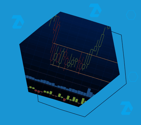
Example. A 30-minute Bitcoin price chart from Binance Futures, where a Delta indicator has been added to the candlestick chart alongside standard vertical volume.
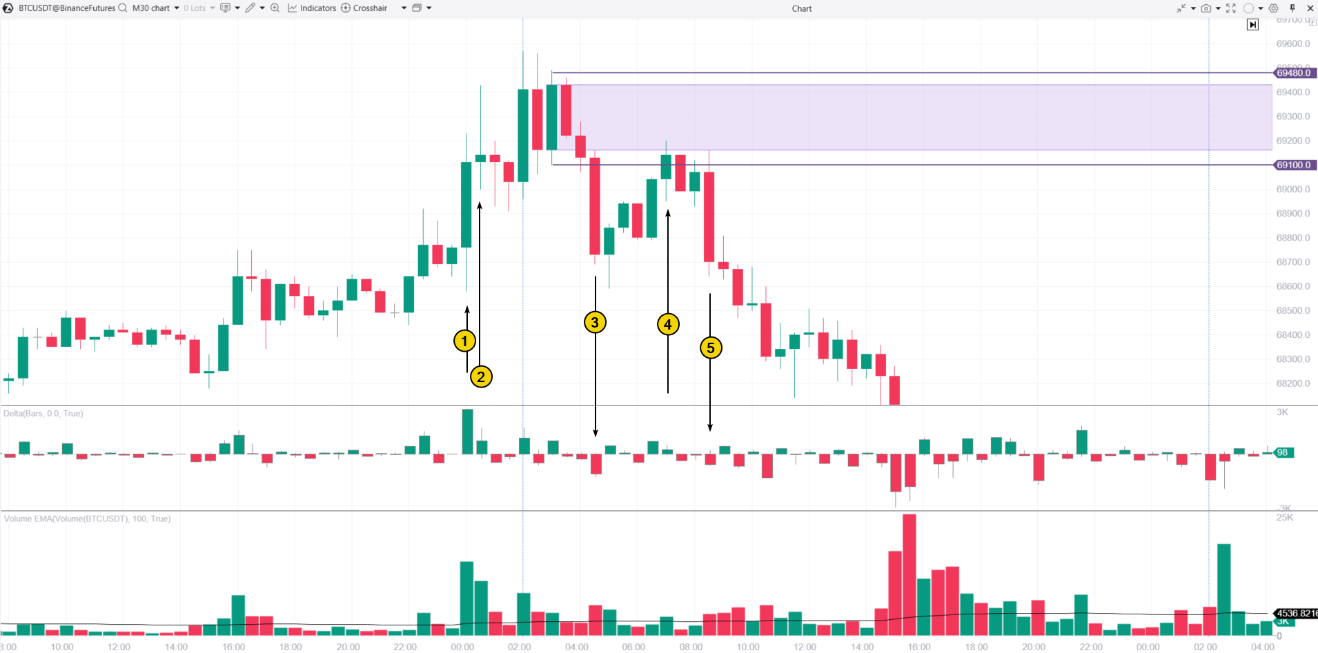
(1) This bullish candle looks strong, with a wide body and a close near its highs. However, the extremely high volumes could be a warning sign.
(2) Here is where the concern lies. Sellers are showing up above the 69k level—the candle has a long upper wick, and signs of market selling are evident in the delta.
Despite this, the rally attempts continue, though bullish momentum is fading: with each new bullish candle, it is getting harder for the price to reach new highs.
(3) A decline below the 69k level, accompanied by increased volume and a surge in negative delta, signals clear seller aggression. This setup provides the basis for an order block, marked on the chart as a price zone (projecting from the candle’s body or high-low range) in purple.
This area can be considered a supply zone because:
- the price struggled to push higher here;
- selling pressure is evident in candles #2 and #3.
(4) Testing the supply zone. Notice that as the price approached this zone, volumes were light—indicating buyer hesitation and suggesting that a reversal downward could follow.
(5) And that is exactly what happened: a broad bearish candle appeared, along with a spike in negative delta. Interestingly, a classic head-and-shoulders pattern was visible on the chart, but volume analysis would have allowed for an earlier short entry before the “neckline” break, with more substantial confirmation.
Method 2. FVG
The Fair Value Gap (FVG) is another concept from ICT Smart Money methodology. An FVG forms when the price moves sharply up or down due to a strong imbalance between supply and demand.
As a result, Fair Value Gaps can be considered as supply and demand zones because of the buyer-seller imbalance. The price often returns to this zone for a “test,” which traders may use to their advantage.
Learn more about how an FVG works in our article: What Is the ATAS Fair Value Gap in Trading.
Example. Another 30-minute Bitcoin price chart with the same set of indicators.
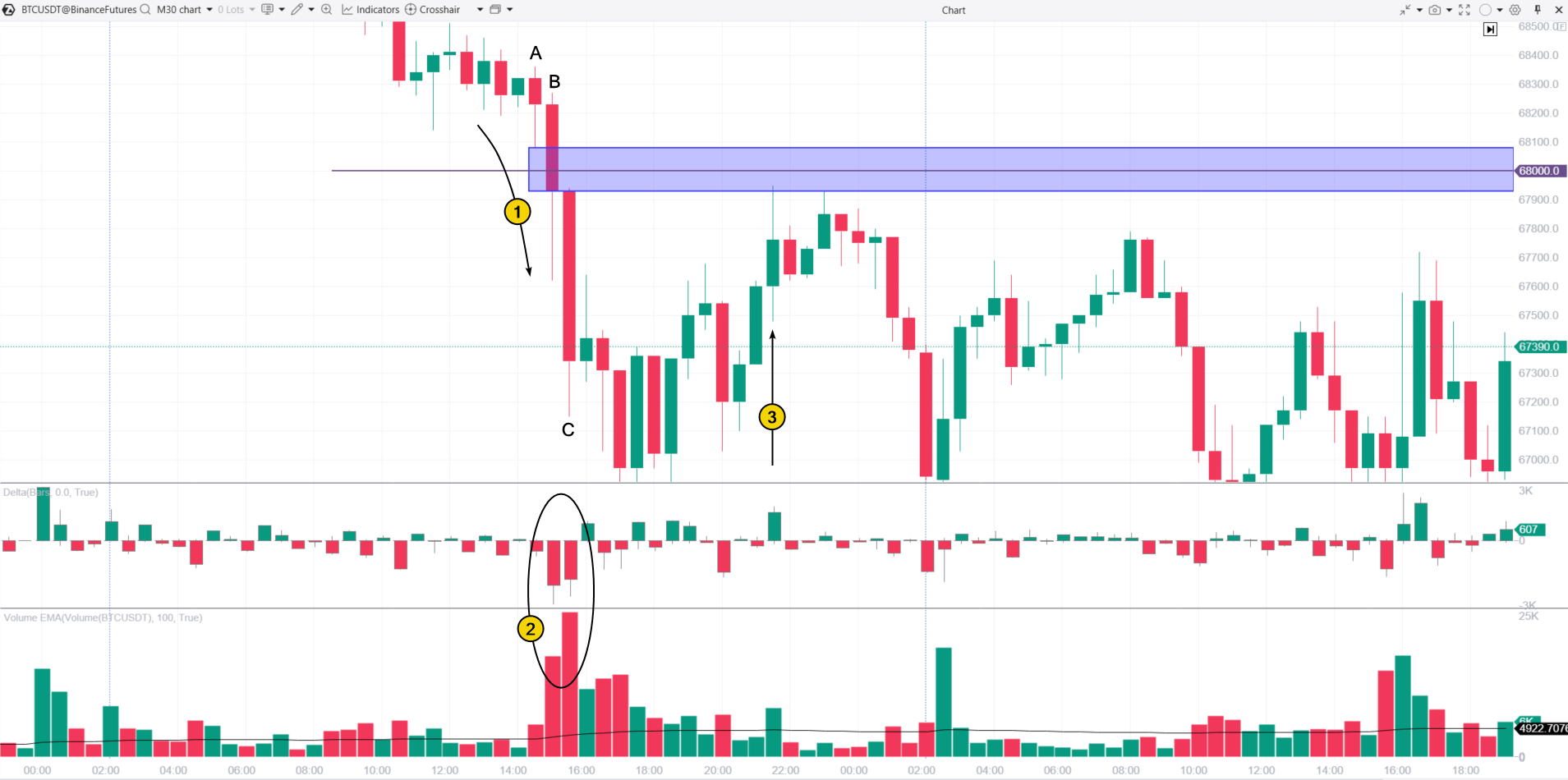
(1) Sellers dominate at the psychological $68k level, as shown by volume indicators (2).
The OHLC prices of candles 1-2-3 create the basis for an FVG zone, which can be interpreted as a supply zone.
(3) A test of the supply zone shows a spike in positive delta (a signal of local buying climax, more visible on a lower time frame). This test can be used to open short positions, with the assumption that sellers maintain control around this psychological level.
Method 3. The Wyckoff Method
The Wyckoff Method analyzes the stock market by evaluating the actions and intentions of the Composite Operator (the large players) as they interact with retail traders.
According to Richard Wyckoff’s methodology, there are four market stages:
- Accumulation – the Composite Operator buys shares by capitalizing on panic selling among retail traders.
- Markup – the stage where prices begin to rise.
- Distribution – the Composite Operator sells the previously accumulated shares, taking advantage of the enthusiastic buying from retail traders.
- Markdown – the stage where prices start to decline.
The Wyckoff Method can be applied to supply and demand zones, with demand zones corresponding to the accumulation stage and supply zones aligning with the distribution stage.
For more insights into the Wyckoff Method, you can read this article.
Example. A 30-minute chart of Alphabet (GOOG), featuring the TPO and Profile drawing object that highlights the accumulation zone.
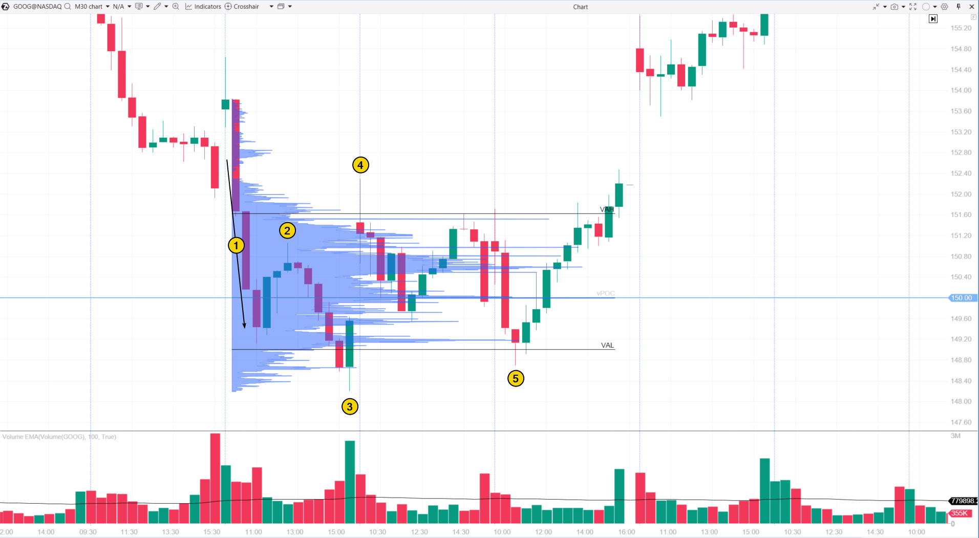
The chart above illustrates a brief accumulation phase, during which the Composite Operator accumulated shares as the price declined below $150.
(1) Selling Climax (SC). The price drops below a key psychological level with large bearish candles and increasing volume, likely prompting emotional (panic) selling from retail traders.
(2) The upward movement to this peak could be seen as an Automatic Rally (AR), but with low volume. This low volume suggests weak demand rather than strong buying activity, which is usually more evident in a typical AR.
(3) Secondary Test (ST). The price attempts to fall below the previous low but fails. A large bullish candle at the day’s end, high volume and a close near the top indicate the presence of buyers.
(4) The price returns to the levels where panic selling began, followed by trading at below-average volumes, signaling reduced activity. This day resembles Phase B of the accumulation stage.
(5) Another attempt to push the price below the panic-selling level failed again. Following this, the price began to climb steadily, suggesting a potential drop in sellers for Google shares. This scenario often leads naturally into the markup phase.
The market profile reveals that the Composite Operator was accumulating shares in the range between VAL and VAH, effectively establishing a demand zone between $149 and $151.60, where the Composite Operator was buying shares from those inclined to sell.
Method 4. Market Profile Analysis
In the example above, we added the TPO and Profile drawing object to the chart.
The versatile and powerful ATAS Market Profile indicator can be used in several ways to identify supply and demand zones. Here are some options:
✓ Bulges in the profile histogram can highlight potential supply and demand zones.
✓ Thin areas (or “narrow” sections of the histogram) can indicate zones where demand or supply had a strong edge.
To learn more about using Market Profile, check out this video on our YouTube channel.
Example. On the E-mini S&P 500 futures chart:

(1) We see levels where trading activity was high, followed by a price drop. This bulge in the profile may represent a supply zone.
(2) Levels with active trading, where the price later rose. This bulge in the profile can be interpreted as a demand zone.
Traders can use tests of these zones as triggers for entry. As shown on the chart, price often “bounces” when it reaches these zones.
Method 5. Footprint Analysis
A footprint (or cluster) chart is a highly detailed type of chart that precisely tracks exchange trades, showing price levels, trade volumes, and the direction of trades (market buys or market sells).
By analyzing clusters (the chart’s smallest elements), traders can observe shifts in buyer and seller activity, making it easier to spot the formation of supply and demand zones.
Example. A cluster chart of the BNB/USDT pair, Binance Futures data.
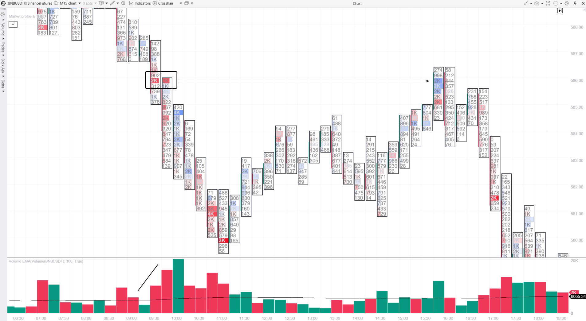
The footprint chart with vertical volume indicators reveals:
- At 9:30, a decline began, breaking through local support with increased volumes. Sellers’ efforts are clear near the $586 level for BNB. They are reflected in the bright red clusters highlighted by a rectangle. This selling activity indicates a resistance zone forming around $586.
- Six hours later, this zone was tested. In this case, the blue clusters with increased vertical volumes serve as a confirming signal that the price may turn downward.
Method 6. Non-Standard Chart Types
The ATAS platform enables users to create various chart types using tick data. For instance, you can create a range chart, which offers a unique perspective on price dynamics.
Range charts ignore time intervals and form a new candle only when a specific price change is reached, providing a distinct approach for identifying demand and supply zones.
Example. NQ futures market.
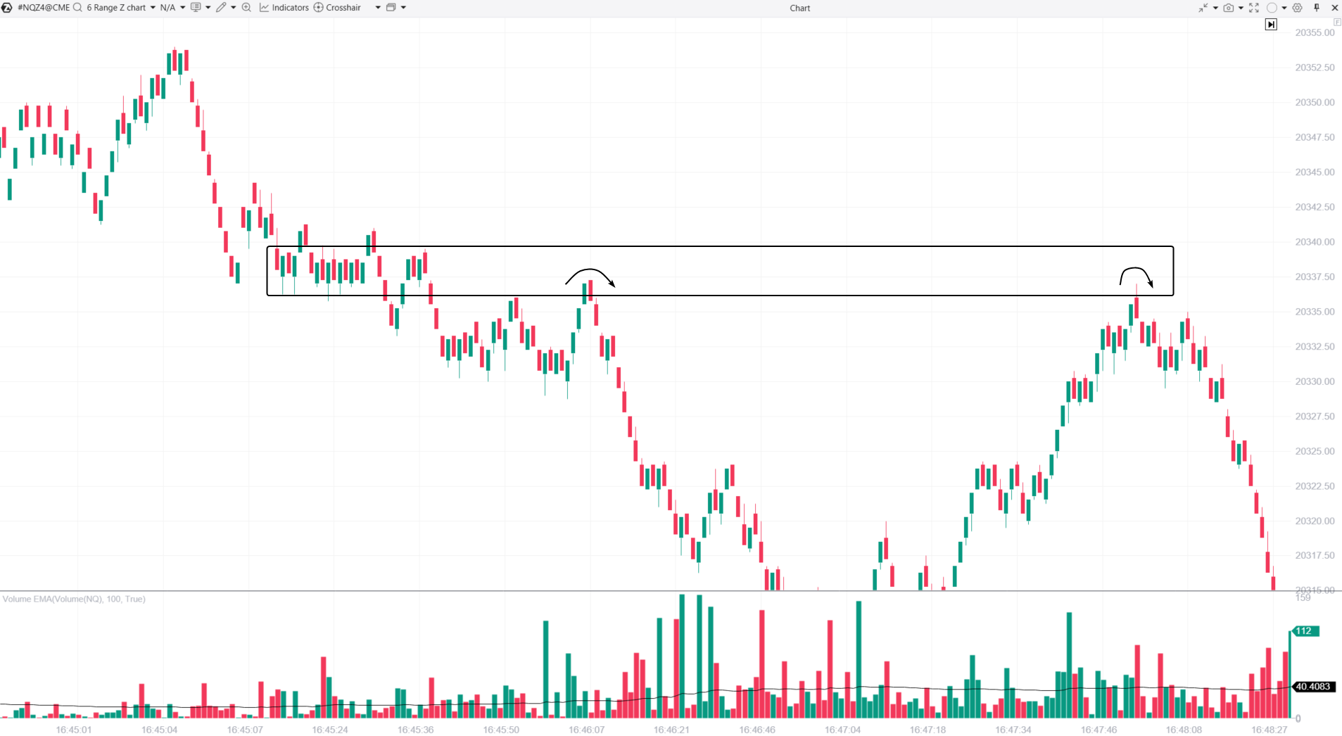
In this range chart, we see a period where the price fluctuated within a narrow band around the 20,337.50 level, signaling a balance between demand and supply.
After this period, the price began to decline, suggesting that sellers gained control. This area, highlighted by a rectangle, can therefore be viewed as a supply zone.
The chart also shows that testing this zone could act as a signal to open short positions, anticipating a downward reversal (indicated by arrows).
Method 7. Liquidity Analysis
In conclusion, there is a simple method on how to identify strong supply and demand zones using Level II data (order book analysis), based on the following logic.
✔ A high concentration of buy limit orders strengthens the case for considering that area a demand zone.
✔ Clusters of large orders? This area can likely be considered a demand zone.
Example. The ATAS platform includes the DOM Levels indicator, which highlights levels with significant limit orders directly on the chart. The BTC/USDT chart example shows this feature in action:

The bright yellow-orange levels represent large sell orders placed below the 68,700 level. As a result, the cluster of these sell orders acted as a supply zone, halting Bitcoin’s upward movement and pushing the price down.
How to Mark Demand and Supply Zones?
Marking demand and supply zones is mainly a matter of personal preference. ATAS offers a variety of drawing objects that can help you do this, including:
✔ horizontal lines and rays;
✔ rectangles;
✔ the Highlight Y tool for marking horizontal ranges (which may be the best option).
Plus, ATAS users can set alerts on these horizontal levels to get notifications when the price approaches them. This way, you will not miss any opportunities to test the demand and supply zones.
How to Trade Supply and Demand Zones?
Working with Charts
Trading supply and demand zones starts with identifying those zones, which can be done using the seven methods outlined above. It is crucial to use clean and simple charts, focusing on workspaces with minimal indicators and distractions. This approach allows for better concentration on the dynamics of supply and demand.
Strategies and Rules
The basic strategy for trading these zones involves:
- buying an asset in the demand zone, anticipating a price increase;
- selling an asset in the supply zone, expecting a price drop.
By following these steps, traders can effectively implement their plans:
- Identify demand and supply zones based on strong reasoning.
- Mark these zones on the chart.
- Wait for a test of the identified zones.
- Look for confirming signs that suggest the test will be successful and that the price is likely to reverse.
- Open a position in the direction of the reversal.
Risks
Supply and demand trading strategy involves risks, making effective risk management an essential part of the process. Be sure to incorporate stop-loss and take-profit orders.
- Place stop-losses beyond the zone boundaries, and if needed, use additional indicator data from lower timeframes to further minimize risk.
- Ensure your take-profit target is not lower than your stop-loss level. For example, if you are entering a long position during a demand zone test, you might set a supply zone above as your profit target.
FAQ
What is the difference between supply and demand zones vs. support and resistance?
Supply zones act as resistance, while demand zones function as support. These concepts are similar and complement each other.
How to identify supply and demand zones?
Shifts in the balance between buyers and sellers create distinct price patterns on the chart, which are also reflected in indicator signals. To identify supply and demand zones, use the methods listed above, including market profile analysis, SMC patterns, footprint cluster analysis, and others.
What is demand and supply in trading?
These are fundamental concepts that help explain price fluctuations. By analyzing market volumes and using other tools to assess the market, traders can gain valuable insights into how supply and demand interact, even in real time. This increases the chances of making successful trades based on the dominant market force.
Conclusion
Supply and demand zones are key indicators of potential price reversal points in the market.
Pros of Supply and Demand Zones
✔ Versatility. These zones can be used in various markets, including stocks, futures, cryptocurrencies, and more.
✔ Volume-based approach. Assessing supply and demand is closely tied to the relationship between price and trading volumes.
✔ Involvement of major players. Strong zones are often created by institutional investors, large hedge funds, and other influential market participants who can move prices.
✔ Risk management. This method helps minimize risk by setting stop-loss orders beyond the supply and demand zones.
Cons of Supply and Demand Zones
Supply and demand zones may seem clear when looking at historical data, but identifying these zones in real time requires experience and a strong grasp of market dynamics.
✘ Other potential drawbacks include:
- Complexity. The balance between supply and demand is affected by a range of factors.
- Volatility. Supply and demand forces are highly sensitive to the market participants’ emotional responses to prices, often leading to irrational behavior.
- Dependence on time frame and trading style (whether conservative or aggressive).
- Uncertainty. Even a strong-looking supply or demand zone can be broken by a sudden market shift.
- Subjectivity in interpretation. You may identify supply and demand zones differently than the examples shown here.
Is Trading Supply and Demand Zones Profitable?
Trading supply and demand zones can be profitable if you:
- learn to accurately identify these zones,
- develop a trading plan that manages both risks and potential rewards,
- maintain discipline and follow the plan consistently.
Can you make money trading supply and demand zones? You will only find out if you try. Here is how the ATAS professional trading and analytics platform can help you:
- the ATAS Market Replay trading simulator enables traders to practice using historical data, providing risk-free trading. It is an effective way to build trading skills and learn to identify supply and demand zones.You can also use built-in ATAS demo accounts;
- cluster charts that provide the highest level of detail on trading volumes;
- advanced volume analysis indicators, such as ATAS Market Profile, ATAS DOM Levels, and other ATAS tools.
Download ATAS. It is free. Once you install the platform, you will automatically get the free START plan, which includes cryptocurrency trading and basic features. You can use this plan for as long as you like before deciding to upgrade to a more advanced plan for additional ATAS tools. You can also activate the Free Trial at any time, giving you 14 days of full access to all the platform’s features. This trial allows you to explore the benefits of higher-tier plans and make a well-informed purchasing decision.
Do not miss the next article on our blog. Subscribe to our YouTube channel, follow us on Facebook, Instagram, Telegram or X, where we publish the latest ATAS news. Share life hacks and seek advice from other traders in the Telegram group @ATAS_Discussions or on Discord.
Information in this article cannot be perceived as a call for investing or buying/selling of any asset on the exchange. All situations, discussed in the article, are provided with the purpose of getting acquainted with the functionality and advantages of the ATAS platform.