The price reflects the commodity value in economic theory. However, it is not always so on the exchange — it is rather an instrument for attracting investors and traders. An investor buys securities if he thinks they are undervalued and will become more expensive. Traders actively buy and sell assets, hoping for a speculative profit. Traders do not care whether the price falls or grows—they are interested only in making money.
You may often come across the following statement on the Internet:
The price grows because there are more buyers and falls because of more sellers.
It makes no sense from the point of view of order matching. Financial assets are not taken from the thin air. For someone to buy futures or stock, someone must sell them. The laws of demand and supply are still true for exchange trading. However, the price movement mechanics on the exchange has its specific features.
Stock and futures prices change every second. It is practically impossible to predict the price movement on the exchange with 100% accuracy. However, it could be forecasted with a certain probability using various instruments of technical and cluster analysis.
Read further in the article:
Price movement trends
Technical analysts pay huge attention to the exchange prices, that is why let’s remember the main ideas of technical analysis before we start to discuss price movement on the exchange:
- Prices consider everything, and you cannot distort them – this is the main postulate of technical analysis.
- Price history is repeated, which is why the study of regularities in price behavior is based on chart analysis of patterns that are repeated in the course of time. For example, the price often returns to the maximum volume level on non-trend days. Another example is bars with a narrow spread and huge volume at local day extreme points appearing before reversals. An ideal trading strategy includes setups based on certain regularities of the price behavior. Traders could write down their profitable setups, sort them out by success level, and then increase the volume of contracts or positions in super setups.
- Prices move in trends, so there are three main variants of price behavior in time: increasing tendency, decreasing tendency, and flat. If highs and lows successively increase, then the bullish trend acts in the market. If highs and lows successively decrease, the bearish trend acts in the market. If highs and lows do not decrease or increase, it means there is no pronounced tendency at the moment. Such situations are called a flat. To understand how to correctly determine the price movement trend, we may analyze highs and lows.
Let’s consider an example in the 30-minute copper futures (HG) chart. See Picture 1.
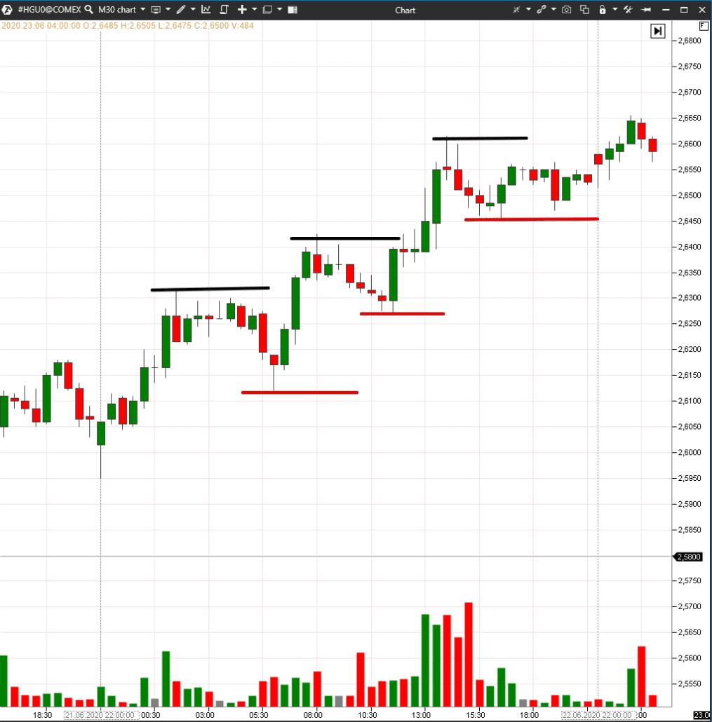
We marked increasing highs as black levels and increasing lows as red levels. Since both highs and lows successively increase, it means that the bullish trend acts in the market. Unfortunately, there are fewer such obvious situations in the market than unobvious ones.
Trade by the price and volume behaviour
Let’s consider one real-life example. Let’s assume that a store owner sells 10 cans of peanut butter a week at €8. He decides to increase the price to make more money, but sales fall to 8 cans a week at €8.5. The seller has to reduce the price in a couple of weeks to sell a surplus of peanut butter.
The same takes place on the exchange. Volumes are a certain price movement indicator. If traders consider the prices to be high or low, they stop trading at these levels. Moreover, trader efforts should be rewarded with a result – a certain profit.
Let’s consider an example of the 5-minute WTI oil price movement chart. See Picture 2.
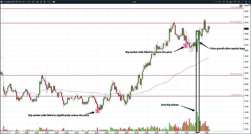
We added to the chart:
- Volume indicator;
- Daily Lines indicator, which shows the previous day’s significant levels. All traders see these levels, and many of the traders take these levels as reference points for, say, posting stops;
- Big Trades indicator with an autofilter.
Big Trades indicator with an auto filter. Big Trades analyses data from the Smart Tape and marks those levels in the chart, which accounted for big trades. Red squares are big sells, and green squares are big buys. The bigger the shape, the bigger the number of contracts that were traded at this level. Big Trades shows the volume, which confirms the movement strength. To use this indicator efficiently, you need to monitor the price reaction after the appearance of signals. A trade is executed when a market order meets a limit order. The intentions of traders that work with market orders differ from those of traders that work with limit orders. That is why if big market orders cannot move the price, it means that there are more limit orders, and their intentions are opposite.
In our example, the price doesn’t fall despite a market sell splash in both red squares. This means that limit buys interfere with them.
On the other hand, it grows after market buys and it confirms the volume growth.
Red levels of the previous day are psychological levels for traders, so prices slow down here, stop and reverse.
How to determine the price movement using the Smart DOM
Smart DOM shows both the traded volume and limit orders. It is the only instrument of the order flow that shows traders’ intentions and actions simultaneously in real time. Smart DOM clearly shows momentum — the impulse. However, it is rather difficult to catch such a movement. See an example of a breakout of the day’s local PAO Novatek stock (NVTK) low.
The price fluctuated for some time at the lower boundary, where a big limit order stayed, and then it sharply broke the range and fell. There is no secret in this stock price movement. The stock started to decrease after 14:00 on June 30, 2020. Decreasing highs and lows are clearly seen in the minute chart.
Impulse price movements usually alternate with consolidations and rollbacks. The impulse we captured was the strongest by volume and speed for the past several hours because the price stayed near a significant reference point – the previous day’s low. Many traders look at this level and wait for a breakout. Also, many traders post stops behind such levels because, after a breakout, their protective orders are activated one after another like a snowball. See Picture 3.
Rollback occurs immediately after the breakout, and a long tail appears in the candle. At first sight, it might seem that this is the buyer’s resistance to the price, and the seller’s behavior strategy should change. However, the ‘liquidity falls’ are often formed after a sharp breakout, so the price bounces back. In other words, limit orders fail to ‘line up’ during the breakout because the impulse is strong. In this case, the candlestick tail doesn’t mean that the fall ended. As we can see from the chart, one more sharp shoot-down takes place after a small bounce.

No indicators predict the price movement, although you can find opposite information on the Internet. Should we trust it?
Let’s logically analyze this issue:
- technical analysis indicators analyze the past data and make forecasts using them. We can forecast the future with certain assumptions using past data – for example, they forecast the weather this way. However, it is impossible to obtain guaranteed results.
- Cluster analysis indicators show the situation at the moment. They could also be used only for forecasting future price movements.
Trading results are probabilistic, which is why losses are part of trading. Successful traders assess a trading situation from the point of view ‘if ___, then ___’.
Let’s check an example of such trading scenarios of a trader who works with the market profile. Let’s assume he trades soybean futures (ZX). See Picture 4.
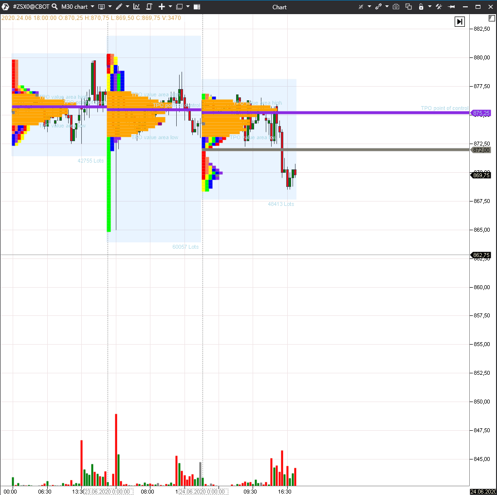
We used the instrument from the upper menu – TPO and Market Profile. We checked three items in standard settings:
- prolong the POC level – the violet line;
- display and prolong single prints – the grey line. See Picture 5.
These levels could be considered as resistance and support areas, which is why they are interesting for opening or closing trading positions.
Orange value areas of three trading days practically coincide with each other in the chart, which means that the market is in balance. Strong trend movements always start with a balance, so such a trading situation attracts attention.
June 24 is a double distribution day. The price sharply fell at the end of the trading session, forming a sellers’ single print. If sellers are also strong on the next day, the grey level would be a strong resistance level. If the price passes above this level, it means that the situation changed. In this case, it would probably reach the violet level because the POCs, which are not closed, ‘attract’ the price.
Probable trading scenarios for the next session could look as follows:
- If the price opens below the previous day’s value area, it means that the sellers are still strong, and it makes sense to look for a short position entry point. A single print would be an ideal entry point if the price fails to consolidate above it. If the price doesn’t reach the single print level, it makes sense to look for a short position entry point near USD 870, which is the center of the lower block of the profile volume. It is difficult to assess the movement potential beforehand because the balance area breakout would begin a new trend movement. The initial take profit is the previous day’s low. A stop could be posted at the single print level or a bit higher. If the single print is ‘erased,’ it means that strong buyers emerged.
- If the price opens within the previous day’s value area, it means that the situation has changed, and the single print is no longer valid. However, if the price fails to fix above the violet line, it means that the buyers are not strong enough, and it makes sense to look for a short position entry point. The movement potential is the same as in the first scenario. A stop could be posted above the upper boundary of the value area.
- If the price opens within the previous day’s value area and can be fixed above the violet line, it makes sense to look for a long position entry point. The previous day’s highs offer movement potential. A stop could be posted below the POC level.
Let’s see now how the following trading session developed in real life. See Picture 6.
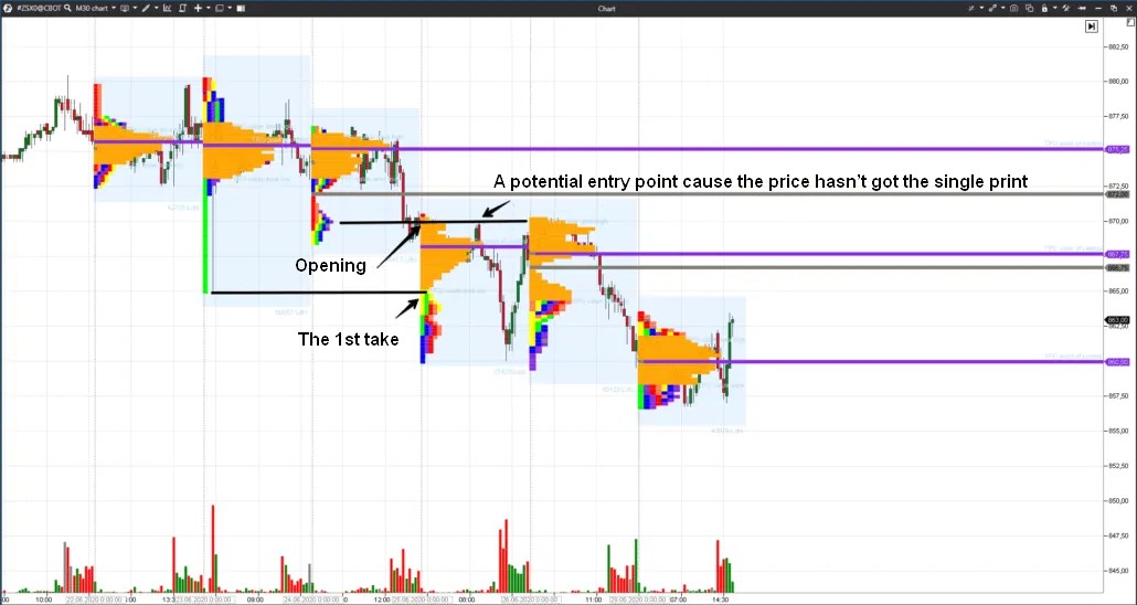
The June 25 session opened below the previous day’s value area, meaning the sellers were strong. The price failed to move up to the single print but traded for quite a long time near the level of USD 870, and traders could have opened short positions at this level.
In our example, we used TPO and Profile as indicators of the price movement probability. Any other indicator could be used as such — the most important thing is to remember probabilities and limit losses.
Summary
There are no magic indicators for guaranteeing price movement forecasting. However, you can use advanced instruments of the ATAS platform for high-quality market analysis, a study of price movement regularities, and the building of plans and strategies for your behavior in the market with the aim of making a profit.
Your goal is to keep chances in your favor. They will never be 100%, but we will try to increase them. Try ATAS in action, read our blog and subscribe to our YouTube channel, Facebook, Instagram, X or Telegram.