A rectangle is a technical analysis pattern that forms when the price moves between clearly defined support and resistance levels.
In this article, we will explain how to trade the rectangle pattern and how traders can significantly improve their performance using ATAS’s powerful volume analysis tools. They will help you gain deeper insights into market dynamics and make more informed trading decisions.
Read more:
What Is a Rectangle?
This pattern can be found on charts across various markets, including stocks, futures, and cryptocurrencies. A rectangle forms when the price moves between support and resistance levels, creating a visually distinct rectangular shape.
A rectangle is a specific type of trading channel with horizontal boundaries. Learn more in these articles:
Real-World Example of a Rectangle
How to identify a rectangle pattern:
1. Bounces off the boundaries. The price should repeatedly bounce off both the upper and lower boundaries, forming clear support and resistance levels.
2. Formation duration. The longer the pattern takes to form, the more reliable it becomes. A prolonged consolidation within the rectangle reinforces the strength of these levels and market confidence.
Example: The screenshot below shows a rectangle pattern that formed on the daily chart of Soybean Oil futures, based on CBOT exchange data.
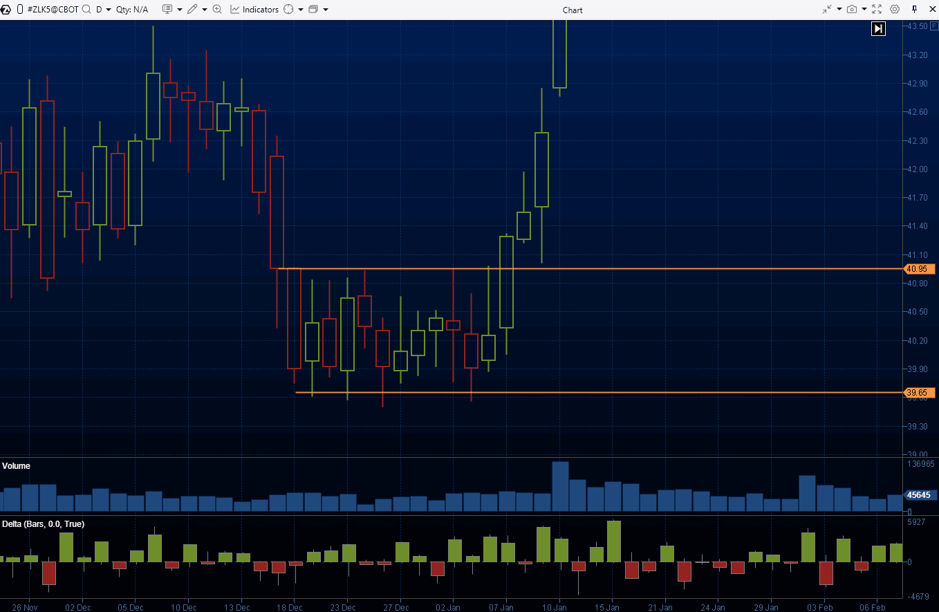
The chart shows a two-week period where the price moved between the resistance level of $40.95 and the support level of $39.65, forming a clear rectangle pattern.
What Does a Rectangle Tell You?
The rectangle pattern represents a period of price consolidation, where supply and demand are temporarily balanced. In other words, buyers and sellers agree that prices above resistance are “too high,” while prices below support are “too low.”
In the example above, the pattern formed during the Christmas holiday when trading activity was low. This suggests the market was in a ranging phase (leading to the rectangle formation), and the trend only resumed after the New Year holidays.
Related articles:
Variations of the Rectangle Pattern
The rectangle pattern can be classified based on the market context:
- Bullish rectangles. In an uptrend, a rectangle pattern often represents a “pause” (a period of consolidation or correction) before the trend continues.
- Bearish rectangles. The opposite is true for a downtrend. However, in both cases, rectangles do not guarantee that the trend will continue, and a reversal is also a real possibility.
Additionally, this pattern can be divided into:
- Rectangle tops. This is a reversal pattern that forms after a rally. After fluctuating between two levels, it signals a potential bearish reversal.
- Rectangle bottoms. This pattern forms after a period of price decline and often leads to an upward price movement.
Examples of How to Use a Rectangle
There are two main approaches to trading the rectangle pattern:
Range trading. Here, traders expect the price to continue fluctuating within the rectangle, bouncing off its boundaries (either with or without a false breakout):
- The target is set at the opposite boundary of the pattern.
- The stop-loss is set to ensure the potential loss does not exceed the profit potential.
- Once the price reaches the middle of the rectangle, the stop-loss can be moved to breakeven.
Breakout trading. Traders can enter a position in the direction of the breakout once the price breaks through and holds beyond one of the rectangle’s boundaries, with the expectation that the trend will continue:
- The target is calculated based on the height of the pattern, extended from the breakout level.
- The stop-loss can be set beyond the opposite boundary (larger size) or at the nearest intermediate extreme to reduce risk.
Helpful articles on the topic:
Next, let’s take a look at a few detailed examples of trading rectangle patterns on real charts.
Range Trading
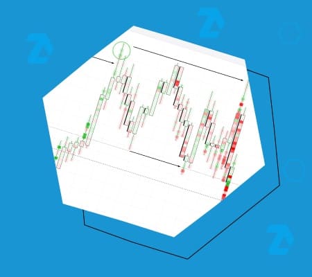
On the left side of the screenshot, you can see an example of a rectangle pattern that formed on the 30-minute chart of Dow Jones futures at the end of January 2025. Note that:
- The pattern formed when the price broke through the top (1), and the level of 44,770 switched from resistance to support (following the principle of mirror levels in trading).
- The price then began to fluctuate, creating reversals at points 2-3-4-5-6-7-8 beneath resistance at 45,145. A bullish breakout attempt at point 8 failed.
- After the bearish breakout of the rectangle, the 44,770 level turned back into resistance, which traders could have used to open short positions (when the breakout was tested at point 9).
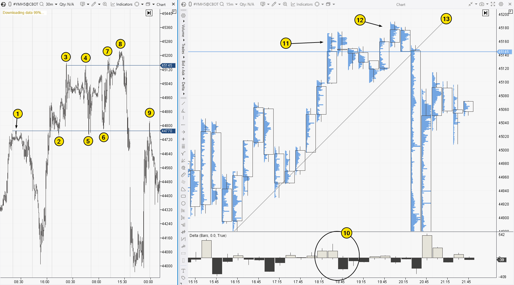
Let’s look at how a trader might trade a rectangle pattern for a downward reversal from the resistance level. For example, let’s focus on point 7.
On the right, we have a cluster chart (showing the volume histogram for each candlestick) on a 15-minute time frame. It reveals more bearish details of how the price reversed downward from the 45145 level:
At level (11), the price attempts an upward breakout, but the candlesticks close far from the highs. We can see significant volume on the long upper shadow, as indicated by the histogram.
At level (12), there is another attempt to break higher, but the price growth quickly slows again, suggesting a bull trap is forming.
As a trade entry trigger, the trader could use the breakout of the trendline at (13) and take the following steps:
- Set the stop-loss at the peak (12).
- Expect the price to drop to the support level of 44770 (using it as a profit target).
- Move the position to breakeven once the price reaches halfway toward the target.
Breakout Trading
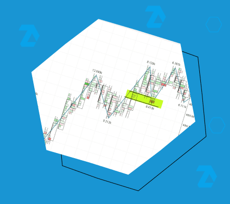
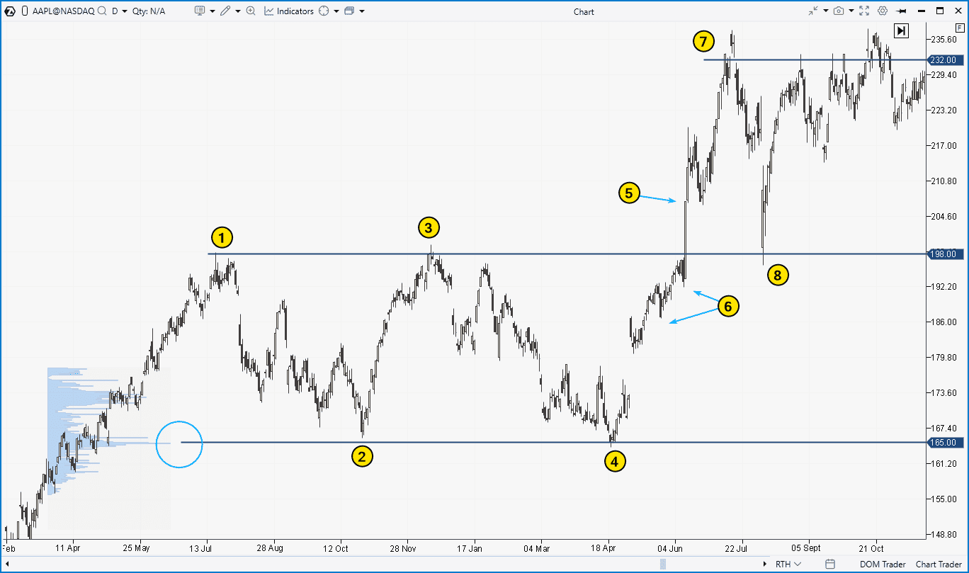
The screenshot below shows an example of a rectangle pattern (1-2-3-4) formed on the daily chart of Apple (AAPL) stock in 2024:
- The upper boundary at $198 is close to the psychological $200 mark per share. It seems buyers were not willing to pay that much.
- The lower boundary of the pattern aligns with a noticeable peak on the market profile indicator. Such levels often act as support.
The bullish momentum that broke through the $200 mark was driven by an event in early June 2024, when Apple introduced its AI innovations under the Apple Intelligence brand, a move that was met with excitement by investors.
According to the classic approach to rectangle breakout trading:
- Signal. A long position should be opened when a candle closes above the resistance level. In this case, that happens at point 5.
- Stop-loss orders should be placed either below the lower boundary of the pattern or under intermediate lows, which are marked by arrows at point 6.
- Take-profit. The target is based on the height of the pattern, measured from the breakout level in the direction of the impulse. Here, the target level is at point 7.
This example highlights some challenges traders may face when trading a rectangle pattern:
- Psychological discomfort when buying after an uptrend. Following a prolonged upward move, traders may hesitate or feel uncertain about buying, even if the pattern suggests further growth.
- Difficulty achieving the recommended risk-reward ratio (1:3). If the stop is placed below the support level, it may be larger than the potential profit target.
The AAPL chart demonstrates another way to trade this pattern—through a breakout test, which occurred at point 8. We will explore this approach further using the cryptocurrency market.
Related articles:
Breakout Test
The screenshot below shows a rectangle pattern that formed on the hourly chart (left) of Litecoin futures, between the resistance (R) and support (S) levels.
Two key details suggest that market sentiment was shifting in favor of buyers, increasing the chances of a bullish breakout:
- Higher lows (marked with a dashed line);
- A sharp drop followed by an equally strong rebound (shown by the arrow), which could be interpreted as a bear trap that often occurs before the start of an uptrend.
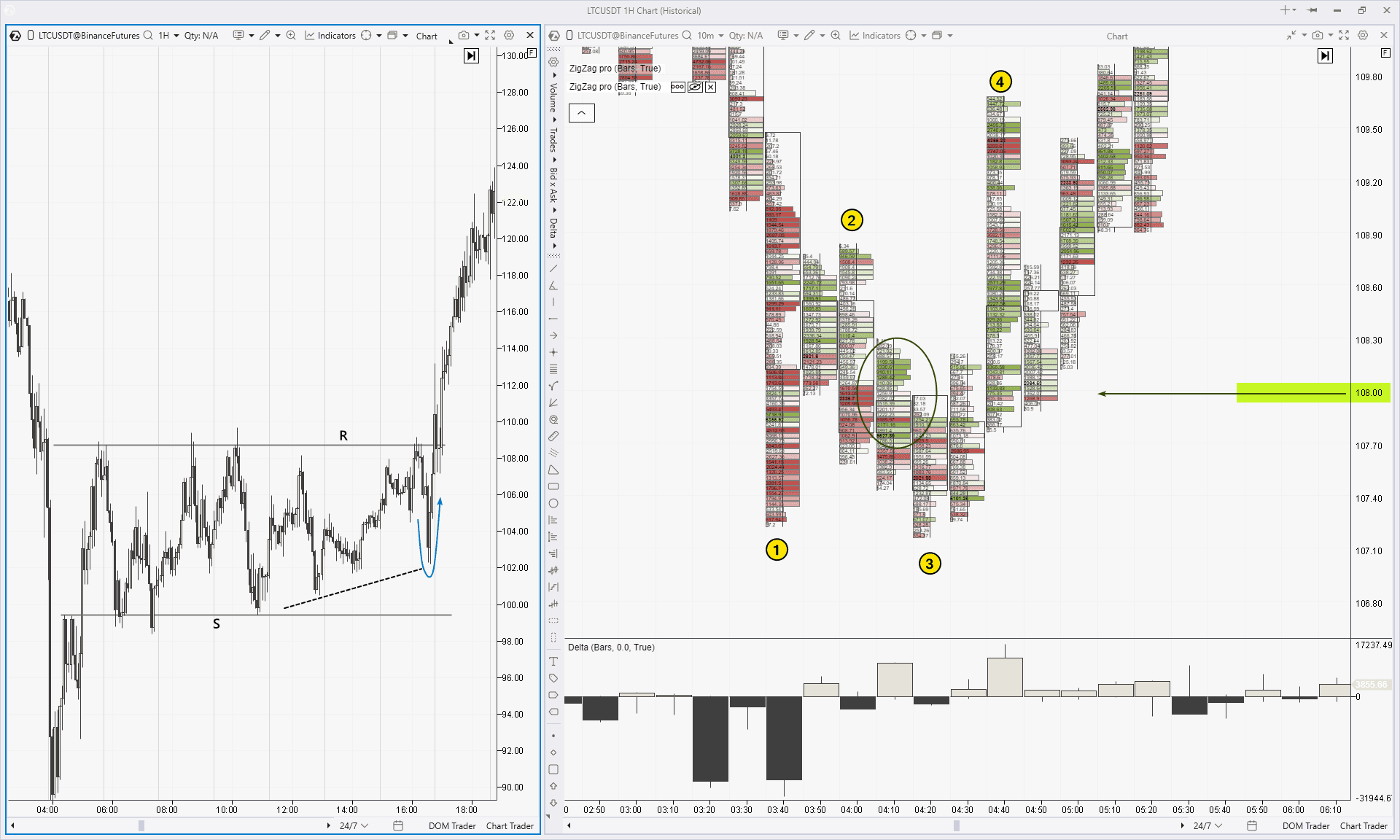
Suppose a trader prefers to enter a long position not immediately after a candle closes above resistance but rather after a pullback has completed. In this case, a footprint chart (shown on the right) with the Delta indicator can help pinpoint the ideal entry.
The chart shows a price structure labeled 1-2-3-4 which can be interpreted as a bullish Quasimodo reversal pattern, with the following key details:
- As the price drops to point 1, bright red clusters appear below the $108 level on the lower wick of the candle—an indication of panic selling, often marking the initial stage of a reversal.
- The green oval highlights the emergence of buyers (as indicated by the bright green clusters) around the $108 level.
- The formation of a higher high at point 4 aligns with what is known as a ChoCh pattern in the Smart Money Concept strategy.
This provides the trader with a strong rationale for entering a long position on the next test of the $108 level, with a target based on the rectangle pattern.
Related articles on footprint (cluster) chart trading:
FAQ
Rectangle vs. head and shoulders pattern. Which one is better?
Both are chart patterns used in technical analysis, but they indicate different market conditions. The head and shoulders pattern signals a potential bearish reversal after an uptrend, while the rectangle pattern is a consolidation figure, suggesting the market is temporarily trendless. The choice of pattern depends on personal preference and the market context. However, neither guarantees profit, therefore, strict risk management is essential.
What are the limitations of the rectangle chart pattern?
- Subjectivity in Identification. Different traders may interpret the rectangle pattern differently. There are no clear-cut rules for defining the pattern, such as how many reversals should occur or the exact distance between them.
- Challenges with risk/reward ratio (1:3). Following the classic rules may result in a stop-loss that is too large.
- Market risks. Breakouts can be false, and the price may not test breakout levels. Additionally, reversals may not form as expected.
How profitable is trading the rectangle pattern?
According to expert Thomas Bulkowski’s research on technical analysis patterns in stock markets, the rectangle bottoms pattern has the highest profit potential in a bullish market. To take advantage of this, you should:
- Confirm that the stock market is in an uptrend.
- Wait for the stock price to form the rectangle pattern after a corrective pullback.
- Enter a long position after a bullish breakout of the pattern.
In this case, the idea is that the stock has finished its correction and is ready to continue rising. Bulkowski found that in these scenarios, the price hits its target 79% of the time, making the rectangle bottom pattern in a bullish market the 8th most profitable out of 39 other patterns. A pretty solid result.
What is the rectangle pattern price target?
To determine the take-profit target when trading the rectangle pattern, measure the height of the rectangle and then project that distance from the breakout level, either upwards or downwards, depending on the direction of the breakout.
Is a rectangle pattern bullish or bearish?
Both options are possible. You cannot predict with 100% certainty whether the rectangle pattern will be bullish or bearish. If there is an upward breakout, the pattern is considered bullish; if there is a downwards one, it is considered bearish.
How to learn to trade using patterns?
Patterns are a simple and effective way to build your trading strategy. To start trading with the rectangle pattern (or any other), try using the ATAS Market Replay feature. It enables you to practice in real market conditions without any risk.
Advantages of Market Replay in ATAS:
- Built-in demo account. This enables you to replay historical data, creating a “live” market experience. It is a great way to learn trading and test strategies without the risk of losing real money.
- Database. In ATAS, you can load detailed tick history (including Level II data) for stocks, futures, and cryptocurrencies.
- Advanced tools. Use ATAS tools like footprint charts, cumulative delta, vertical and horizontal volume to gain a real trading edge and analyze the market situation more accurately.
To start Market Replay in ATAS:
Download the ATAS platform for free, install, and launch it, and then:
- Open a chart of a financial instrument.
- Click on the Market Replay button in the main ATAS menu.
- Activate the Replay mode (the icon should turn green).
- Adjust settings (date and data type).
- Start the replay and look for three peaks at approximately the same level.
- Did you spot the setup? Trade it on the built-in Replay demo account.
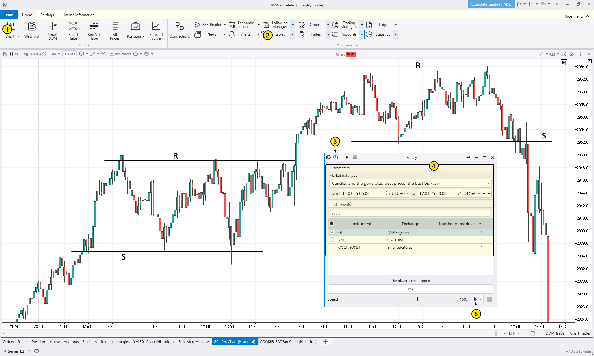
On the attached chart, the lines R and S represent two potential rectangle patterns. In the first case, the rectangle signaled the continuation of a bullish trend, while in the second, it indicated a trend reversal.
We hope you found the information on the rectangle pattern helpful and that you can now apply this knowledge to your trading.
Conclusion
The rectangle is a simple technical analysis pattern that forms when the price fluctuates between support and resistance levels. It is typically interpreted as a temporary consolidation phase, where neither bulls nor bears have enough strength to break through the established range.
Advantages of the rectangle pattern:
✔ Clear signals. The rectangle pattern is easy to spot, making it a great choice for traders who are just starting to learn chart patterns.
✔ Versatility. This pattern can be used across various markets and time frames, including stocks, futures, and cryptocurrencies.
✔ Compatibility with volume analysis. Using volume indicators can enhance the effectiveness of trading the rectangle pattern (as well as other chart patterns).
Disadvantages of the rectangle pattern:
✘ False signals. Like any technical pattern, the rectangle does not guarantee profitability, especially if traded without proper preparation or confirmation.
✘ Risk-to-reward ratio in breakouts. If you place a stop loss outside the opposite boundary of the pattern, achieving the ideal risk-to-reward ratio of 1:3 can be challenging.
✘ Subjectivity. How many reversals should happen at the support and resistance levels? How precise should they be? Are false breakouts and “near misses” acceptable? Everyone has their own interpretation, different traders may or may not recognize the rectangle pattern on the same chart.
When trading chart patterns like the rectangle and using advanced volume analysis tools, traders can more accurately assess and increase the chances of success in their strategy.
ATAS gives traders a unique edge by allowing for a deeper analysis of all technical patterns. With ATAS tools such as footprint charts, cumulative delta, and volume charts, you can closely examine the relationship between price and volume. This helps refine your ability to identify high-potential entry points. ATAS tools not only offer a more in-depth view of the market but also give you the confidence to track price movements between liquidity zones, boosting the chances of profitable trades.
Download ATAS. Once you install the platform, you will automatically get the free START plan, which includes cryptocurrency trading and basic features. You can use this plan for as long as you like before deciding to upgrade to a more advanced plan for additional ATAS tools. You can also activate the Free Trial at any time, giving you 14 days of full access to all the platform’s features. This trial allows you to explore the benefits of higher-tier plans and make a well-informed purchasing decision.
Do not miss the next article on our blog. Subscribe to our YouTube channel, follow us on Facebook, Instagram, Telegram or X, where we publish the latest ATAS news. Share life hacks and seek advice from other traders in the Telegram group @ATAS_Discussions or on Discord.
Information in this article cannot be perceived as a call for investing or buying/selling of any asset on the exchange. All situations, discussed in the article, are provided with the purpose of getting acquainted with the functionality and advantages of the ATAS platform.