We will discuss the basics of the topic in this article. This information may be well-known to some readers. But if you’ve got acquainted with ATAS recently only, this article will help you to figure out what to start from. Can you forecast the weather by clouds, pressure, and air humidity for a week? Or are you just able to say with confidence that there would be no rain in the nearest 5 minutes since the sky is blue? The same is true for the exchange price movement – it is much simpler to see what happens right now than to forecast where the market will be in a week. In this article – in simple words:
WHAT THE ORDER FLOW IS?
The order flow term in this article stands for a conditional ‘complex,’ which includes two components:
- intentions – limit orders, same as Smart DOM, market depth, and order book;
- executed trades or behavior – the trades registered in Smart Tape, same as Order Flow indicator, Time-and-Sales Tape, and trading history.
The exchange trading occurs at the junction of these components when a market order meets a limit order.
Working with this complex order flow is not a mechanical approach to opening trades based on some specific signal like MA (Moving Average) and price crossing. Understanding the order flow allows a trader to decide whether it makes sense to enter a trade at this level and whether it makes sense to hold the work if the trader is already in it.
We can compare the order flow with a book. All books are different, but the letters of one alphabet are the same. We learn letters, then we learn to read, and only after that we read fluently and enjoy it. The same is true for the order flow – you start enjoying it only after some time, having passed the period of receiving painful bruises and scratches.
WHAT TRADERS USE THE ORDER FLOW FOR?
- Identification of a local trend for selecting a trading direction.
- Identification of an impulse. You can also come across another term – momentum.
- Identification of reversals by specific signs (absorption and entry into a trade of an opposite aggressive side).
- Confirmation of the point of entry into a trade. Selection of such an entry point, in which the price would immediately move in our favor.
- Search for a second chance to enter a trade if we missed the initial impulse. The market moves in steps, rolls back, tests the broken levels, and, as a rule, gives a second chance to enter the trade. Such ‘second chances’ are not evident in candle charts.
- Pure scalping or immediate profit in 1-2 ticks.
- Refusal from unconfirmed setups and trades with a high risk. The order flow allows moving together with the market rather than ‘catching falling knives.’
WHY PRICES MOVE AND STOP?
All traders (and not only traders) wonder why actually the prices move. What is the difference between the forward and stock or currency markets? The forward market is a game with a zero-sum, which means that there is a buyer and seller for each executed contract. The number of executed (opened) contracts is not limited and does not depend on the volume since most futures contracts do not envisage physical delivery of the underlying asset (what futures are). A frequent mistake of traders is that they believe more sellers or buyers are in the market. As we already explained, it makes no sense for the futures markets. One of the sides is more aggressive and impatient than the other one. From the point of view of the order flow, a more pertinent question would be not why prices move but what stops the prices. If you are a buyer, then liquidity is the ability of traders to trade with you. Market orders are liquidity consumers. Limit orders (bids and asks) are liquidity suppliers. Limit orders create obstacles in the way of market orders. In a household environment, you can compare limit orders with the floor and the ceiling in a flat. To break the floor or ceiling in your flat, you need to undertake some effort, and sometimes, even solid efforts cannot damage your floor or ceiling. The same happens in the market. To pass through the limit orders, the market orders should ‘eat’ them; in other words, there should be more market than limit orders at the current demand or supply level. And the price moves further up or down only after that. Do you find it too complicated? Let’s check an example. We will show Smart DOM on EUR/USD exchange rate futures (EDU9).
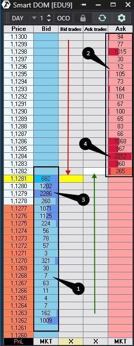
- Black rectangle to the left marks limit buy orders. There is no limit on buy orders or buyers’ liquidity above 1.1281. We marked the movement of the market sell orders with a red arrow.
- We marked the level at which 2,286 limit buy orders accumulated with the number 3. If the price reaches them and the orders do not disappear, the ‘floor’ would stop the market sell orders for some time.
- Black rectangle to the right marks limit sell orders. There is no limit on sell orders or sellers’ liquidity below 1.1282. We marked the movement of the market buy orders with a green arrow.
- We marked the level at which many limit sell orders accumulated, with the number 4. If the price reaches them and the orders do not disappear, the ‘ceiling’ would stop the market buying orders for some time.
Now, let’s return to your flat and imagine you made a hole in the floor and fell through it. Would you be able to come back to your flat? Of course, you would, but only until someone repairs your floor. If someone fixes your floor, you will not be able to come back through that place where the hole was. The same happens with prices. When prices sharply go up and ‘eat’ limit sell orders, there would not be limit orders behind them for some time. It is a vacuum through which it is easy to come back. Some time is required to fill this vacuum, fortunately, much less time than to repair the floor in your flat. That is why bounces, which take place immediately after sharp price movements, are not counter-trends but the absence of liquidity or a vacuum, which is not yet filled.
ORDER FLOW DERIVATIVES
All order flow derivatives are a reflection of the similarly important exchange information but in different variants and at different view angles.
- Limit and market orders;
- Volume Profile;
- Delta, Cumulative Delta;
- Tapes: Smart Tape and Spread Tape;
- Footprint;
- Smart DOM.
WHAT PRICE MOVEMENTS ARE SEEN BETTER ON THE ORDER FLOW THAN ON THE CANDLE CHART?
- Absorption. New market orders always appear, but the price doesn’t move. It means that limit orders absorb the market orders. Do you remember what we discussed above? The market orders should ‘eat’ the limit orders to break a level. But the market orders ‘splutter’ when too many limit orders exist.
- Disappearance of buyers/sellers. A significant reduction in the number of limit orders at a certain price level.
- Aggressive entry of the opposite side. A significant increase in the market orders, which are opposite to the local movement, at a certain price level.
- Ranges. Price levels, which attracted a more significant number of traders. Or the opposite – price levels at which no one wanted to trade.
- Rollbacks. Correction movements against the current trend.
In the examples below, we will show you what these movements look like for different instruments of the volume analysis.
FOOTPRINT EXAMPLES
The footprint is a unique instrument that is easily read in real-time mode. It shows the order flow not only with numbers but also with colors. ATAS has more than 25 footprint types, and any trader can find exactly what he needs.
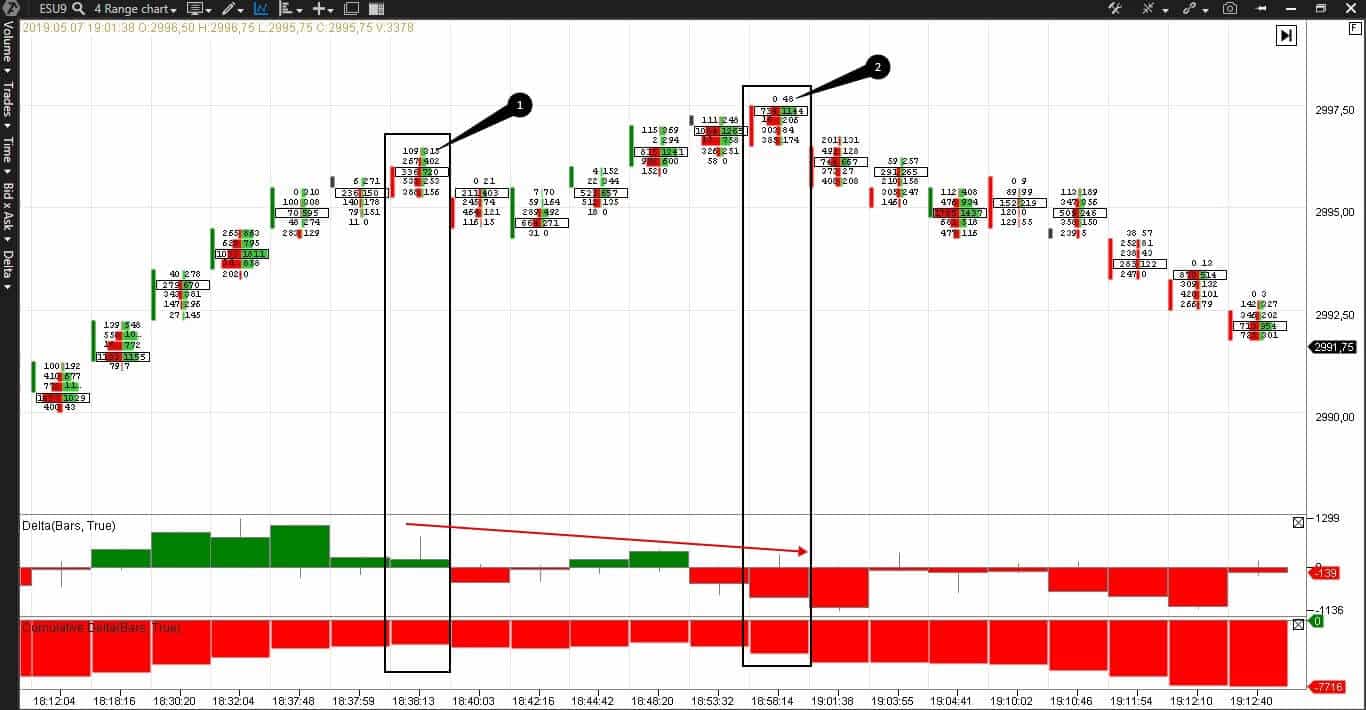
Here’s an example in the E-mini S&P 500 futures (ESU9) range chart (4). Such charts are not connected with time and are good at filtering market noise. See Picture 2.
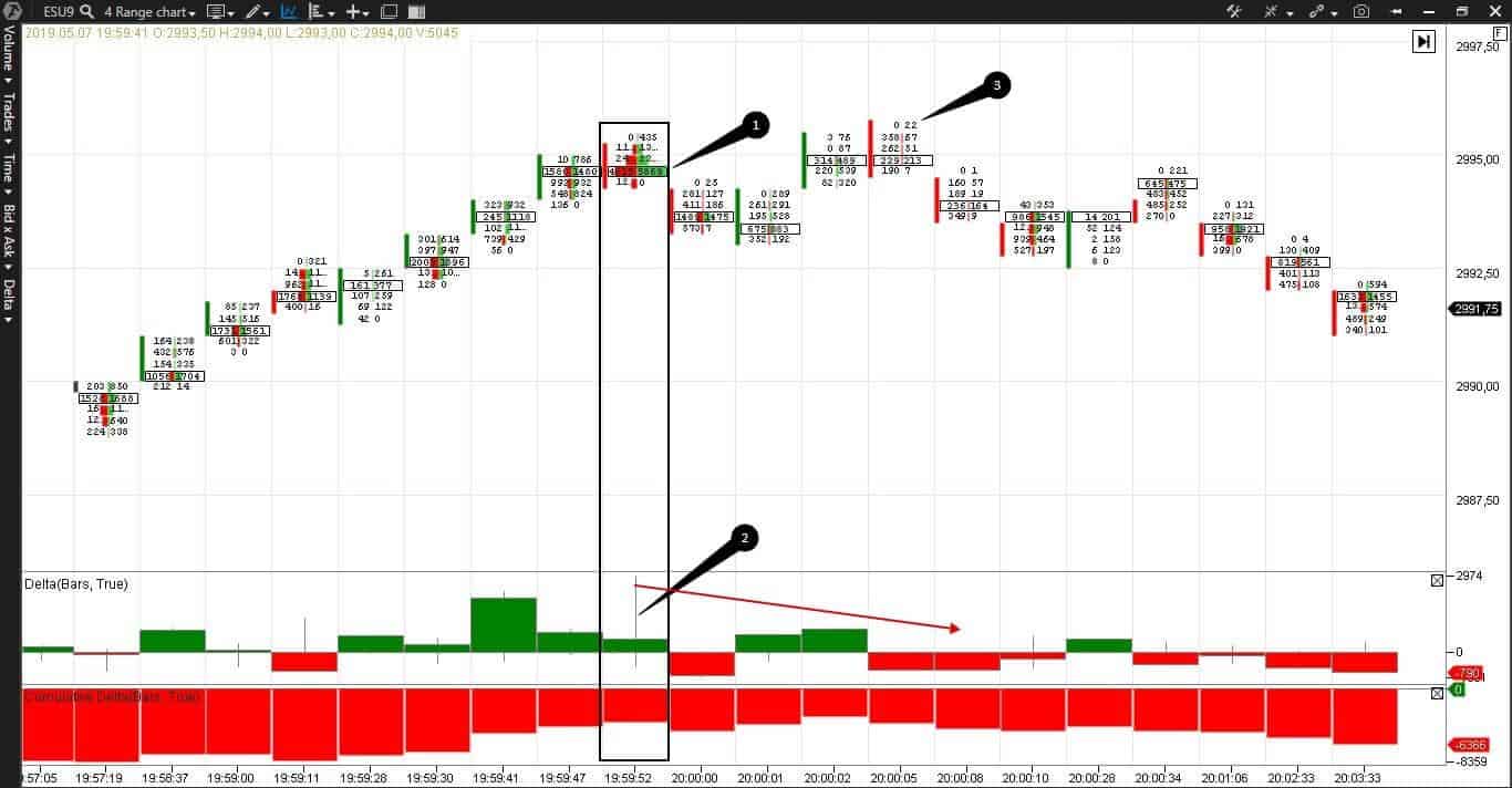
- We marked absorption with point 1. The volume of bids and asks in the marked cells is much higher than in all previous bars, but the price, practically, does not move.
- Note the delta, which we marked with the number 2. The delta with a tail tells us how the buyers were keen to move the price further, but the sellers opposed them. First, limit sell orders didn’t allow the price to grow, then aggressive market sell orders emerged and pressed the price down. The sellers were aggressive for a short time. Most probably, serious players wanted confirmation that the price growth had stopped and no traders wished to buy.
- We marked the bar, where there are only 22 market buy orders on the very top – compare it with the quantity at the moment of the price growth – 614,932,786, with number 3. Such an insignificant number confirms that the buyers were ‘exhausted.’ At the same time, we see the delta divergence – we marked it with a red arrow in the chart. The price reaches a new peak, while the delta doesn’t because no one wants to buy.
EXAMPLES WITH THE DELTA AND CUMULATIVE DELTA
Let’s look at the delta attentively and consider one more example in the same E-mini S&P 500 futures (ESU9) range chart (4).
There is no evident absorption here, but the delta divergence works very well – we marked it with a red arrow again.
- We marked the first local price high with point 1. Some sellers emerged there, but not many, while the buyers didn’t disappear.
- And no one wanted to buy at the very high in point 2 – just 48 market buy orders.
The cumulative delta works better in less volatile markets and clearly shows the current trend and reversals. The cumulative delta is not read well in volatile (oil, for example) markets.
Consider an example in the E-mini S&P 500 futures (ESU9) tick chart (2000). These charts are also not connected with time – a new bar is built as soon as 2,000 trades are registered.
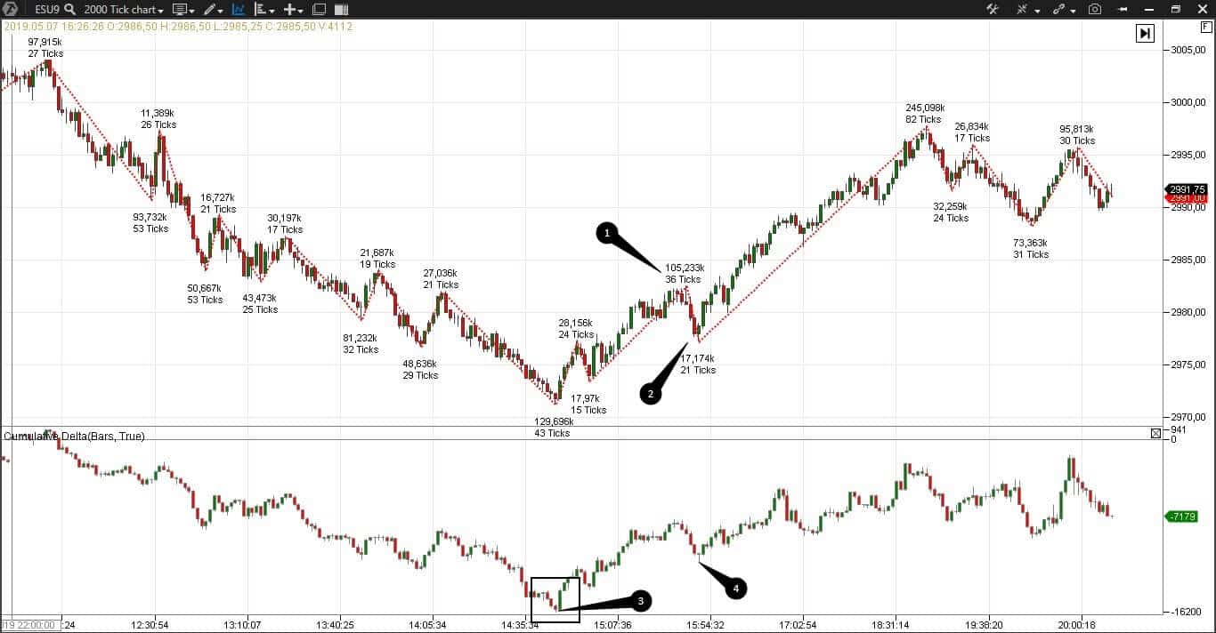
Apart from the cumulative delta, we added the ZigZag pro indicator, which changes direction every 15 ticks, to the chart. ZigZag pro is required to confirm a reversal, which the cumulative delta shows.
In this case, we consider the global picture of the day. The price gradually decreased, and the cumulative delta shows a reversal in point 3. Enter a long by this signal if you are an aggressive trader. Cautious traders want to see additional confirmation signals:
- Entry of buyers – we marked the real emergence of buyers with point 1. The maximum volume is on the upward wave from the beginning of the trading session.
- Disappearance of sellers – we can see a rollback with the minimum volume on the downward wave from the beginning of the trading session in point 2.
- Delta growth. Six thousand contracts emerged from point 3 to point 4. If you are a cautious trader, enter after this rollback.
EXAMPLES IN SMART DOM, SMART TAPE AND SPREAD TAPE
The main difference between the DOM and footprint is that DOM shows intentions (limit orders). Intentions are often deceitful and confuse beginners. We wrote a separate article about spoofing with the help of limit orders.
The Smart Tape shows market orders and ease of movement. The Spread Tape shows volumes and delta at a spread change. If we combine these three instruments, we will not get an explosive mixture but an excellent variant of analysis of the price movement in real-time mode.
Let’s consider an example of the Moscow Exchange index futures (MXU9).
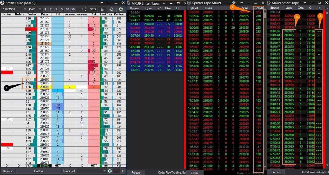
First, a couple of words about the chart legend.
- Red rectangles are round levels. They have the informative load only.
- L1, L2, and L3 are the levels of gradual expansion of the day’s Low during a trading session. In other words, the price first broke the Low (L) and reached the Low1 (L1) level and then rolled back. Then it broke Low1 (L1), and so on. Any trader puts these and other marks for himself.
- We marked the Smart DOM level, at which especially many trades were made, with number 1. We became interested in this level after seeing big new buys on the tape. The Open Interest grows, meaning these are new contracts rather than the closure of old positions.
- Number 3 marks the price levels at which traders bought.
- We marked the delta, which grew approximately by 100 contracts, with number 2. We calculate from top to bottom – from earlier to later. At first sight, the new buys should move the price up. But not in this case.
We marked a handy column in the tape – Up Tick & Down Tick – with the number 4. Ideally, if traders buy, we see + or several +++ in this column. If traders sell, we see – or several — in this column. But if we see – at buys, it works as a divergence. That is, traders buy, but the price doesn’t move higher. Instead, it moves lower. It isn’t good if we observe many consequent minus signs during buys in the green area. It is a red light for buyers. It is a primitive explanation, and you shouldn’t apply it mechanically.
In this example, we consider a combination of factors:
- appearance of new buy orders – we see it from the OI growth;
- accumulation of new buy orders approximately at the same price level – we see it from the delta increase;
- absence of price growth during buys and even some reduction – we see it from Up Tick & Down Tick.
We conclude that we want to sell at this level. This is because new buy orders ‘bump into the ceiling’ and cannot break it. Sooner or later, the traders would realize that and start to exit from long positions. As soon as it happens, we would see a sharp downward movement.
The result is in the following chart.
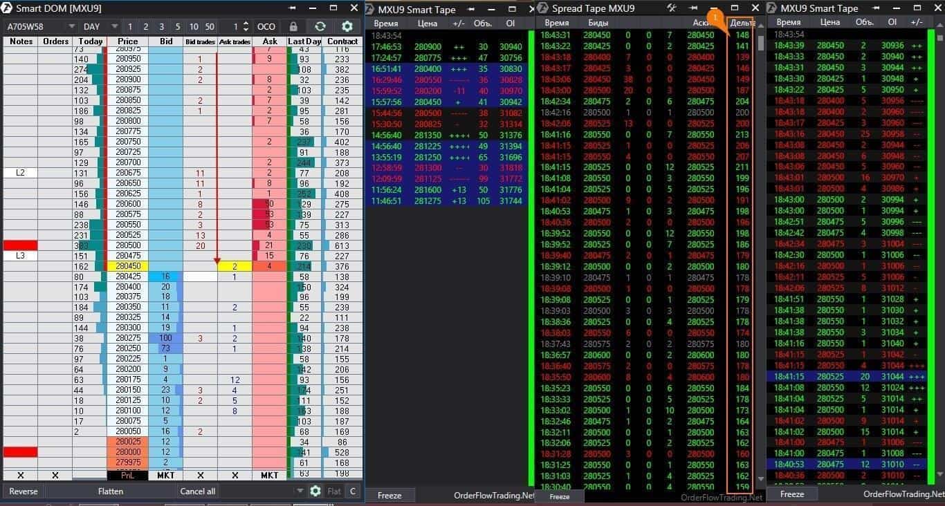
The price fell from 280,925 down to 280,450. The delta was 263 at 18:02, and it became 148 at 18:43. Most probably, these are those unlucky buyers.
This beautiful story with absorption and delta works even better at the day’s highs and lows. A bit of rain on your parade – not a single beautiful story works in 100% of cases, so use protective strategies.
EXAMPLES WITH THE MARKET PROFILE
An intraday Market Profile shows where trades occur and what price levels interest traders. We see a profile in Smart DOM or directly in the chart. Traders are interested not in the absolute volume in a profile but in a profile increment. The profile increment is a sharp change in the number of traded contracts at the neighboring price levels.
To understand what we speak about faster, let’s consider a 5-minute Five Year Treasury Note futures (ZFU9) chart and Smart DOM.
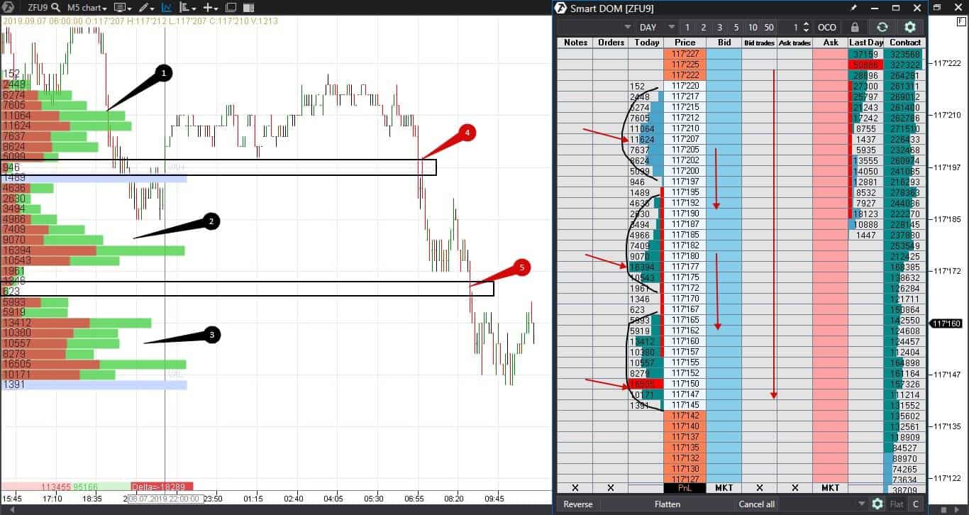
We marked three balanced profile areas with numbers 1, 2, and 3. Formation of such areas takes time – the price moves up and down in a narrow range. Sooner or later, the price breaks the balanced areas.
We see a sharp acceleration and a change of the profile increment at breakout moments – red arrows 4 and 5. The narrower a balanced area is, the faster a breakout would happen. It is very profitable to trade these breakouts, because a risk is lower than a potential profit. The range breakout trades are called initiative trades. We discussed them in the earlier articles about the Market Profile.
The price movement was obviously downward in our chart. The maximum volumes of each of the balanced areas increased during the downward movement. We marked these volumes with red arrows in the book – 11,624, 16,394 and 16,505. The price slows down in the high volume areas and quickly passes the low volume areas. This is exactly what the profile shows and what you can use in trading.
CONCLUSIONS
To trade profitably, you need:
- to know and understand why prices stop;
- to see (and not just to look at) what happens in the market in real time.
The ATAS order flow components will simplify the market analysis and help you get down to the bedrock. You do not have to forecast what happens in the market in a week, month, or year for intraday trading and/or scalping. Make money here and now – join the dominating side. ATAS will also help you to jump out of the train, heading for the abyss, in due time.
Download the free test version of ATAS right now.
Have you found this article helpful? Don’t forget to press the like button.