The Hanging Man is a Japanese candlestick pattern that often appears at the top of an uptrend, signaling a possible end of the current price increase.
Trading with the Hanging Man pattern typically involves opening a short position in a rising market, which carries higher risks. This article explores how to reduce those risks and improve your chances of success by using footprint charts and volume analysis when this pattern appears on a candlestick chart.
Learn more:
How to Identify Hanging Man Candlestick Pattern
The Hanging Man pattern (known as kubitsuri in Japanese) consists of a single candlestick that forms after a period of rising prices. To identify this pattern, look for the following features:
- A small body positioned at the top of the candlestick.
- A long lower shadow that is at least twice the length of the body.
- An upper shadow is small or does not exist at all.
An example of the Hanging Man pattern is shown in the image below, with the candlestick marked as number 3.
Why such a striking name? The name comes from the candlestick’s shape, which resembles a hanging person.
How Does the Hanging Man Differ From Other Patterns?
There are a few patterns that look similar to the Hanging Man, as they also have a small body on one end and a long tail on the other. To understand the differences, let’s take a closer look at them in the cheat sheet below:
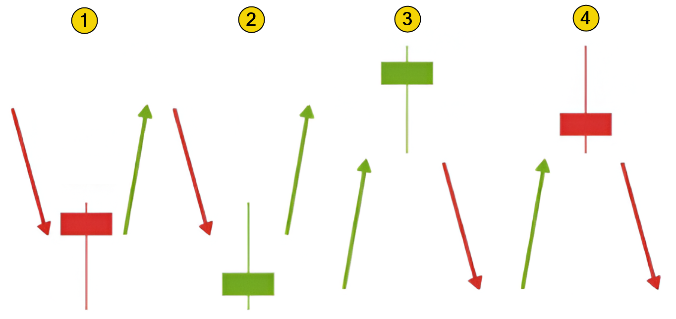
The cheat sheet above shows:
- The bullish Hammer pattern.
- The bullish Inverted Hammer pattern. (a detailed explanation can be found in the article: What Is a Hammer in Trading).
- The bearish Hanging Man pattern, which is the focus of this article.
- The bearish Shooting Star pattern (learn more about it here).
While the Hanging Man looks similar to the Hammer, and both are reversal patterns, there are some key differences:
✔ The Hammer forms at the bottom of a downtrend, whereas the Hanging Man appears after a significant price rally.
✔ The Hammer is a bullish pattern, while the Hanging Man is bearish.
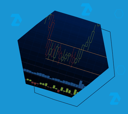
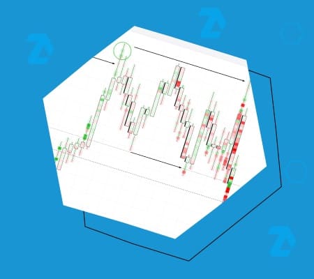
Examples of the Hanging Man Candle on the Chart
In the image below, arrows point to two examples of the Hanging Man pattern:
- on the left: the candlestick that formed on the daily chart of E-mini S&P 500 futures;
- on the right: the Hanging Man on the Apple (AAPL) stock chart.
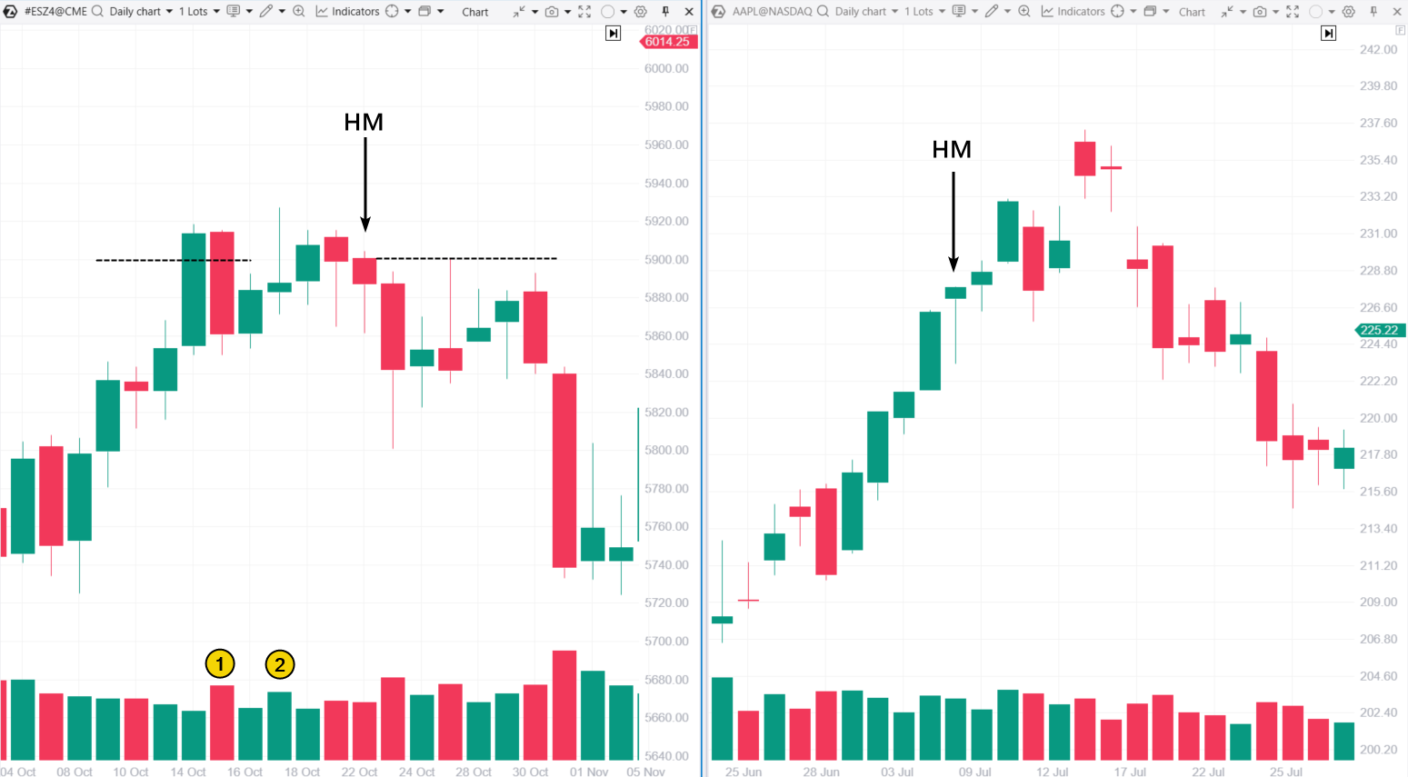
In the first example, the Hanging Man pattern was effective: after it appeared, a bearish trend took over, and prices started to drop over the next few days.
In the second example, however, the uptrend continued, and trading based on the Hanging Man would likely have led to a loss. Volume analysis hinted that this was the most probable outcome. More on that below.
Meaning of the Hanging Man Pattern
When the Hanging Man pattern forms on the daily chart, it typically suggests the following:
During the session, prices drop significantly below the opening level, signaling strong selling pressure.
By the end of the session, prices partially recover but fail to climb much higher than the opening level. This indicates that buyers could not fully regain control, and there is a possibility that selling activity (bears) will pick up again.
However, in practice, the balance between supply and demand can be more unpredictable and may evolve in a less straightforward manner. Let’s revisit the chart above to visually explore these nuances.
The Hanging Man Pattern – Left Example
The shift toward bearish sentiment in the market is evident from the context (events took place near the psychological level of 4900 points) and the vertical volume indicator analysis:
✔ On October 15, the price dropped sharply with increasing volume, signaling that sellers became more active after a day when prices had risen on low volume (indicating weak demand). In candlestick terms, this resembles a bearish engulfing pattern.
✔ There also was an upthrust or a shooting star. The price briefly rose above the previous high by a tiny amount, only to reverse and move lower. Many retail traders likely got caught in a bull trap there.
The Hanging Man Pattern – Right Example
In this case, the Hanging Man pattern appeared after a strong candle – the price rose from open to close, with the bulls making significant gains. The long lower shadow on the Hanging Man candle likely represents a small intraday correction, after which the bulls regained momentum and the uptrend continued.
In the next examples, we will demonstrate how advanced volume analysis tools, such as footprint charts, can help provide a more accurate assessment of the market when the Hanging Man pattern and other candlestick patterns form.
Analyzing the Hanging Man Candle on a Cluster Chart
The screenshot below shows the Bitcoin chart, using data from Binance Futures:
- On the left, you can see the candlestick chart where the Hanging Man pattern formed on July 16, 2024 (1).
- On the right is a 4-hour footprint chart with a delta profile, and the delta indicator is applied at the bottom.
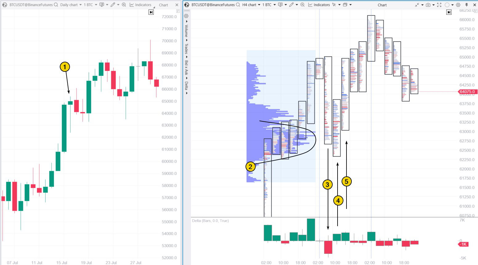
As you can see, the pattern did not work as expected, and the footprint chart explains why:
On July 15, Bitcoin saw a strong price increase throughout the day, but the move was not smooth: as you can see, the peak on the profile (2) indicates price consolidation around the 63,000 level.
The following day, after reaching the psychological level of 65,000, a correction took place:
- the price dropped to around 63,000 during a spike in negative delta (3);
- however, the price quickly reversed upward during a spike in positive delta (4), which can be seen as a “test of the bulge”;
- on the next candle (5), buyers showed their presence.
As a result, the Hanging Man bearish pattern appeared on the daily chart, but the footprint chart indicated a bullish reversal within the day.
This situation is similar to the AAPL chart example above: after a wide bullish candle, the Hanging Man pattern gave a false signal of a potential downward reversal. Instead, the uptrend continued after a brief correction.
How to Trade with the Hanging Man Candlestick Pattern in the Stock Market?
The daily chart is the optimal timeframe for identifying the bearish reversal pattern Hanging Man, as it is for most other classic Japanese candlestick analysis models.
To trade this pattern more effectively (whether you are working with stocks or other assets), consider these recommendations:
✔ open short positions near key resistance levels;
✔ look for additional confirmations.
Classic Trading Strategy for the Hanging Man Candlestick
A short position (sell) can be initiated if the following candlestick closes below the low of the Hanging Man. Here is how to manage your risk and profit:
- Stop-loss. Place it just above the high of the Hanging Man candle or its upper shadow, if present.
- Take-profit. This is flexible. One option is to calculate the target mathematically or base it on previous support levels (such as Fibonacci retracements).
How Reliable Is the Hanging Man Candlestick Pattern in Technical Analysis?
Here are the results of profitability assessments for trading based on the Hanging Man pattern, analyzed using historical data by various candlestick pattern researchers.
Candle Scanner analysis:
A study of the Hanging Man pattern using daily candlestick data for stocks in the S&P 500 index from July 1, 1995, to June 30, 2015, found:
- Within five candlesticks after the pattern appeared, prices dropped significantly in 30% of cases (indicating the pattern worked well) and rose in 14% of cases (resulting in a loss). In the remaining cases, prices showed a slight average decline.
- Within ten candlesticks after the pattern appeared, prices dropped significantly in 40% of cases (indicating strong performance), while they rose in 13% of cases (a false signal). In the other cases, price declines were moderate or minimal.
According to Thomas Bulkowski
Thomas Bulkowski, the author of Encyclopedia of Chart Patterns, tested the Hanging Man pattern and found that it does not always perform as expected. In theory, prices should decline after this pattern appears. However, Bulkowski discovered that in 59% of cases, prices rise (indicating a false signal).
Nevertheless, he noted that the Hanging Man pattern proves profitable in 86% of cases when it occurs alongside a support level breakout in a reversing bear market.
What Is the Success Rate of the Hanging Man Candlestick Pattern?
Studies show that the risk of loss when trading the Hanging Man pattern can range from 13–14% to 59%. These findings emphasize the need for additional analysis and careful consideration of the market context to make well-informed trading decisions.
Example: The Hanging Man Pattern in the Gold Market
Below is a daily chart of gold futures:
- on the left: standard candlesticks with vertical volumes;
- on the right: a footprint chart showing horizontal volumes, complemented by a custom profile to analyze potential market developments.
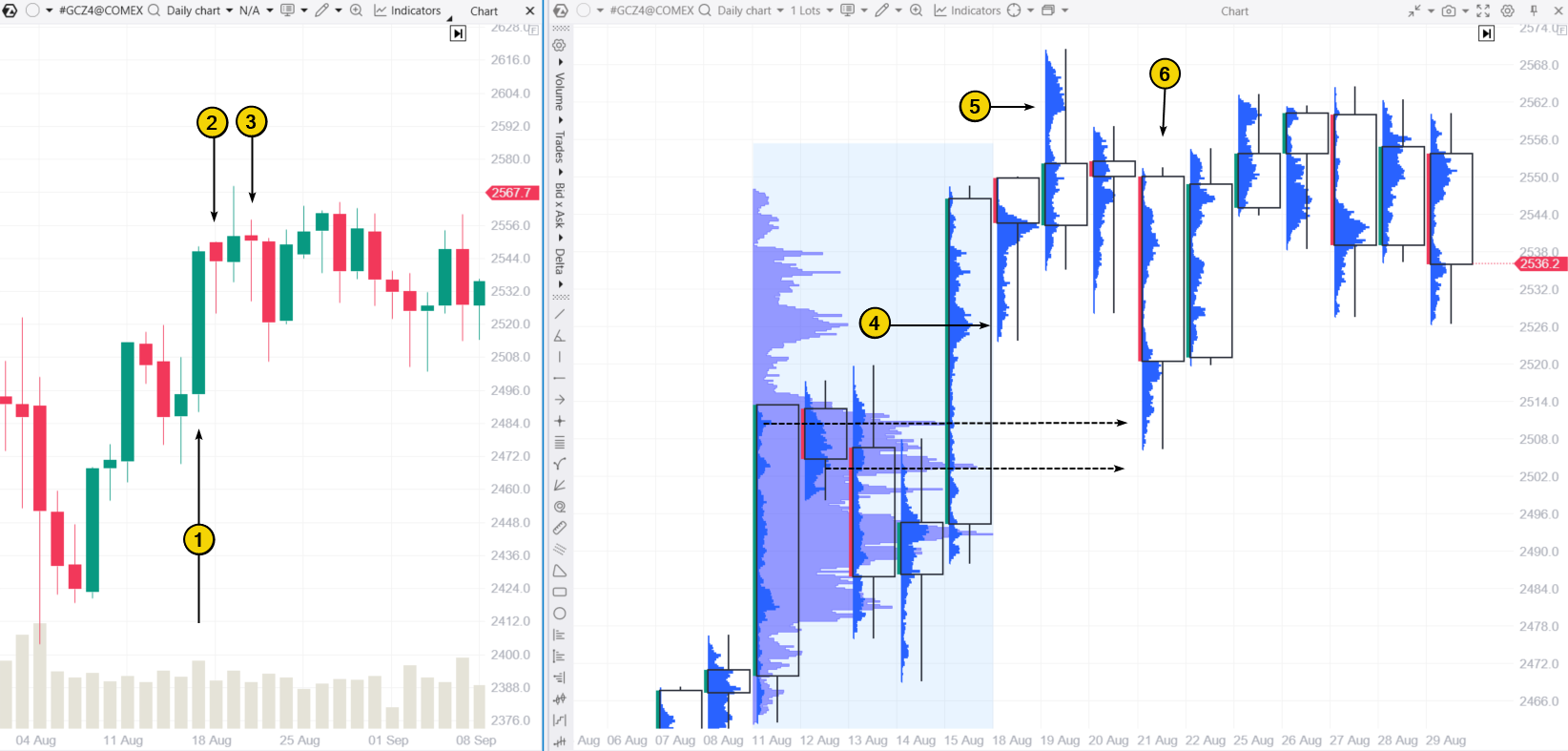
After a sharp rise in price (1), two candles (2 and 3) formed on the 2024 chart that fit the criteria for the Hanging Man pattern: both have small bodies at the top and long lower shadows.
However, the footprint chart reveals important details that help differentiate between these two patterns:
- The decline that created the long lower shadow on the first Hanging Man candle was likely a test of the Point of Control (4) from the previous day.
- The drop on the second candle could have been part of a bearish impulse, trapping buyers from the previous day (5) above the $2560 level.
In this case, the decline on candle (6) suggests a lack of buyers around $2560, causing the price to fall further in search of support in the high-volume areas indicated by the dashed arrows.
The footprint chart helps clarify many important nuances. Even from these examples, it is clear that while traditional candlestick analysis has its merits, it can be less precise compared to modern analysis tools.
The spike in buying activity (shown by the arrow) occurred at the top of the candle’s shadow. The close in the middle suggests that if those market buys were the result of new long positions being opened, the buyers got trapped in a bullish setup — a bearish signal. With this in mind, traders using footprint charts could have planned their trades on the sell side.
Example: Hanging Man on Non-Standard Charts
The Hanging Man pattern was originally designed for candlestick charts on daily timeframes. This raises the question: can it also be applied to intraday trading? This can be challenging because intraday trading often develops unevenly. In such cases, assessing the shape of candles and their relationship with neighboring candles can be difficult and not always accurate.
One potential solution is to use volume-based charts. In these charts, a new candle is generated after a set number of contracts have been traded on the exchange. This approach reduces distortions related to the uneven distribution of trading activity across the day, with the Volume indicator showing more balanced volume bars.
Example: A Volume chart for Litecoin, using data from Binance Futures.
Arrow #1 points to a candlestick that meets the criteria for the Hanging Man pattern:
- a long lower tail;
- a small body positioned near the top;
- a preceding period of price growth;
- additionally, there is a peak to the left, meaning the Hanging Man formed near a resistance level.
However, the pattern did not work, and the price continued to rise. Why?
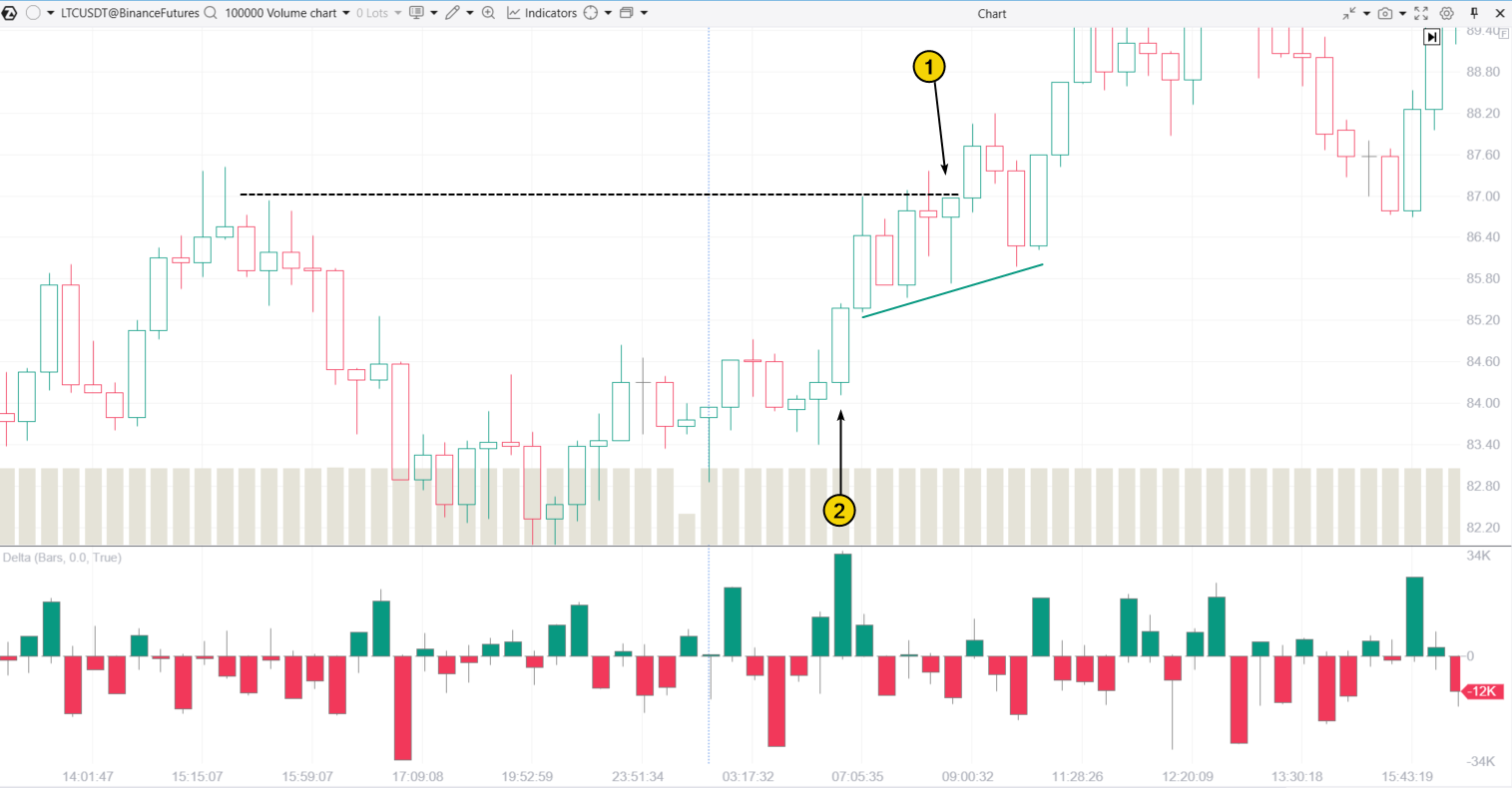
Arrow #2 highlights a spike in demand, evident from the green bar on the Delta indicator and a wide bullish candlestick closing near its highs. After this candlestick, a series of higher lows developed, signaling growing buyer momentum.
As the chart shows, buyers were aiming for a breakout of the resistance marked by the dashed line. The Hanging Man pattern appeared incidentally as prices fluctuated before the resistance breakout. Eventually, the broken resistance turned into a support level, as seen on the right side of the chart.
Takeaways from the examples
Analyzing price behavior following the formation of a Hanging Man candlestick shows that, despite its widespread use, this pattern should be approached with caution. It is essential to consider additional factors such as market context and volume indicator signals, which can help evaluate whether the pattern is likely to play out in a given situation.
FAQ
Is the Hanging Man a bullish or bearish pattern?
In theory, the Hanging Man is a bearish candlestick pattern that indicates a potential reversal of an uptrend. However, in practice, such reversals do not always materialize.
When does the Hanging Man candlestick pattern appear?
It typically appears after a period of rising prices (an uptrend).
How frequently does the Hanging Man Candlestick pattern occur?
According to CandleScanner, the Hanging Man pattern appears on daily charts of S&P 500 stocks just over 3% of the time.
Is there a similarity between the Hanging Man and Shooting Star candlesticks?
The Hanging Man and Shooting Star have some key similarities:
- both are bearish reversal patterns that form after a price increase;
- both have small candle bodies.
The main difference is the shadow placement: the Hanging Man has a long lower shadow, while the Shooting Star has a long upper shadow.
What is the difference between the Hanging Man and Hammer candlesticks?
While the Hanging Man and Hammer look almost identical (both have small bodies, long lower shadows, and narrow upper parts), their meanings are completely different. The Hanging Man signals a potential downward price reversal. The Hammer appears at the bottom of a downtrend and suggests a possible upward reversal.
How to Trade Profitably Using Candlestick Patterns
Trading on financial markets using the Hanging Man pattern can often lead to frustration, as its signals are frequently unreliable. This raises an important question: if additional analysis tools are needed to obtain more accurate insights, why not start with those tools?
Such tools include modern solutions for financial market analysts:
- ATAS indicators for volume analysis;
- cluster charts (footprint) with various configurations;
- non-standard chart types.
See how these tools can help you analyze the market and forecast price movements by trying out the ATAS Market Replay simulator for traders. This module of the ATAS platform uses historical data to recreate trading conditions.
You can develop trading skills in near-real conditions without any financial risk. Practice using footprint charts and other valuable ATAS features to trade not only with the Hanging Man pattern but also with other strategies.
When practicing trading patterns in the Market Replay simulator, you can:
- adjust the playback speed and pause;
- analyze footprint charts;
- use over 200 indicators;
- use Chart Trader and other features to trade on the Replay built-in demo account and then analyze your performance;
- use exit strategies.
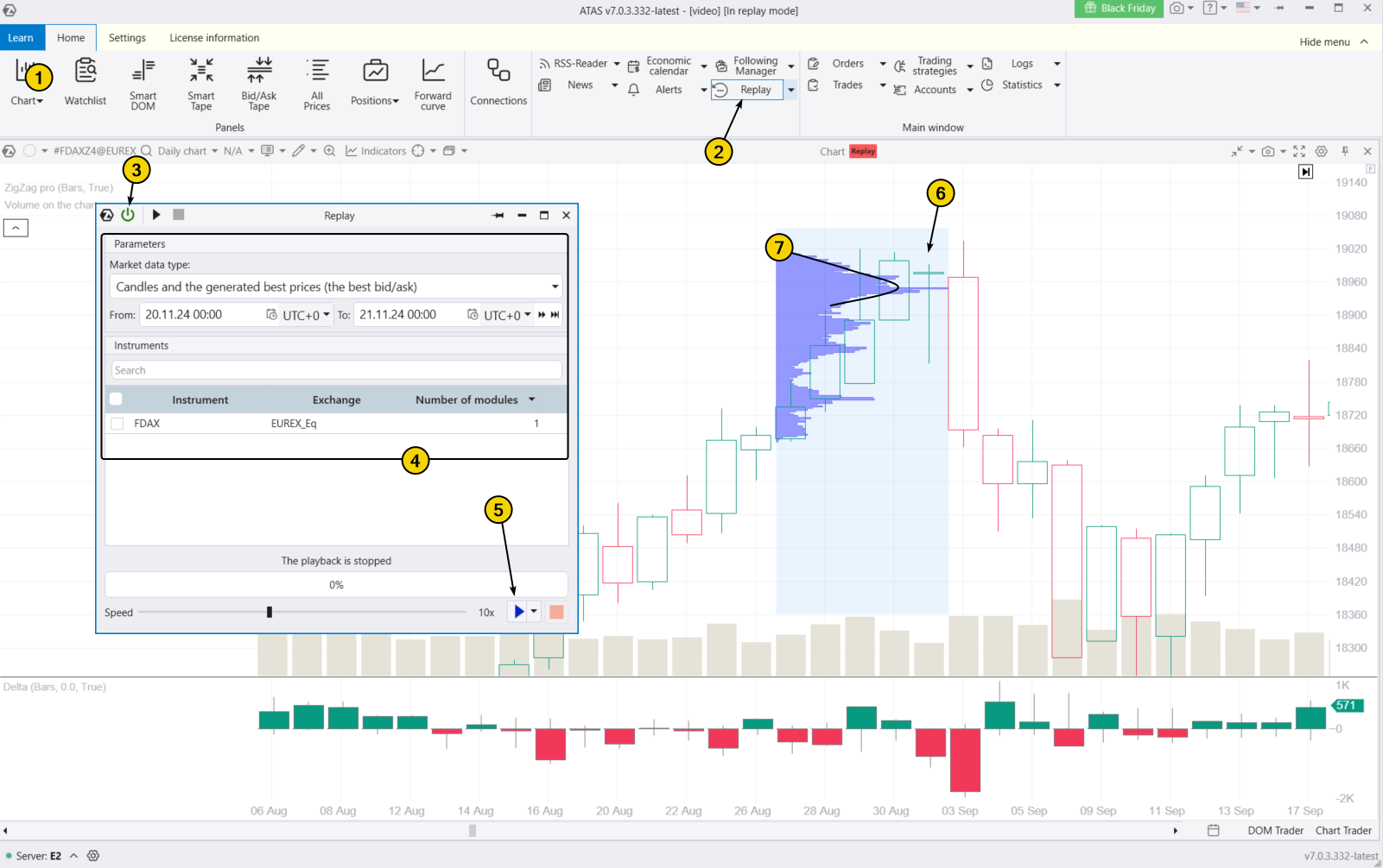
To try the simulator, download the ATAS platform for free, install, and launch it, and then:
- Open a chart of a financial instrument.
- Click on the Market Replay button in the main ATAS menu.
- Activate the Replay mode (the icon should turn green).
- Adjust settings (date and data type).
- Start the playback and monitor when the Hanging Man or other familiar candlestick patterns appear on the chart. Look for confirmations using the footprint chart or indicators.
ATAS enables you to load tick-by-tick data from cryptocurrency, stock, and futures markets, providing a comprehensive basis for identifying patterns in the interaction between price and volume to refine your trading strategy.
Example. The chart above shows the Hanging Man candlestick (6) that formed near a bulge in the volume profile (7). After a price rally toward the psychological level of 19,000, buyers likely encountered a block of sell orders. Despite active trading, the price failed to rise further — a bearish signal.
Conclusion
The Hanging Man pattern is widely recognized, but relying solely on its signals can add uncertainty to the already unpredictable nature of financial markets.
Advantages of the Candlestick Pattern
✔ Profit potential. There is a chance to enter a short position early in a downtrend before it becomes obvious to other traders.
✔ Versatility. The Hanging Man pattern works well alongside other analytical tools and methods.
Disadvantages of the Hanging Man Candlestick Pattern
✘ High risk. The Hanging Man suggests a short trade in an uptrend, which could continue, creating significant risk.
✘ False signals. Research shows that the accuracy of the Hanging Man pattern’s signals is often close to 50%, making it an unreliable tool for predicting market movements.
Before risking real money, ensure that trading with candlestick patterns is giving you positive results. ATAS Market Replay and its historical data can help you with this. Enhance your regular candlestick analysis with professional volume analysis tools like cluster charts, the Delta indicator, market profiles, and other features from the ATAS platform, built by traders for traders.
Download ATAS. Once you install the platform, you will automatically get the free START plan, which includes cryptocurrency trading and basic features. You can use this plan for as long as you like before deciding to upgrade to a more advanced plan for additional ATAS tools. You can also activate the Free Trial at any time, giving you 14 days of full access to all the platform’s features. This trial allows you to explore the benefits of higher-tier plans and make a well-informed purchasing decision.
Do not miss the next article on our blog. Subscribe to our YouTube channel, follow us on Facebook, Instagram, Telegram or X, where we publish the latest ATAS news. Share life hacks and seek advice from other traders in the Telegram group @ATAS_Discussions or on Discord.
Information in this article cannot be perceived as a call for investing or buying/selling of any asset on the exchange. All situations, discussed in the article, are provided with the purpose of getting acquainted with the functionality and advantages of the ATAS platform.