We continue our series of articles “Getting acquainted with ATAS”:
- General Overview of the Platform’s Capabilities
- Overview of Capabilities and Advantages When Using Charts
- Overview of Cluster Chart Capabilities
- Overview of Indicators
- Trading Opportunities
Today, in the third article of the series, we will focus on charts.
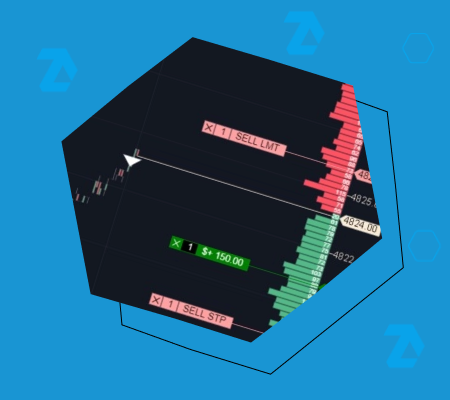
The chart is the most popular module of the platform. It enables you to analyze candles, bars, and footprints using indicators and drawing objects, and it also enables trading.
As with every article in the series, the information is divided into two parts:
- a video overview;
- a text description with screenshots and links to practical materials on working with charts.
A trader, demonstrates in this video the powerful arsenal of the ATAS functionality for working with charts. To make sure you always have the information you need in front of you, below is a text version of the video’s content.
In this article, we will cover basic operations, describe the main elements of these operations, and provide useful information for those who understand the principles of trading using charts but are new to the ATAS platform.
Read more:
If you have any questions, feel free to contact our support team, we will be happy to help.
How to open the chart
In the main window, click the Chart button (1). Note that you can also open a chart through the menu that becomes available after clicking the “plus” icon at the bottom (6).
This will open the instrument manager with two tabs – Favorites (2) and All Instruments (3).
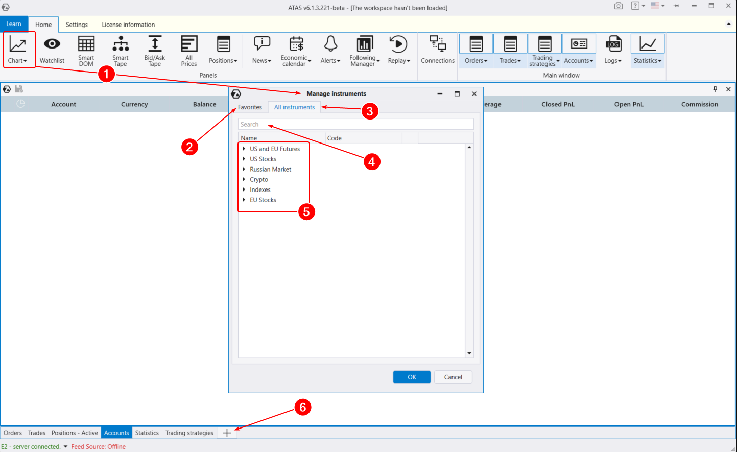
By default, the Favorites tab in the instrument manager is active, allowing you to quickly open your desired chart. Initially, it includes popular instruments like ES futures and BTC/USD. Let’s see how to customize this list to suit your preferences.
Open the All Instruments tab. Here, you can find the instrument you need (4) by its name or ticker. Additionally, all instruments (which are gradually being added) are categorized into(5):
- US and EU Futures. American and European futures, including currency futures (similar to forex currency pairs).
- US Stocks. American stocks from NYSE, NASDAQ, AMEX.
- Russian Market. Russian currency, futures, and stock market.
- Crypto. Available cryptocurrency exchanges.
- EU Stocks. A list of European stocks.
For example, if you are interested in the oil futures market on American exchanges, open US futures > Energy Products > Light Sweet Crude. Under the CL ticker, you will find the oil futures market on the NYMEX exchange.
To add an instrument to Favorites, click the star (1) next to the contract you need. Most likely, this will be the Continuous (2) contract, which is always at the top (in our case, the CL ticker).
You also have the option to load specific contracts (3) with set expiration dates (CLX2, CLV2, CLU2, etc.). What is the difference?
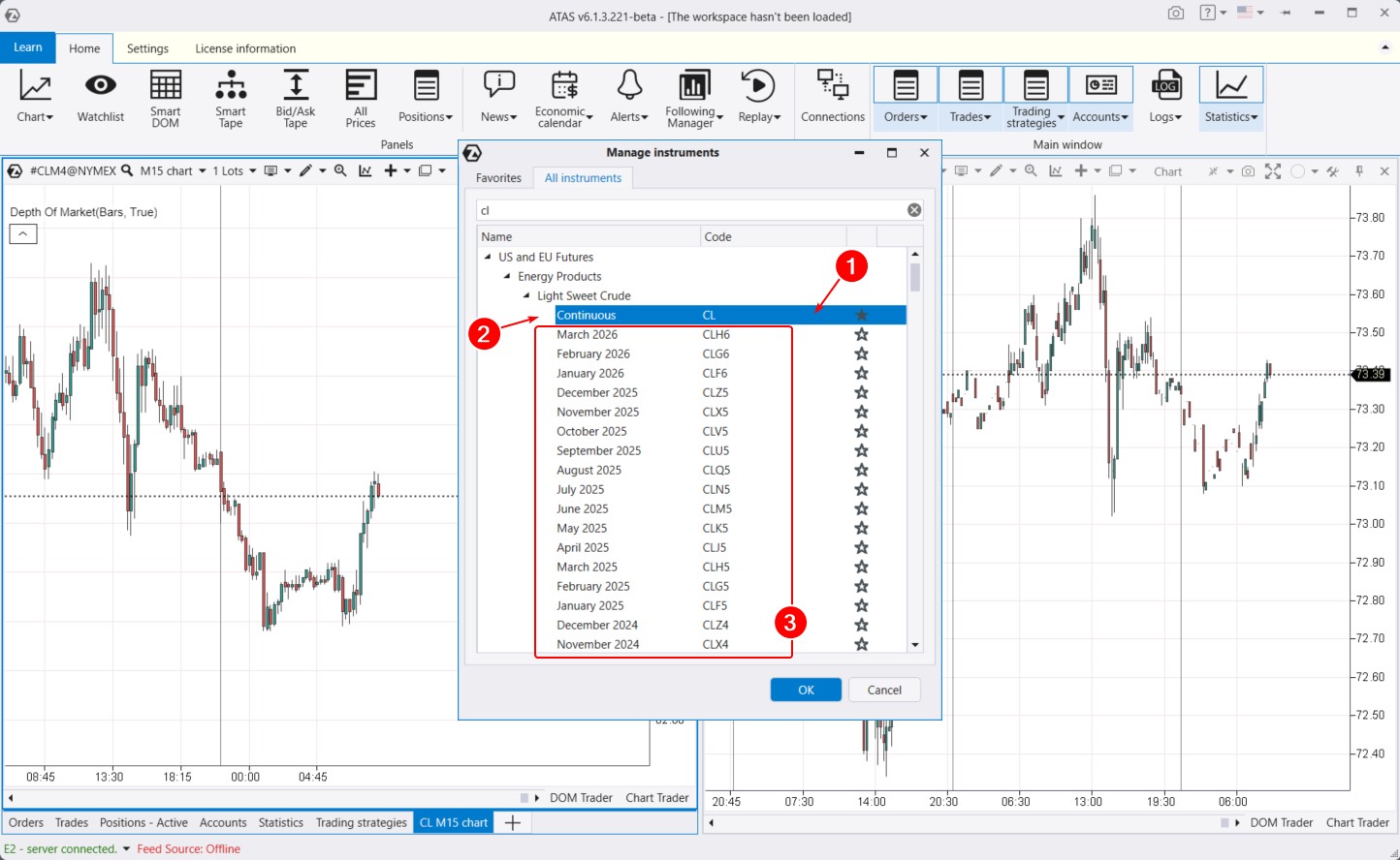
Futures are traded with contracts that have expiration dates. The moment when a contract reaches the end of its validity is called expiration. Some instruments expire every 3 months, while others expire every 2 months. This means each contract has a specific date when all open positions will be forcibly closed by the exchange. Traders then start trading the next contract by date.
When you load a specific contract, you will only see data related to that particular contract. For instance, the chart on the right depicts trading activity for a futures contract expiring in the fall of 2024, still representing a relatively illiquid market.
If you are interested in a long-term history of the instrument, such as over a year and a half, you need to load the Continuous contract (example on the left chart). This contract combines all liquid contracts. The contract switches automatically when the total volume on the next contract exceeds the total volume on the current contract. The next day after this event, there will be a change in the Continuous contract.
Useful links:
Chart settings and menu
After selecting an instrument in the manager and clicking OK, the Chart module opens. By default, the chart opens with a classic color scheme: red-green candles and the only added indicator is the Depth of Market. To display it, the connection to the exchange must be active.
The primary tool for adjusting charts is the settings manager window.
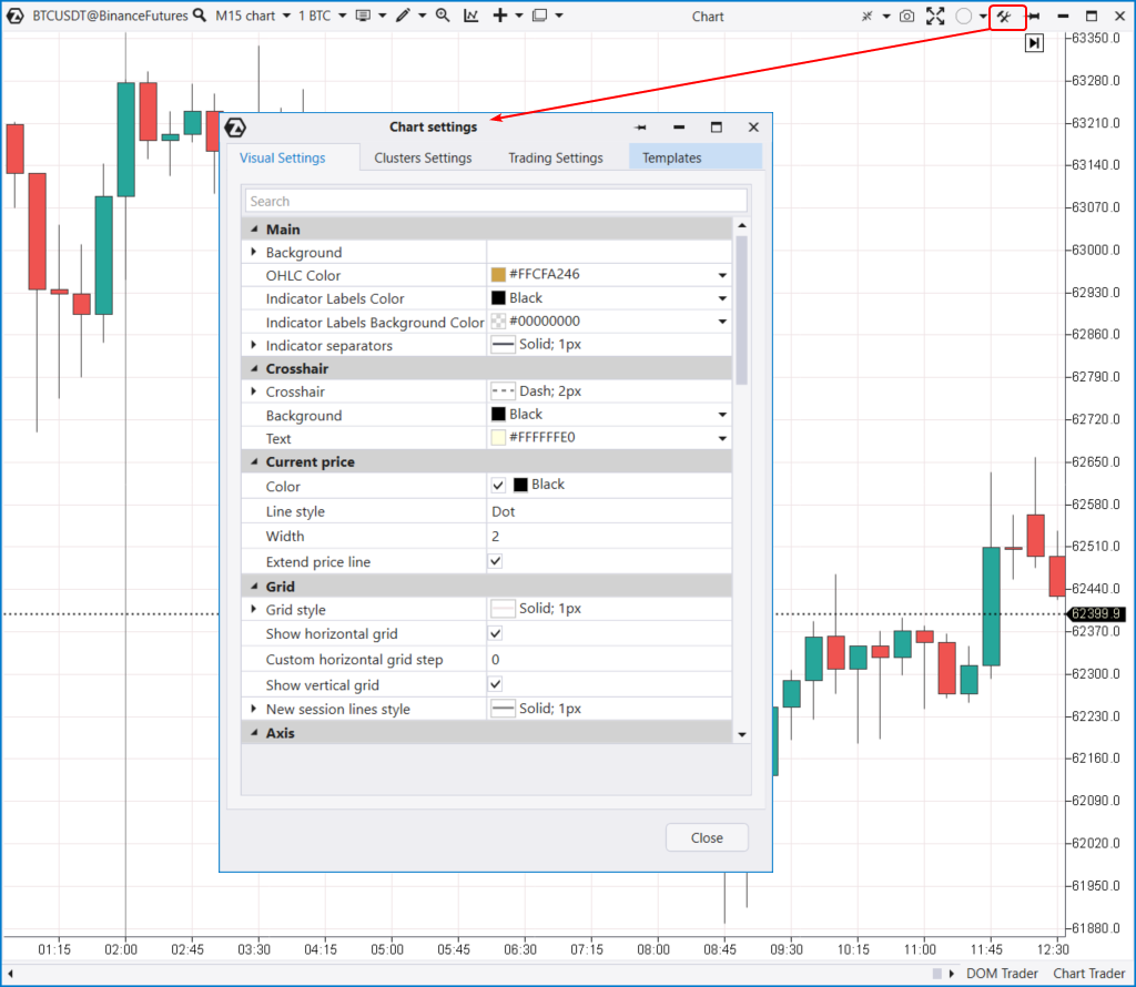
To access it, use the icon in the top menu (indicated by the arrow), or press Ctrl+S. You can also access the settings manager through the context menu that appears when you right-click on the chart.
The settings manager window is divided into four tabs:
- Visual. Settings for colors, chart annotation, and other parameters.
- Clusters. Settings for colors, annotation, and other parameters of the cluster chart.
- Trading. Settings for trading.
- Templates. Settings for templates.
Next, we will delve a bit more into each tab of the settings manager.
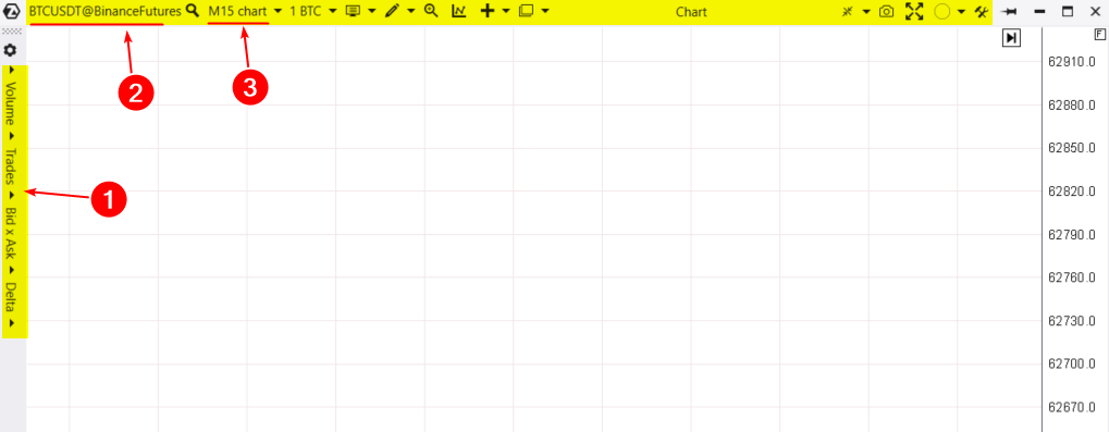
You can interact with the chart module through a concise menu in the top bar (highlighted in yellow above).
When you expand the chart horizontally before switching to cluster display mode, another menu with cluster settings will appear on the left (1). We will discuss cluster charts in our next article in this series. For now, let’s go through the menu in the top bar from left to right.
By clicking on the contract ticker@exchange (2), you will open the instrument manager.
Next is the period settings (3). Let’s delve into this important point in detail:
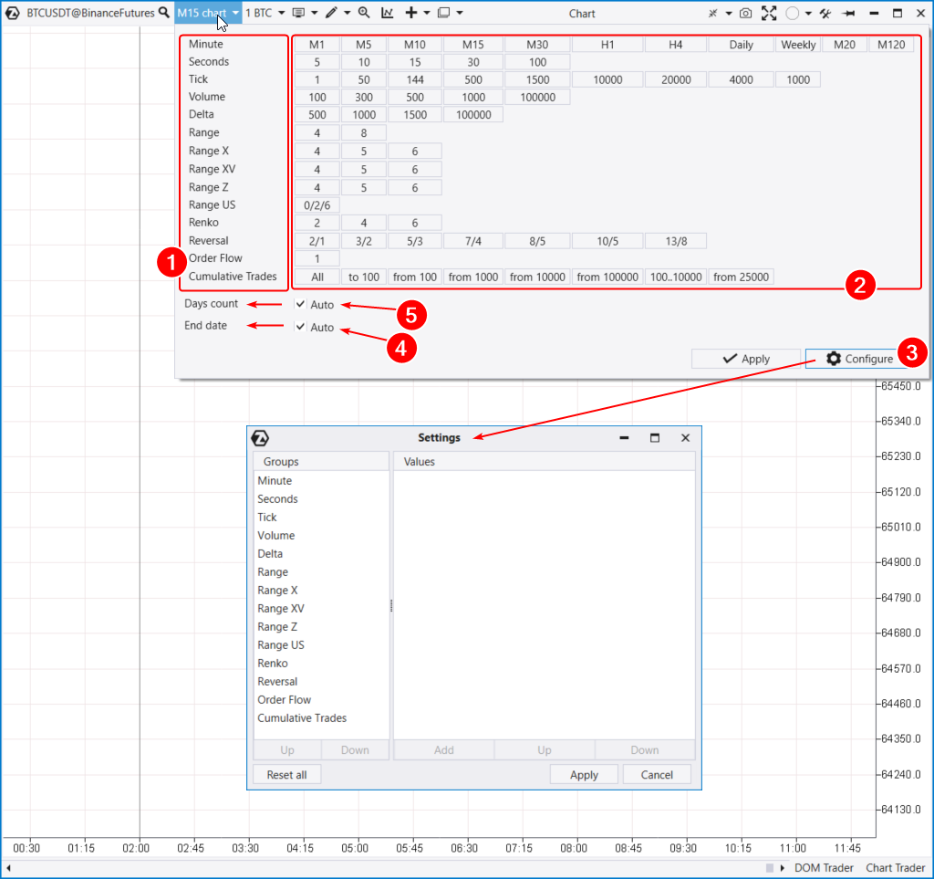
In the period settings, you will see a list (1) of available time and other frames: delta, volume, range, renko, etc. Some of them are unique. Be sure to experiment with them.
To the right of each frame type are default values (2).
By entering the frame configuration window (3), you can create your own unique period.
Below, you can adjust the end date (4), which will correspond to the last loaded day on the chart.
You can also specify the number of days of historical data (5). Keep in mind: the amount of available data and features is limited by the current subscription plan. For more details, check out the pricing page.
Useful links:
Volume Selection menu
In this menu, you can set the order volume. Crypto traders can specify volume either in a specific coin or in USDT.
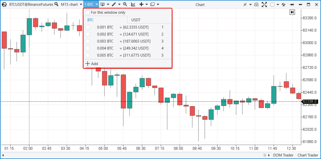
Assigning hotkeys for different volumes allows day traders to execute their strategies more flexibly and quickly.
Chart display types
ATAS can create charts of seven different types (modes):
- Standard bar chart.
- Traditional Japanese candlesticks.
- Transparent candlesticks.
- Classic line chart.
- Footprints (switch to cluster mode).
- Area.
- There is an option to hide candles entirely. It can be useful when working with the TPO indicator, also known as the classic Market Profile.
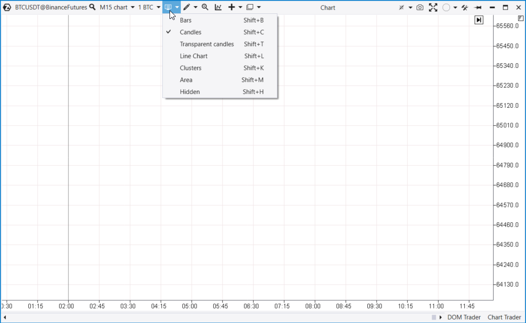
To select the desired chart type, use the menu (next to the volume selection menu) or hotkey combinations with Shift.
Each chart mode offers a full range of customization options, including colors, line thickness, and other display settings.
Useful links:
Drawing objects
In the drawing menu, you will find a wide array of tools for annotating your chart: various lines, zones, channels, shapes, and text labels. Highlighting a few useful objects:
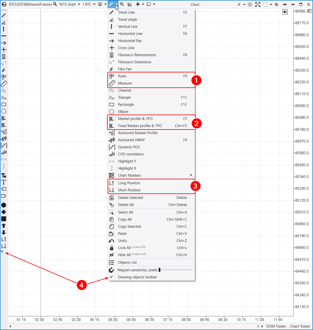
Here are a few useful tools to highlight:
- Tools (1) for measuring statistical information on any section of the chart.
- Profile indicators (2). The TPO and Profile drawing object enables you to create a Market Profile & TPO for any area on the chart. A fixed volume profile can be conveniently attached to the edge of the chart.
- Tools for planning risk, potential profit, and trade volume.
Many objects have hotkeys. For faster and easier work, you can activate (4) and customize the drawing objects panel on the left side of the chart area.
Tip. By selecting a profile and pressing Ctrl, you can drag and clone it, as well as other drawing objects.
Useful links:
Indicators, templates and trading functions
Right after the drawing tools menu, you will find the “Magnifying Glass” mode activation (hotkey “M”). This feature enables you to view clusters when hovering over a candlestick chart.
Next in the menu is the Indicator Manager (1). With it, you can add, configure, or remove indicators on your chart. ATAS offers over 400 indicators, and this list is continuously growing.
We will discuss indicators in more detail in a future article.
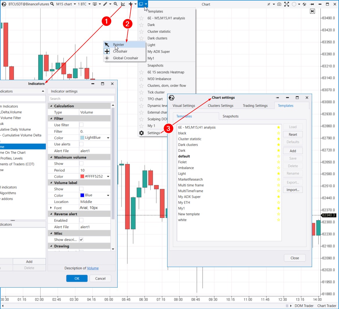
Next, you will find the crosshair selection (2). For example, by choosing the Global Crosshair mode, you can synchronize mouse movements across different charts.
Following that is the Templates menu (3). The template settings open as a tab within the Chart Settings window. Here, you can save and load templates and snapshots.
What is the difference between these formats?
- A template saves indicators and color settings.
- Snapshots are templates with an extended set of chart elements, such as drawing objects, period settings, and other details.
Templates and snapshots can be exported/imported as files between computers.
Useful links:
- You can download chart templates in the Learn section (blue tab in the main platform menu)
- How to work with templates can be found in the Knowledge Base
- More about crosshair types
Vertical scaling
Scaling allows you to compress price levels and trade data.
For example, if you expand the chart from candle mode to cluster mode but cannot see the levels, you need to adjust the vertical scale by dragging the price axis. This is often necessary for volatile instruments or larger time frames, such as daily or higher.
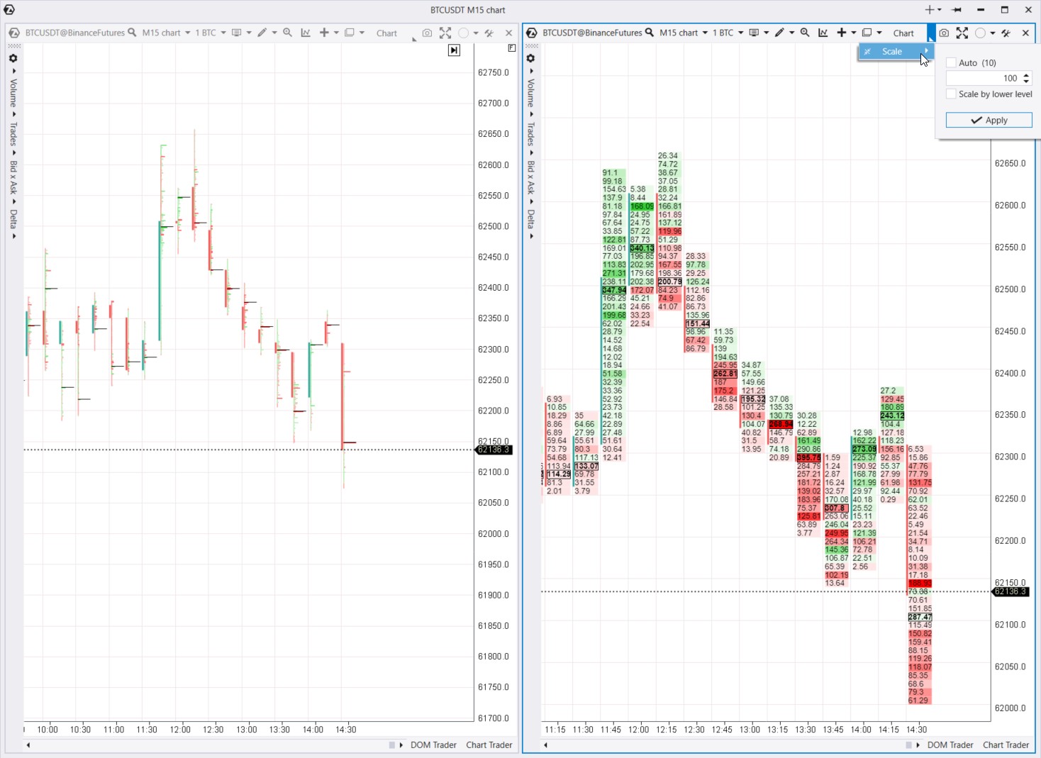
By default, on the Bitcoin futures chart on Binance, one tick (the minimum price change, or price step) equals 10 cents. If we set Scale = 10, then one tick on the chart will equal one dollar, and all volumes, deltas, and trades will be aggregated within that 10-dollar range.
ATAS can automatically choose the optimal scale based on market conditions if you enable the Auto checkbox. You also have the option to manually disable Auto mode and set the scale to your preference, which is particularly useful for volatile instruments or larger time frames.
For example, the footprint chart shown above compares two different scale settings: the left chart uses a 1:10 scale, while the right chart uses a 1:100 scale. The right chart simplifies data analysis, making the profile less “microscopic and fragmented” compared to the 1:1 scale.
Screenshots and groups
Next in the menu is the quick screenshot feature (1) and its automatic uploading to the screenshot folder on the ATAS website. The screenshot will open in your browser, and you can copy the link, save the image, or share it.
The link format will be: https://atas.net/s/yourlink.png
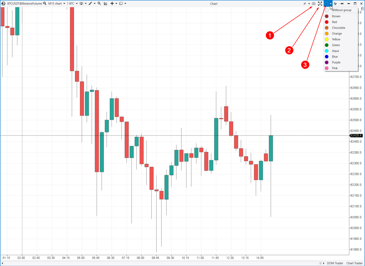
You can also maximize the chart to full screen (2), which will make the top menu even more streamlined. To exit full screen mode, press ESC.
Next, you will see the group selection menu with color markers. You can group multiple charts (e.g., daily and hourly) and synchronize them, such as changing the instrument on all grouped charts simultaneously.
Layouts
If you have multiple chart sets but lack monitors or free space, you can switch between layouts and different chart groups.
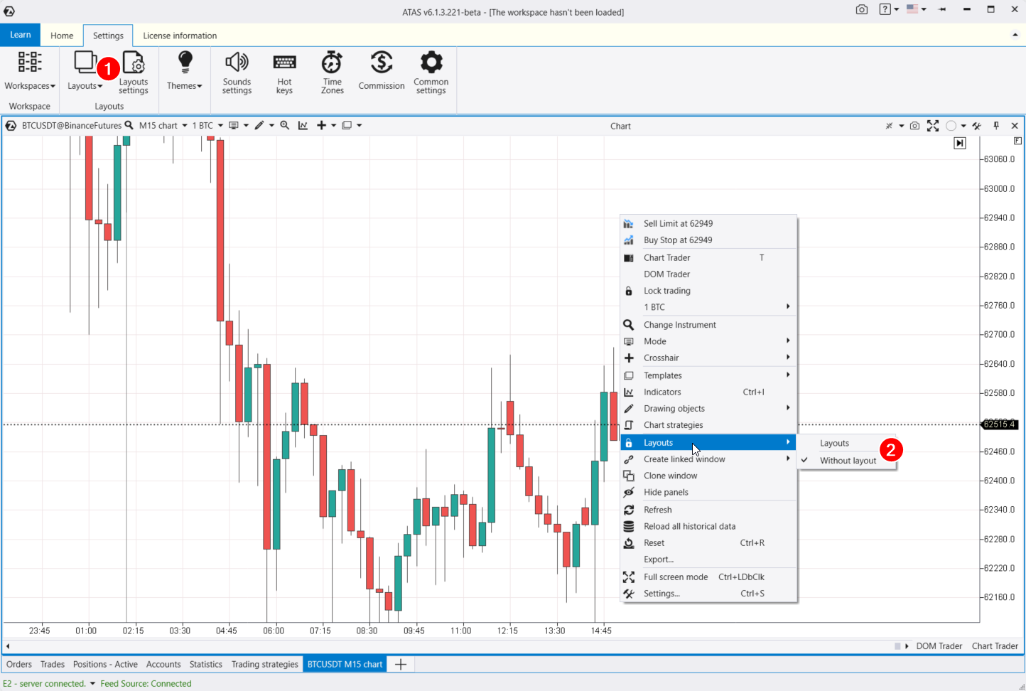
You can access layout settings:
- from the main ATAS window by selecting the Layouts option in the settings tab;
- through the context menu (2).
This will open the window for managing layouts. In the Settings tab, you can configure the layouts, and the Panel tab provides a switch between layouts that can be integrated into your workspace if desired.
Helpful links:
Context Menu
The context menu offers some functions we have already covered, plus a few additional options:
- Clone window — create an exact duplicate of the current window.
- Refresh and reload — refresh data and reload all historical data. For instance, if your internet connection drops and online quotes stop updating, you can click “Refresh all history” to download all the missing candles and trades within them from the servers.
- Export — export price data to a CSV file.
- Chart Strategies — open the window for working with algorithmic strategies (robots, advisors).
A particularly cool feature to highlight is the creation of a Linked Window. This can be a Smart Tape or a Bid/Ask Tape. This function allows for a detailed analysis of the tape on historical data, helping you closely examine specific areas on the chart.
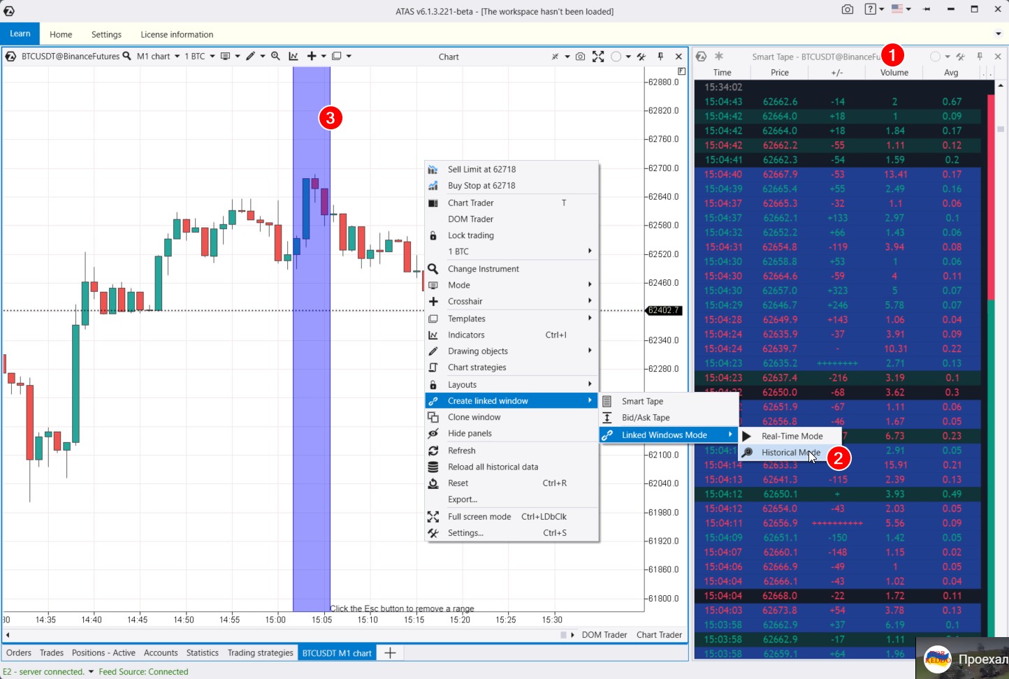
Exchange transactions are highlighted in red and green in the Smart Tape (1). Red shows aggressive sell orders, while green shows aggressive buy orders. This type of tape is also known as Time and Sales.
When you open the tape module, ATAS will immediately load a small portion of trades for the active instrument on the chart. You will see both the tape and chart updating in real time (if the exchange connector is active).
There is also a historical mode for studying significant moments in detail.
For instance, if you want to analyze a downward reversal in the Bitcoin futures market. Open the tape and select Historical Mode (2). The platform will activate a purple vertical capture area (3). Select the area of interest on the chart with your mouse, and ATAS will display the trades that occurred during those moments in the tape.
To remove the selection, press the Esc key. You can then highlight another section of the chart.
When analyzing the tape, you can use filters. For example, to focus on trades of a specific volume. To do this:
- go to the Smart Tape settings;
- select the “Filters” tab;
- specify the minimum and maximum trade size in the cumulative trades field;
- select a section on the chart again — the Smart Tape will display trades filtered by the specified criteria.
Useful links:
Navigator
You can combine charts and modules in one space with the help of the navigator.
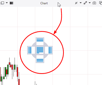
It appears when you grab and drag the module window. Select the place in the navigator, where you want to place the chart, and ATAS will combine it with other modules in one window. This is how it works:
It is like a construction set. You can drag elements within the common space, contract or add them to another place using the navigator panel.
Visual Settings
Charts in the ATAS platform offer endless customization possibilities.
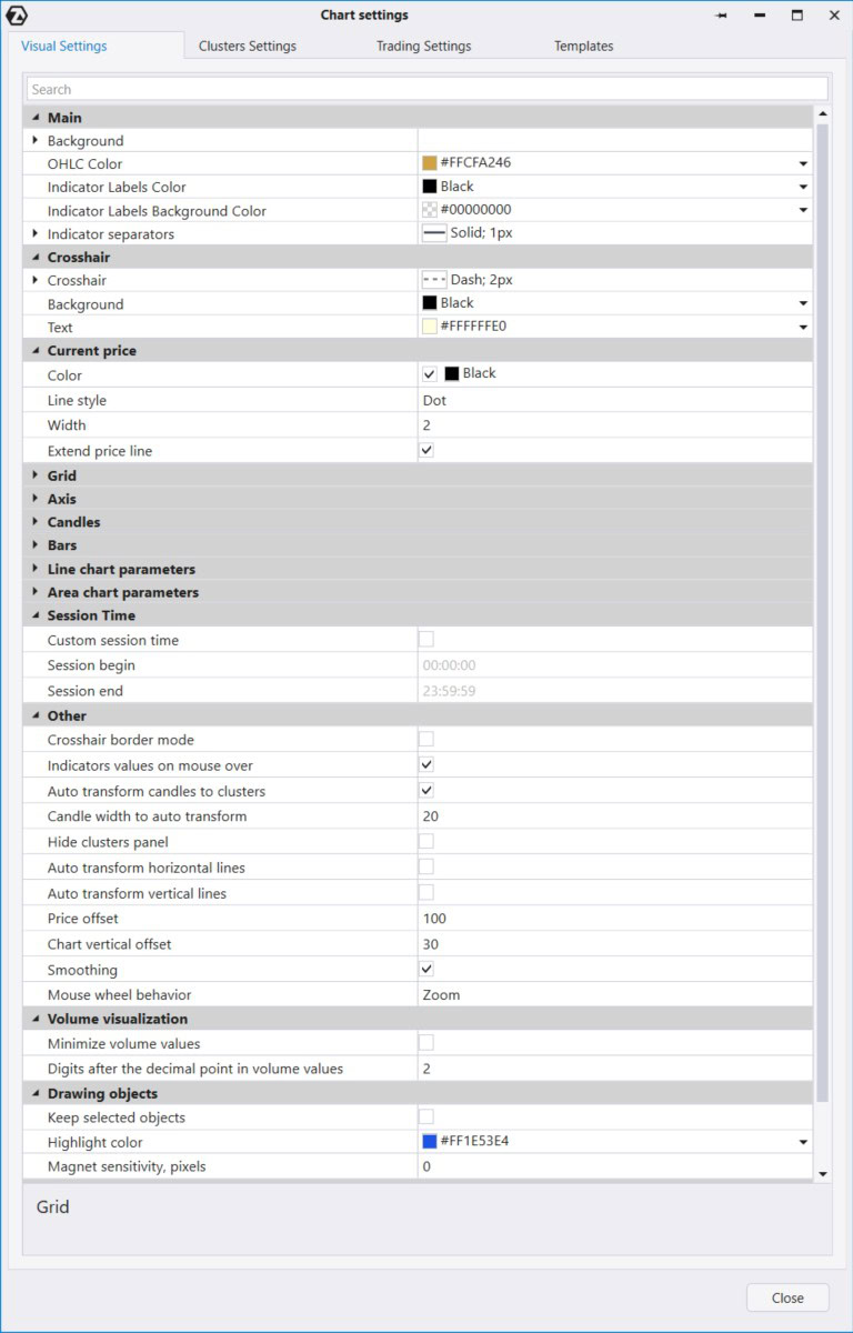
Let’s look at the Visual tab in the chart settings manager window, where the settings are grouped into categories:
- Main. Set up the chart background, including gradient options.
- Grid. Grid settings
- Settings for different types of charts: Bars, Candles, Line, and Area. Cluster chart settings are in the Clusters tab.
- Session Time. Set the start and end parameters for trading sessions.
At the end, there is the Other section with additional settings. There is an important feature “Auto Transform Candles to Clusters”, which is checked by default. When you zoom in on candles, they transform into clusters. If this does not suit your trading style, you can uncheck it to keep the candles or clusters unchanged when zooming in or out.
Results of the second article of the ‘Getting acquainted with ATAS’ series
Now you are familiar with the main features of the chart module in the ATAS platform. It combines a wealth of useful functions for analysis and trading with flexible customization options for comfortable everyday use.
We recommend downloading ATAS and putting all the tips into practice to reinforce what you have learned and experience the platform’s power firsthand.
Read the third article >>>
Information in this article cannot be perceived as a call for investing or buying/selling of any asset on the exchange. All situations, discussed in the article, are provided with the purpose of getting acquainted with the functionality and advantages of the ATAS platform.