Footprint is a format of the exchange chart that accurately displays information about executed trades, including time, price, volume of buys and sells.
This article aims to help traders gain a competitive advantage using footprint charts. Beginners will be able to quickly progress along the learning curve, while more experienced traders will find new ideas to enhance their strategies.
Read more:
What Is a Footprint Chart in Trading?
In simple terms, a footprint chart is the most modern type of financial chart used for market analysis, which provides detailed information about trading volumes and price levels over a specific time interval.
Another name for footprint charts in trading is cluster charts. In this case, each element (cell) on such a chart is called a cluster.
Unlike classic charts, which can only show OHLC prices (open, high, low, close) and vertical volume, footprint charts enable you to ‘look inside the candle’ – they provide insight into the aggressive actions of market participants in buying and selling at each price level.
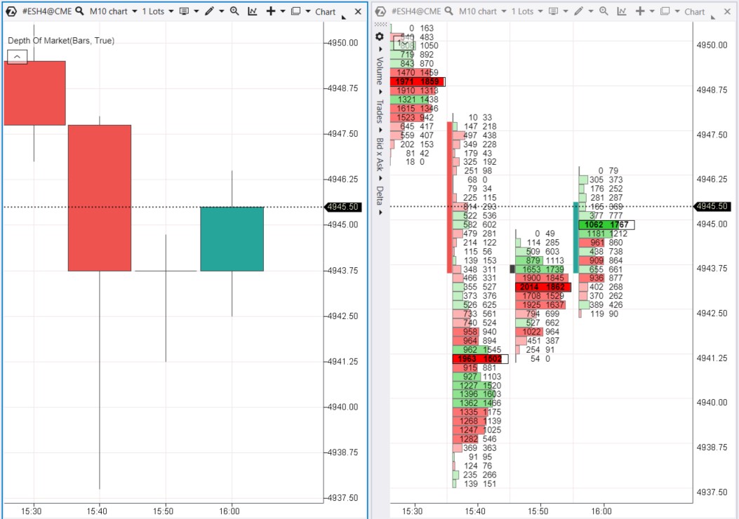
Example. The screenshot below depicts the same scenario: on the left side as candlesticks and on the right side in the footprint format (the ES market – E-mini futures on the S&P-500 index).
Footprint derives from the concept of leaving traces or marks. While studying the footprint, an analyst becomes akin to a tracker, interpreting precise data on executed buy or sell trades. The analyst considers both time and price to form their own judgment on market strength or weakness.
Footprint charts are often compared to X-rays. Another comparison is like switching from a blurry analog picture to a 4K screen. If you use the footprint, you keep up with the rapidly evolving exchange trading market.
The maximum level of detail makes the footprint an indispensable tool for:
- understanding the balances and imbalances of supply and demand as they unfold in real-time;
- making more informed trading decisions;
- identifying potential support and resistance levels;
- reducing risks by finding more accurate entry and exit points for positions.
What Do Footprint Charts Show?
Footprint charts visually display volume information that characterizes each trading level. Cluster charts enable you to track precise asset accumulations and distributions.
Footprint charts are created by markets, after all, it is buys and sells that move the quotes. In other words, price fluctuations occur due to sellers predominating over buyers (downward) or buyers predominating over sellers (upward).
There is a buyer for every seller in the market. Every auction starts with the buyer accepting the conditions set by the seller (the offer), and vice versa. Accepting these conditions happens under the pressure of either bulls or bears. Pressure from both sides is reflected on the footprint chart as the volume traded on the ask or bid at each price level.
On the chart above, inside each candle, you can see:
- trades initiated by sellers on the left;
- trades initiated by buyers on the right;
- numbers – the total number of contracts traded within the timeframe unit,
- color saturation that corresponds to numbers: red indicates sells, green indicates buys.
Individual clusters contribute to the broader market picture, shaping areas of supply and demand equilibrium (ranges) and areas of imbalance (trends seeking new balances).
The Importance of Footprint Charts in Trading
Why are more and more traders worldwide interested in footprint charts?
Footprint is more than just a chart. It represents dynamic narratives of real market activity. Footprint charts offer traders greater opportunities to react to market shifts and anticipate them, thus providing a strategic edge in the swiftly changing trading landscape.
Pros of Footprint Charts
- Visualization. Thanks to flexible settings, a vast array of digital information about market trading activity transforms into an easily perceivable, real-time updated image.
- Detailed information about the price. Footprint charts provide the most detailed view of trading activity at each price level, allowing for precise identification of supply and demand levels.
- Detailed information about volumes. Footprint charts present data on buyer and seller sentiment expressed in bid and ask volumes. This level of detailing enables traders to understand not only what is hidden behind price fluctuations but also why they happen.
- Enhancing strategy efficiency. Thanks to the precise and unaltered information provided by footprint charts, traders can make trading decisions with greater confidence – whether it is setting stop-loss orders, planning entry and exit points, or assessing risk-reward ratios.
Cons of Footprint Charts
- Subjectivity. Data on the evolving interaction between volume and price over time is critically important. However, incorrect personal interpretation of these elements, especially in volatile markets, can lead to incorrect assumptions.
- Ignoring basics. Footprint charts provide insight into market dynamics, but they do not operate in a vacuum. Ignoring overall market trends or significant news events can make even the most thorough footprint analysis ineffective.
- Risk of burnout. The depth of information on charts can be overwhelming. It is important to focus on key insights and not get lost in the details, which can ‘paralyze’ analysis.
Another drawback of footprint charts is related to the technical aspect: they have increased requirements for quote providers and computer configuration. To display footprint charts, you will most likely need a wide-screen monitor.
To combine the wide market coverage provided by candlestick charts with detailed information on footprint, you can use the Magnifier function. To do this, on the open candlestick chart, press the ‘M’ key and hover your mouse over the area of the candlestick chart that you want to examine in footprint mode.
While footprint charts are a valuable resource, it is not wise to rely solely on them as it can lead to interpretation distortion. Footprint is just one part of a comprehensive analysis and trading strategy. You should consider a broader market context and use other sources of information.
How to Open and Configure a Footprint Chart
Download ATAS, install, and launch the platform.
In the main window, click on Chart (shown as number 1 below), and select the market you are interested in, for example, ES – E-mini futures on the S&P-500 index.
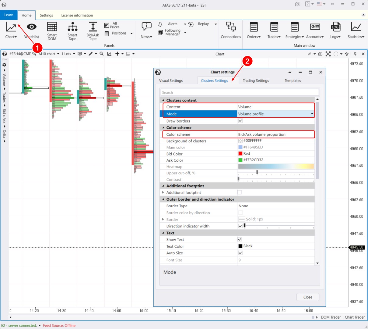
By default, the chart opens in candle mode. Switch it to footprint mode. To do this, either press Shift+K or stretch the time scale on the chart with the mouse. Note that an additional menu for working with footprint charts will appear on the left.
To set the parameters of the footprint chart, open the settings manager window. To do this, use the key combination Ctrl+S, click on the settings icon on the top panel of the chart, or use the context menu. Then go to the Clusters tab (shown as number 2 above). Here, you will find a variety of parameters for customization (colors, maximum level settings, and others).
In the image above, three key settings that significantly alter the appearance of the footprint are outlined with a rectangle:
- Content. You have 10 options to choose from, including Volume, Delta, Bid x Ask, None, and others.
- Mode. There are 7 possible options, such as Volume Profile, Trades Profile, Bid/Ask ladder, Full Row, and more.
- Color Scheme. Select the most suitable option from 9 choices, including Bid/Ask Volume Proportion, Solid, Heatmap by Volume/Trades, and others.
This means you have the opportunity to obtain 10*7*9 = 630 unique variations of footprint charts. The actual number may be even greater since ATAS is regularly updated, making the platform an optimal choice for working with footprints.
Moreover, you can activate the ‘Additional Footprint’ setting and apply another layer to the chart. Footprint over footprint? Yes, endless possibilities! When it comes to footprint, choose ATAS.
How to Interpret Footprint Charts? Theory
Initiating trades drive the price to a point where a trade that satisfies both sellers and buyers can occur. If supply exceeds demand, the price can only go down where it will meet reacting buyers.
At higher levels, supply exceeds demand, and new buy orders can be satisfied with slightly higher limit orders. Here, the activity of participants who were pushing quotes upward sharply decreases.
The upward movement will stop once demand for the asset is satisfied by supply. Trading is ready to enter a flat phase, i.e., sideways fluctuations without clear trend movements, when new participants cannot absorb the assets offered at the top.
The footprint will indicate that the initiative is shifting towards sellers, as the volumes of trades on the ask side are lower than the executed bid orders. There will be no resistance in case of a level breakout. Trading operations will take place within a certain zone – a channel.
Limit orders that are placed at a certain level can stop the movement. The reason for this movement, however, is market orders that are displayed on the Smart Tape.
A substantial volume emerges at a level where bulls and bears meet, which means that significant two-way trades are made. This unveils the fair price towards which the market was moving.
Only a new imbalance in supply and demand will make the chart initiate a new movement.
Asset quotes move in a specific direction due to market orders. While limit orders have the potential to stop this movement. It is important to pay attention to the highest volume in the bar at the moment of their execution. Stops and reversals occur at crucial levels in areas where significant volumes accumulate.
How to Read a Footprint Chart? Practice
Understanding the language of footprint charts is like learning a new alphabet. Every symbol and every number carries weight and meaning, telling the story of market dynamics. To truly harness the potential of footprint charts, it is necessary to become adept at interpreting the various elements they present.
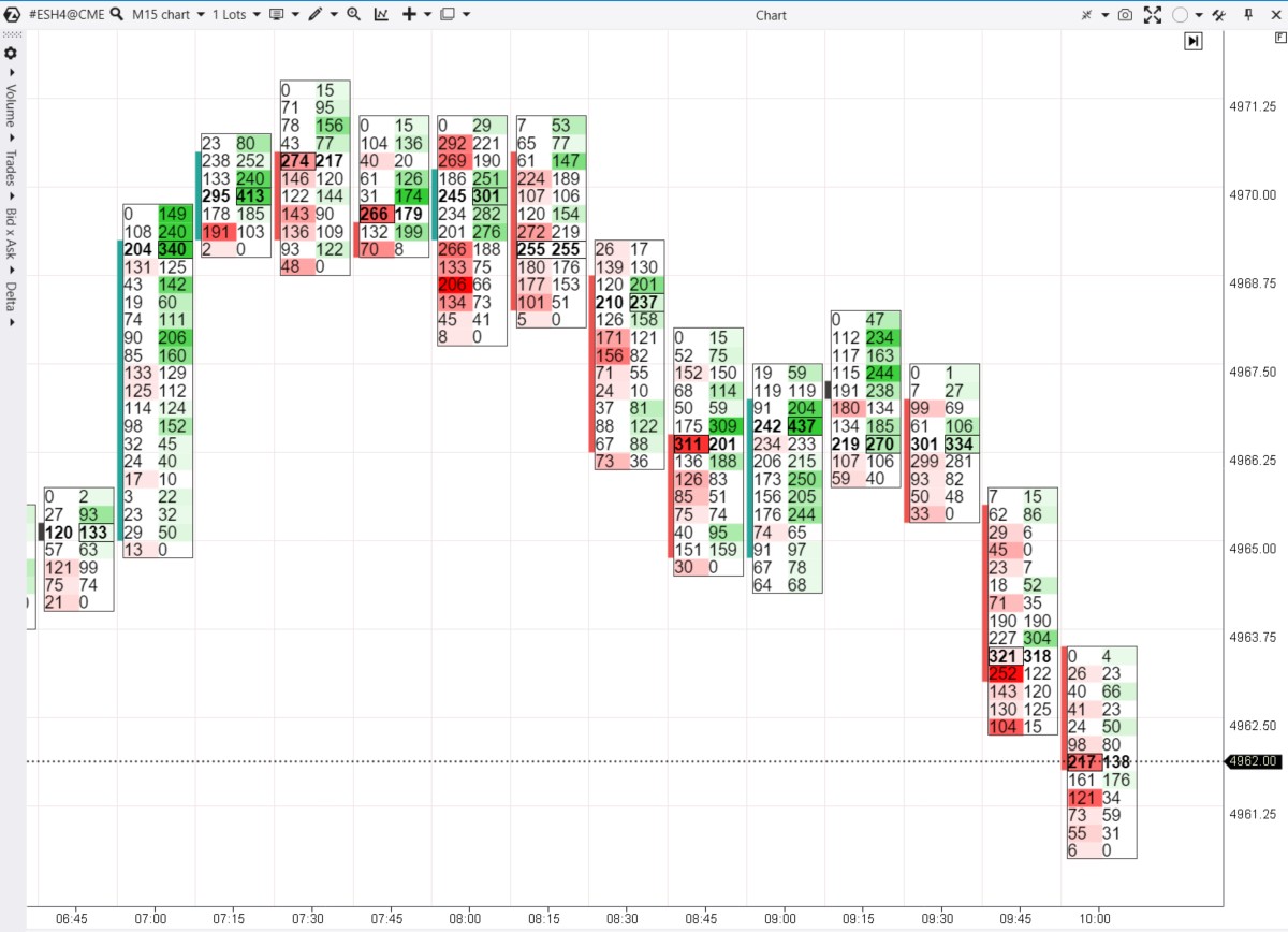
Example 1
Let’s start with a chart already used – ES, the E-mini futures on the S&P-500 index. The regular Volume (in light color) and the Delta indicators (red-green candles) have been added to the indicator area.
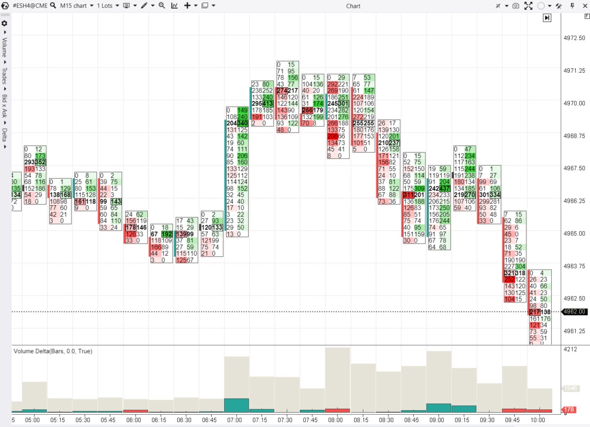
06:00 – the are signs of the seller activity, which is indicated by the bright red cluster and negative delta.
06:30 – the are signs of buyer activity as the price closes above the red clusters 125 and 166 on the previous candle. The seller’s efforts are ineffective; the limit buyer remains steady.
06:45 – one more confirmation of the buyer’s strength. In the lower part, red clusters outweigh the green ones, but this does not affect the price as it closes higher. Sellers act ineffectively. Therefore, buyers’ efforts may yield tangible results.
07:00 – the buyer becomes active at the opening of the European exchanges. The growth occurs easily in the middle of the candle, but increased buying activity at the top (indicated by the concentration of green clusters) does not lead to further upward movement. This signals a pause in the uptrend. The activity of limit sellers causes the price to enter a range, fluctuating around the 4970 level.
08:00 – the number of open exchanges increases, and volumes and volatility rise. A bright red cluster = 206 most likely reflects the selling of long positions triggered by stop-loss orders below the lows of the previous 3 candles, plus the initiation of short positions on the break of these lows. However, this activity does not lead to significant progress for the sellers.
08:30 – a bearish candle with a low and high clearly below the previous ones, closing near the minimum. Red clusters 171 and 156 indicate bearish efforts to break the support. Buyers who entered long positions from 4968 are trapped. This level can now act as resistance.
09:15 – the 4968 level acted as resistance. Bright green clusters at 234 and 244 indicate buyers in a new trap, as the price closed below these clusters – demand proved ineffective. In such conditions, the odds favor the sellers. The logical continuation – the support level established from 06:00-06:45 was broken.
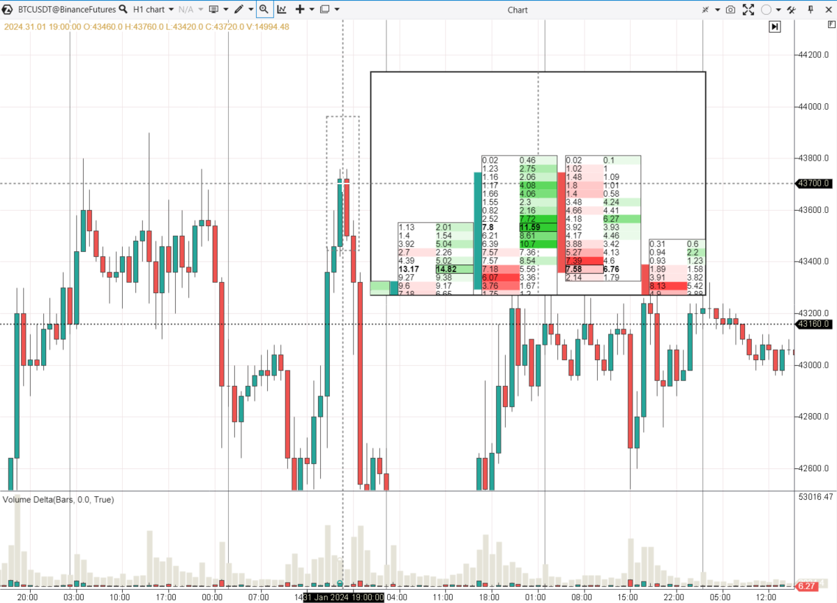
Example 2
This time, we are looking at Bitcoin futures, the data sourced from the Binance exchange. To adjust the 60-minute footprint for this dynamic market, go to the top menu of the chart window and set the Scale parameter to 200. Set the division of cluster values to 100 in the chart settings on the Cluster Settings tab.
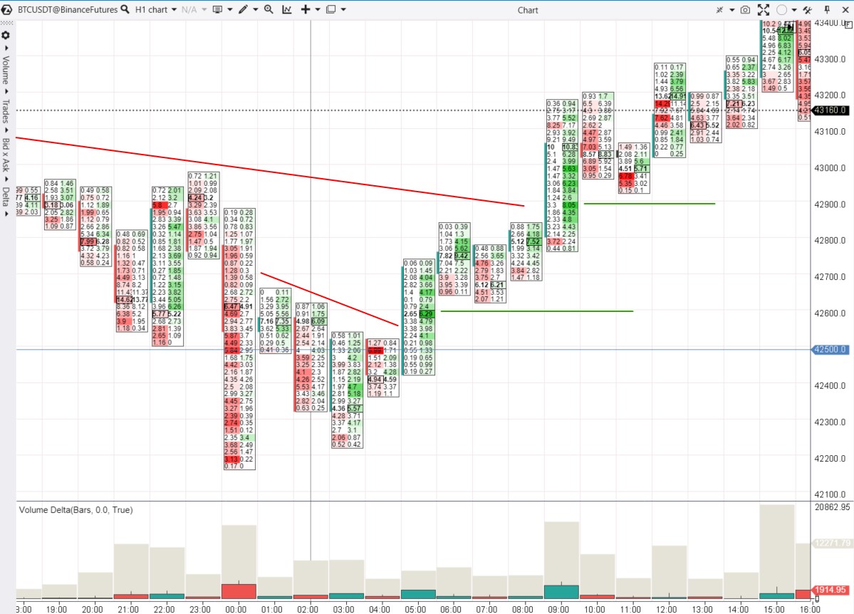
The footprint reveals in detail how the bullish reversal story unfolded from the 42500 level.
00:00 – bitcoin price sharply declined below the 42500 level. Bright red clusters may indicate an involuntary liquidation of long positions. Note that the price closed above the 42500 level. There is reason to believe that no real sellers’ efforts push the price down. And even if there were some, they failed.
03:00 – the candle confirms the lack of buyers below 42500. Compared to midnight, the number of market sell orders significantly diminished. However, buyers became more active – the candle closed at its high with a positive delta.
05:00 – buyers dominate, breaking through resistance (indicated by the red line). A bright green cluster of 629 purchased bitcoins indicates effort – you can expect support from it in the future (indicated by the green line).
09:00 – Buyers continue to be active. There is a new breakout of resistance showing similar patterns on the footprint: a bright green cluster – Buyers’ efforts form support.
Useful links
More useful practical information on how to read footprint charts in trading:
How to Start Using Footprint Charts in Trading
Mastering footprint charts is not just about understanding what each element represents; it is about weaving all the elements together to form a coherent narrative of market history.
Here is a step-by-step guide to effectively mastering footprint charts:
- Download ATAS. This is professional software focused on volume analysis. ATAS offers powerful functionality for working with footprint charts.
- Learn the basics. How to open a footprint chart, select a mode, and fine-tune the chart for different markets and timeframes.
- Analyze history with the footprint perspective. Pay attention to patterns in how buyers and sellers interact during breakouts, reversals, and other important areas on the chart.
- Try Market Replay – a built-in simulator for traders. Do not risk your capital – learn to interpret footprints more accurately on historical data as if trading were happening in real-time.
Reading the footprint is not an easy task. However, investing time and effort into your knowledge, expertise, and financial literacy is worthwhile. If you have been facing losses in trading, footprint charts can reverse the situation in your favor.
Tips on Reading Footprint Charts
Pay attention to large values in clusters. High volume levels may indicate key areas where significant trades occurred, suggesting interest from major players. Watch how the price reacts to these levels in the future, as they often establish support or resistance areas.
Compare effort and results. If the price fails to rise despite buyer activity, this could be an important bearish signal.
Study imbalances. Volume imbalances between buying and selling can provide insight into market sentiment. The areas of imbalance visible on the footprint can serve as support and resistance in the future. The Stacked Imbalances indicator will assist you with this.
Use additional indicators for confirmation. While footprint charts provide a lot of information, combining them with other indicators can provide a more comprehensive view of the market. Try supplementing your footprint with:
- the Cluster Search, Big Trades, and Speed of Tape indicators.
- the Smart Tape.
- tools for working with the order book like Smart DOM, DOM levels.
Keep learning. The blog, YouTube channel, and Knowledge Base provide specific instructions on setting up and working with footprints, using indicators, developing strategies, as well as other valuable information. Additionally, ATAS platform users can rely on responsive customer support.
Conclusions
Footprint charts are a powerful tool that will help you elevate your level of market analysis by conveniently displaying price dynamics and volumes of buying and selling activities. With footprints, you can develop more accurate strategies and form well-founded trading hypotheses.
Download ATAS, a premium-class software for working with footprint charts. It is free. During the trial period, you will get full access to the platform’s tools to experiment with stock trading. Moreover, you can continue using the program for free even after the 14-day trial period is over, whether it is for cryptocurrency trading or volume analysis.
Do not miss the next article on our blog. Subscribe to our YouTube channel, follow us on Facebook, Instagram, Telegram, or X, where we publish the latest ATAS news.
Information in this article cannot be perceived as a call for investing or buying/selling of any asset on the exchange. All situations, discussed in the article, are provided with the purpose of getting acquainted with the functionality and advantages of the ATAS platform.