It had been impossible to imagine how a today’s cluster chart would look like before electronic trades were introduced, since exchanges and data suppliers had not provided all the required data. Today, online trading provides a completely new advanced flow of data from the exchange. Developers of trading platforms have got wide possibilities for creating new types of presentation of exchange information for better understanding and easy interpretation of everything that takes place in the financial markets. A footprint of a cluster chart is an improvement in presentation of the trading information.
Another similar innovation is an order book (Smart DOM), which many traders use today. It drastically changed the trading process. A footprint, in its turn, provides the same level of understanding of the price but in the form of a chart interface.
In this article:

Introduction into footprint
A footprint chart make the market more transparent. The market transparency became a cliché today, but this is the case for a cluster chart. The charts had displayed only the price changing information and had no additional data before the footprint was introduced, but now it is taken for granted. The aim of a footprint chart is to take all data about the exchange trades and organize them logically, creating a better way of market observation.
The cluster footprint chart creates a structured presentation of the data, received from the exchange, in a natural way and allows seeing:
- The volume by price distribution.
- The point where a volume activity occurs in the course of the price movement.
- The way this volume was executed (order flow).
The footprint structures the data, received from the exchange, through splitting the buyers and sellers volumes at price levels. This gives a better presentation for assessment and analysis of the reasons of market fluctuations in the context of volume. The ultimate goal is to ensure a simple and easy-to-read interface, where traders can interpret the market events faster and actively make trading decisions. This can result in three trading decisions:
- To exit a bad trade faster.
- To open a new position faster.
- To skip a trade when the situation is ambiguous.
By the way, the latter could be the most valuable of all, since the cluster chart users note it as the best benefit.
Cluster chart and market mechanism
There are only two variants of classifying a trader who wants to execute a trade: an aggressor and a non-aggressor. Practically every trade in the market is initiated by an aggressor with his market order, which is executed by means of a limit order of a non-aggressor. The footprint gives a quantitative assessment and shows the force, with which buyers and sellers push each other. This force/power is reflected in a quantity and direction of the traded volume that took place in the market. The footprint chart keeps track of this activity and creates the most convenient visualization of the order flow.
Before introduction of the cluster footprint chart, the volume was displayed in the form of bars in the lower part of the horizontal bar chart. The footprint revolutionized the way the market volume was displayed. The data for displaying the volume by price replaced the standard volume by time. Now it is possible to see the volume in vertical (time scale) and horizontal (price scale) directions. This possibility adds a new dimension and helps us to see time and prices where volumes accumulate and where not.

Anatomy
The easiest way to understand the footprint structure is to take it as a simple division of a bar into clusters with information about trades, which formed this bar. Clusters with the volume of the past trades are formed by each price, where an instrument was traded. The clusters are updated in real time when new data about trades are received. This allows traders being better informed and observing shifting of the volume and order flows in the context of the price dynamics in the chart. This gives a better feeling and understanding of the chart through the transaction dynamics with the clusters.
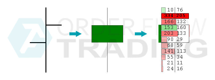
Traditionally, charts present information only with Open, High, Low and Close. The footprint transforms standard bars into a more detailed and relevant way of organization of the electronic trading data. Another way to describe this type of a chart is to take a standard bar and cut it into price fragments. The footprint also has 4 basic points (OHLC), and it also contains trading attributes (volume, delta, trades, time, …) for each price within a bar.
Technically, a footprint/cluster is a cell, which contains certain information on each price in a bar. A series of clusters form a bar in accordance with the selected time frame. Depending on what chart type is used, clusters could be colored on the basis of the delta or volume changes. Cluster coloring also contains very important information, since it points traders to an impulse change inside a bar and allows faster detection of market changes and better moments for trading.

Coloring
Each cluster is of one of two colors according to settings (by default these colors are red and green). Red means more aggressive selling at this price, green, consequently, more aggressing buying. Each cluster is colored in accordance with overweight of selling and buying at a specific price and is based on Delta (Bid – Ask). The coloring intensity proportionally depends on the degree of overweight of buyers over sellers or vice versa. Traders, acquiring experience of use of the footprint chart, are in a closer harmony with market dynamics rationale and changes in the market activity.

- Each price (cell) in a bar shows an individual cluster.
- The color shows whether there were more sells or buys at a specific price.
- The green or red color to the left from clusters shows the body and direction of a bar, as it is displayed in a candle chart.
- A cluster with the biggest volume has a black contour.
We will continue studying the footprint and consider other type of cluster charts and their application in our next articles.
Download Free Trial of the platform — there are at least four good reasons for that:
- It is free. Moreover, you will be able to continue using the program even after the 14-day trial period is over, but only for cryptocurrency trading. Moreover, you will be able to continue using the program even after the 14-day trial period is over, but only for cryptocurrency trading.
- The platform allows you to download tick history from the futures, stock and crypto markets, therefore, you can be sure that parallel channels give you an advantage.
- Market Replay (a simulator for a trader) is built into the ATAS platform,so you will have the opportunity to practice trading without risking real capital.
- 4. The platform offers many benefits for traders who want to combine bounce trading with easy-to-use cluster charts anduseful indicators.
Do not miss the next article in our blog. Subscribe to our Youtube channel, Facebook, Instagram or Telegram where we publish the latest ATAS news.
Information in this article cannot be perceived as a call for investing or buying/selling of any asset on the exchange. All situations, discussed in the article, are provided with the purpose of getting acquainted with the functionality and advantages of the ATAS platform.