Traders used to apply only the fundamental and technical analysis in the 20th century. They didn’t see what took place inside the candles. The cluster analysis or Footprint emerged in the 2000s.
In this article for beginners we will analyze:
What the Footprint and cluster are?
Footprint is the most modern chart format designed for a thorough market data analysis. When connected to the exchange, a footprint chart displays the following information:
- Time. Based on the selected timeframe.
- Price. Shown for each price level.
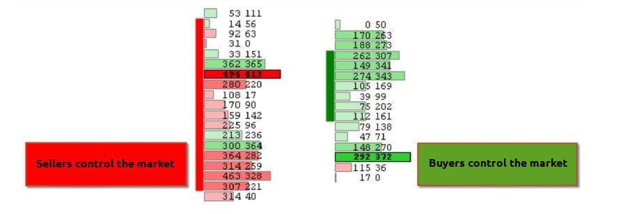
- Volumes. Volume data comes with various details, such as distribution between buys and sells. Sellers’ aggression (market sell order volumes) is highlighted in red, while buyers’ aggression (market buy order volumes) is shown in green.
Some sources use the clusters and cluster analysis terms instead of Footprint and Footprint analysis. The idea is the same.
This method appeared only 20 years ago and, as of today, it is much more advanced than the technical and fundamental analysis. Uniqueness and usefulness of the Footprint lies in the fact that a trader can analyze not only the vertical volume for a certain period of time but also the horizontal volume which was traded at each price level.
Technically, a cluster is a set of cells with important information. Each price level has its own cell at a certain time period. A trader can see in a cluster what took place inside a bar.
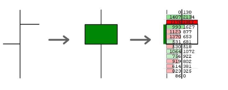
It means that each cluster has data about the volume for each price level apart from 4 standard points – High, Low, Close and Open. It is important to understand that traders see market orders, executed by means of limit orders, in the clusters. (You can find more information about the principle of bringing orders together in the article about the Smart DOM).
What Footprint types are available in ATAS?
The footprint mode is activated on an open chart using the Shift+K key combination or by dragging the mouse over the time scale. You can also use the mouse wheel for activation.
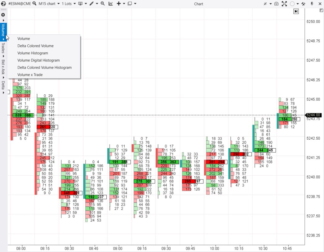
On the left, you will see a menu for switching between different footprint types:
- Volume. A footprint chart based on volume information.
- Trades. A footprint chart based on data about the number of trades. Also known as the ‘tick footprint’.
- Bid x Ask. The most informative footprint is based on data about the volume of market buys and sells. Data is displayed in two columns, as shown in the screenshot above.
- Delta. A footprint chart based on the difference between market buy and sell volumes.
Each menu offers a few variations of the footprint type. In the Volume menu, there are six variations available, as seen in the screenshot above.
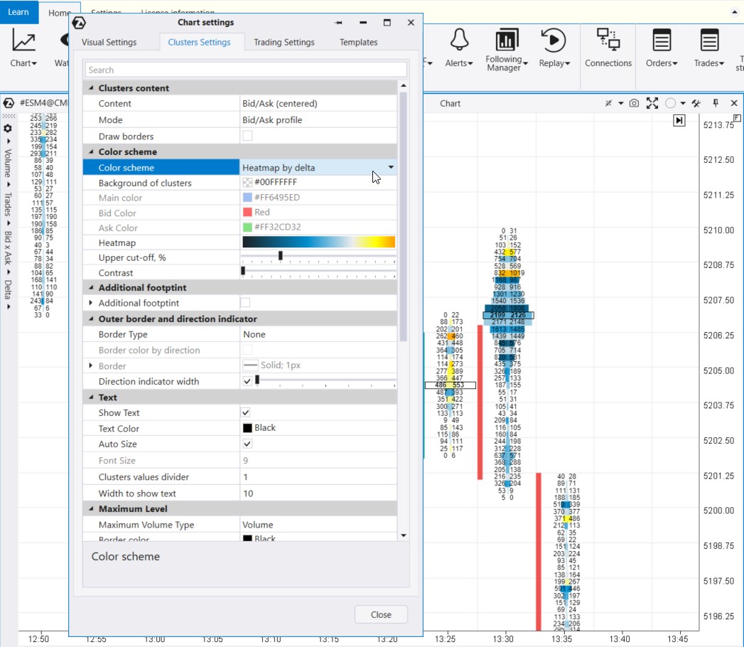
For more Footprint settings, refer to the chart settings manager (accessed via Ctrl+S) on the Clusters Settings tab.
ATAS offers numerous options to customize footprint charts; you can learn more about them in the Knowledge Base. Let’s move on to the article’s main topic – footprint patterns.
Footprint patterns
Footprint patterns help traders understand market sentiments and make more informed decisions based on precise data about trading volumes, price levels, and time.
The footprint patterns presented below are not a strict classification. They should be considered tools that can be used together with other analytical approaches. Like any other patterns, footprints do not offer a 100% guarantee of forecast accuracy or trading success.
Buying and Selling Exhaustion Patterns
These patterns indicate the exhaustion of the current trend when the footprint becomes thinner:
- If there is an uptrend and the footprint indicates that as prices rise, the number of trades decreases, this may indicate a lack of buyers. A principle is known as ‘weak demand’.
- Similarly, if the footprint becomes thinner at the lower end during a bearish trend, it could suggest a decline in selling pressure.
These observations suggest that the current momentum is getting exhausted. Subsequently, one might anticipate the market entering a balanced phase or witnessing a counter-trend movement.
Example from the E-mini S&P-500 futures market, over a 30-minute period:
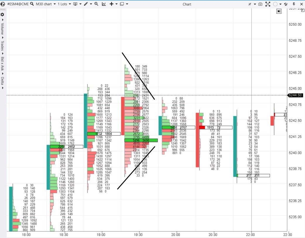
The black lines show a gradual decrease in trading activity at both the bottom and top of the candle. This pattern suggests market equilibrium. In this context, traders might assume that after a period of price growth throughout the day, buyers and sellers have reached a balance, seeing the price as fair for both sides.
Balanced Footprint
Like the previous one (Buying and Selling Exhaustion), this pattern is a sign of a market where supply and demand forces balance each other out.
The Balanced Footprint pattern occurs when trading volume is evenly distributed across a price range. It indicates market uncertainty and equilibrium between buyers and sellers. Consequently, one should anticipate sideways market movement in the future.
Example from the E-mini S&P-500 futures market, daily period:
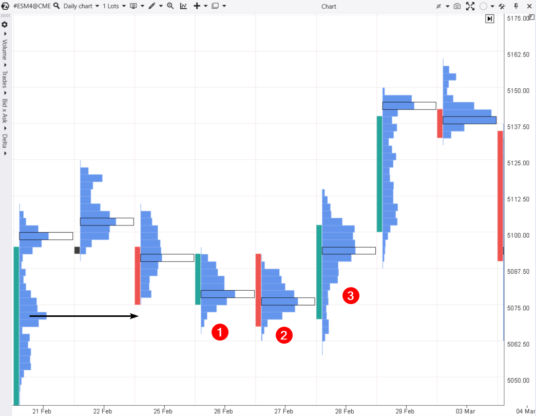
The numbers 1 and 2 indicate days when a footprint chart shows a balanced pattern. The trading dynamics formed a normal distribution (Gaussian bell curve) of volume across price levels. The significant volume level is approximately in the middle.
It is worth noting that the market balanced near a level where balance was previously observed (as indicated by the arrow).
However, something might have happened on day number 3. A factor emerged, shifting the balance of power in favor of buyers, subsequently driving the price upward.
P-Shaped and b-Shaped Profiles
The most contradictory patterns on footprint charts are P-shaped and b-shaped profiles. Depending on the market context, they can be interpreted as continuation or reversal patterns.
Example from the COMEX gold futures market, daily period:
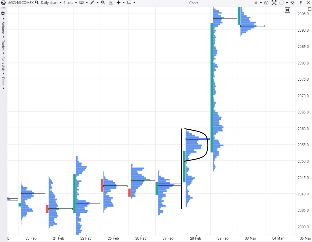
The screenshot above shows that on December 29th, The Volume Histogram footprint formed a pattern resembling the letter ‘P’. What does this mean?
To understand this, we need to study the context, consider the maximum amount of information, and explore two possible scenarios:
- Trend. The balance between buyers and sellers shifted upwards due to increased demand; for example, it was influenced by fundamental factors (news or expectations). In this case, the market was exiting the ‘flat’ stage (when the price mainly traded in the range of 2030-2050), and buyers were absorbing sell offers from those who considered the price of 2055 to be too high. The pressure of demand did not diminish, and the next day the price accelerated upwards.
- Reversal. Alternatively, ‘p’ or ‘b’ shaped footprints often suggest that after a period of market trend, new participants believe that the price has increased (or decreased) enough to take profits (and/or initiate positions in the opposite direction). Further details are provided below.
Example from the oil futures market on the NYMEX exchange, daily period:
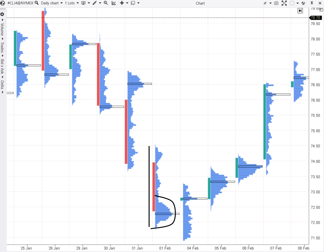
On February 1st, a pattern resembling the letter ‘b’ formed, following a prior price decline. This suggests the emergence of a potential buyer in the market: either short sellers were taking profits, or long sellers were opening long positions through limit orders (buying everything below 72.50) — both things were likely happening.
The next trading day, February 4th, provides important arguments in favor of the bullish reversal hypothesis:
- the price dropped below the minimum of February 1st, but the downtrend did not continue;
- moreover, the contract price closed at the upper part of the day and above the convexity of February 1st.
On February 5th, it became evident that the 72.50 level was acting as support – a Selling Exhaustion pattern was observed at the bottom of the footprint. The gradual thinning of the profile indicated a shortage of sellers. The buyer who emerged on February 1st was victorious. Moreover, the ‘b’ pattern served as an early indication of their intentions.
Buying and Selling Pressure (Directional Footprint)
This is a trending pattern. It indicates that most trading occurs on a specific side of the price range, which can suggest directional price movement and dominance of either buyers or sellers.
Typically, in this scenario:
- the profile (or footprint histogram) is narrow and thin;
- the delta is prominently displayed.
To illustrate it better, let’s consider the Bid x Ask footprint with volume distributed between buys and sells.
Example of bearish pressure in the ES futures market, based on data from the CME exchange, during a 5-minute period:
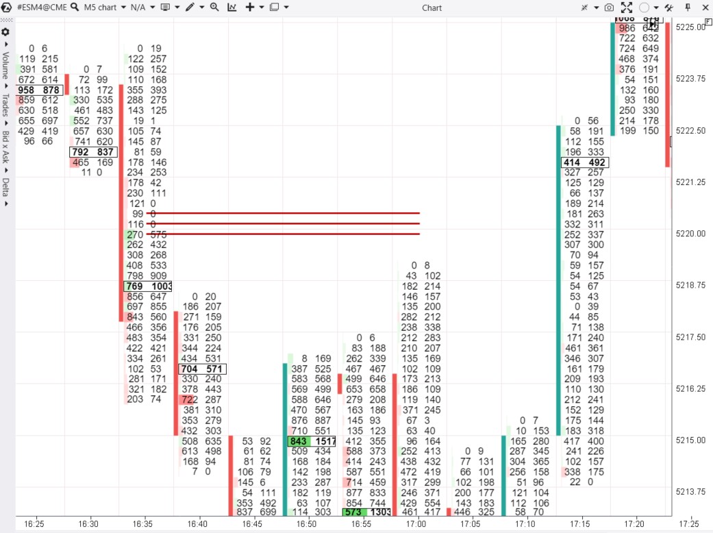
At 16:35 candle, we can observe selling pressure. On the footprint, this is evident through the volume contrast:
- market buys (on the right) show zeros;
- market sells (on the left) indicate small volumes, yet sufficient to effectively push the price down.
To easily identify such zones, use the Stacked Imbalances indicator. The three red lines on the chart represent its functionality.
The Directional Footprint pattern signifies the dominance of one side, as seen in the example where sellers are prevalent. Later, at 17:00, this level acted as resistance.
Example of bullish pressure from the same market:
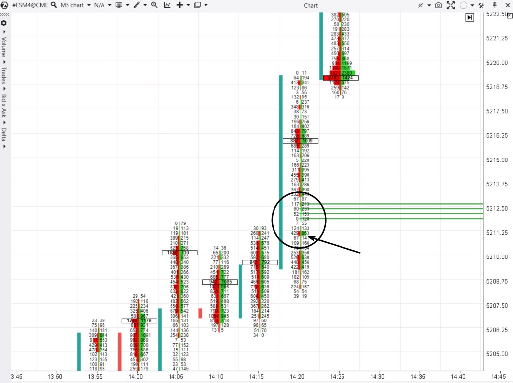
Example: an intraday bullish breakout of the 5212 resistance level. Although the number of trades is limited, they result from buyers’ initiative.
Please note:
- buyers made an effort (an arrow points at a cluster with market buys of 863 contracts);
- the price moved upward without resistance (triggering the Stacked Imbalances indicator).
Reversal Footprint
These patterns suggest a potential reversal in the current trend. They look like a shift in market participants’ initiative. This is often observed through color changes (delta) on footprint charts.
Example of a bearish reversal in the E-mini Nasdaq futures market during a 10-minute period:
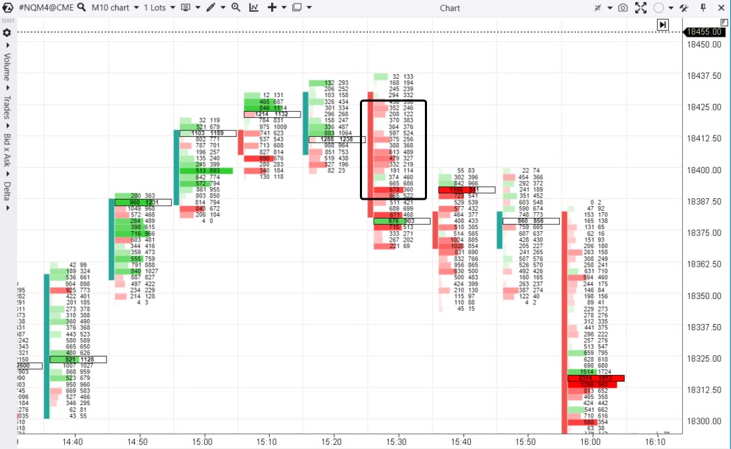
The black rectangle illustrates how, following a period of intra-day price growth (marked by a clear dominance of buyer initiative), sentiment shifted at 3:30 PM. Buyers might have become more active due to emerging news.
The area where sellers emerged on the footprint served as a launching pad for driving the price below the lows of previous candles. Consequently, it prevented buyers from pushing the price higher in subsequent candles.
Below is another example of a bearish reversal from the futures market on a stock index during a 5-minute period:
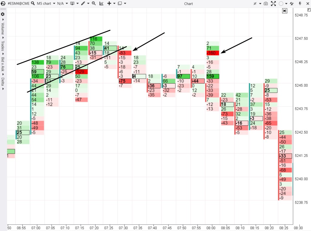
The example shows an interesting correlation between effort and outcome:
- If we interpret the abundance of green clusters on the footprint (between the black lines) as the effort of buyers to push the price higher, it did not yield results.
- However, the seller’s effort (indicated by the arrows) effectively pushed the price down towards the candle’s low.
Perhaps, there was a major seller around 5247: initially entering with limit sells, followed by market sells. This is evident in the footprint.
Example of a bullish reversal in the Bitcoin futures market, data from Binance Futures, during a 10-minute period:
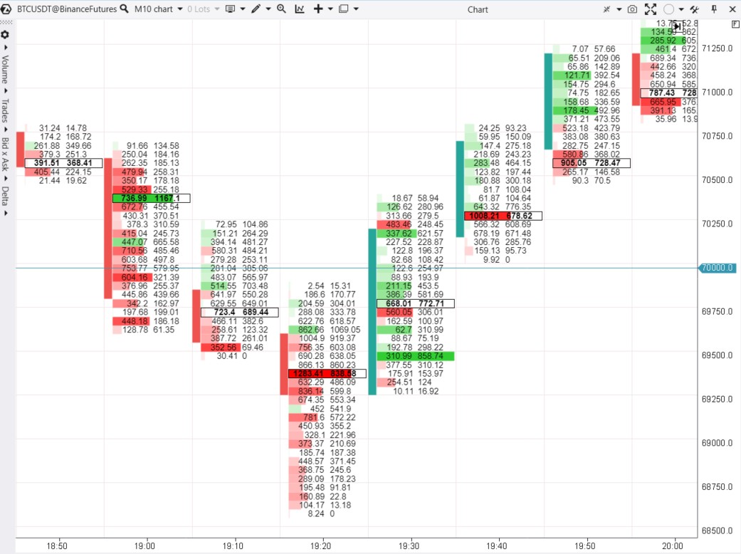
At 7:00 PM, the price dipped below the psychological benchmark of $70,000 – prompting a closer look at footprint patterns. They show that within 20 minutes, there was a notable shift in sentiment.
In areas where market sells occurred (mostly due to stop-loss positions being triggered below the psychological level), buyers took control. The change was especially evident (a shift from red to green with substantial volumes) around the 69,500 level. This marked the beginning of the rally.
Advantages and disadvantages of the Footprint in trading
Advantages of the Footprint in trading
- Helps to find a good entry point with the minimum risk level.
- It quickly shows that a trader took the wrong side and, consequently, it helps to close loss-making trades faster.
- Shows domination of buyers or sellers.
- Shows absorption in real time.
- Shows POC (Point Of Control) movement.
Disadvantages of the Footprint in trading
- One screen shows only a short period of time due to a high degree of detail.
- Day Footprint charts are very stretched out.
How to Start Trading Using Footprint Patterns
Footprint patterns can vary significantly across different markets. Identifying the patterns always involves subjective judgment Therefore, before risking real money, make sure you are well-prepared and remember:
- Patterns do not guarantee profitable trades.
- Study footprint patterns across different timeframes and chart types.
- Take into account the fractal nature of the market.
- Always protect your capital by using appropriate strategies.
Working with cluster charts in the ATAS platform will expand your ability to learn to trade using footprint patterns.
Clear visualization. By default, ATAS highlights the largest clusters within a candle as they are relevant to many market participants and can significantly influence the price in the future. You can also customize fonts, colors, statistics, and footprint gradients.
Indicators. The ATAS platform offers the Cluster Search indicator, which assists in analyzing cluster charts. It provides various search criteria and colors to highlight clusters of interest. The Cluster Statistic indicator is equally useful.
Market Replay. Configure the Market Simulator to replay historical data. Practice identifying and interpreting footprint patterns as if trading were happening in real-time. It is a quick and safe way to enhance your trading skills.
Educational materials. Explore our blog and Knowledge Base for valuable recommendations on developing strategies for footprint trading. Do not forget to check out the Learn tab in the main menu of the ATAS platform – it has valuable insights for footprint trading. If you encounter any difficulties, feel free to contact us – our support team is always ready to help you.
Conclusions
Footprint patterns provide traders with insights into the prevailing buying or selling activity in the market, enabling them to monitor shifts in overall sentiment and trade considering the broader context. They make it easier for traders to find entry points with minimal risk and identify moments for well-founded position exits. Analyzing footprint patterns is especially useful when the price approaches significant support or resistance levels.
That ATAS platform:
- provides you with a powerful toolkit for cluster analysis of futures, stocks, and cryptocurrency markets. The range of available tools expands with each platform update.
- enables you to load tick data history from futures, stocks, and cryptocurrency markets, providing you with a comprehensive foundation for studying patterns on footprint charts.
- offers many other advantages for traders who combine professional-level cluster charts with useful indicators and other features.
Use footprint patterns together with other analytical tools to make informed trading decisions.
Download ATAS. It is free. During the trial period, you will get full access to the platform’s tools to experiment with the DOM and footprint charts. Moreover, you can continue using the program for free even after the 14-day trial period, whether for cryptocurrency trading or volume analysis.
Do not miss the next article on our blog. Subscribe to our YouTube channel, and follow us on Facebook, Instagram, Telegram, or X, where we publish the latest ATAS news.