Support and resistance level is not just a basic trading concept — it is a powerful tool used by professionals. These levels play a crucial role in predicting price behavior in the market, offering profit opportunities.
How can you find strong support and resistance levels? In this article, we will discuss 10 indicators that can help traders effectively identify key zones where price is likely to find support or resistance.
Read more:
What Is Support and Resistance Level in Trading
A support level in trading is a price level where the demand for a financial asset (like stocks, currencies, or crypto) is strong enough to stop its price from falling further. At this level, traders and investors see the asset as a good buying opportunity, increasing demand and helping stabilize the price, often leading to an upward reversal.
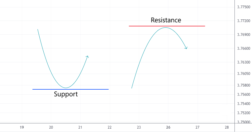
A resistance level in trading is a price point where sellers start increasing supply, slowing or stopping the price’s upward movement, and in some cases, causing a downward reversal.
When these levels are broken, they often swap roles — support becomes resistance, and resistance turns into support.
How to Identify Resistance and Support?
There are two main methods to find support and resistance levels:
Method 1. Analyzing price actions using recent history
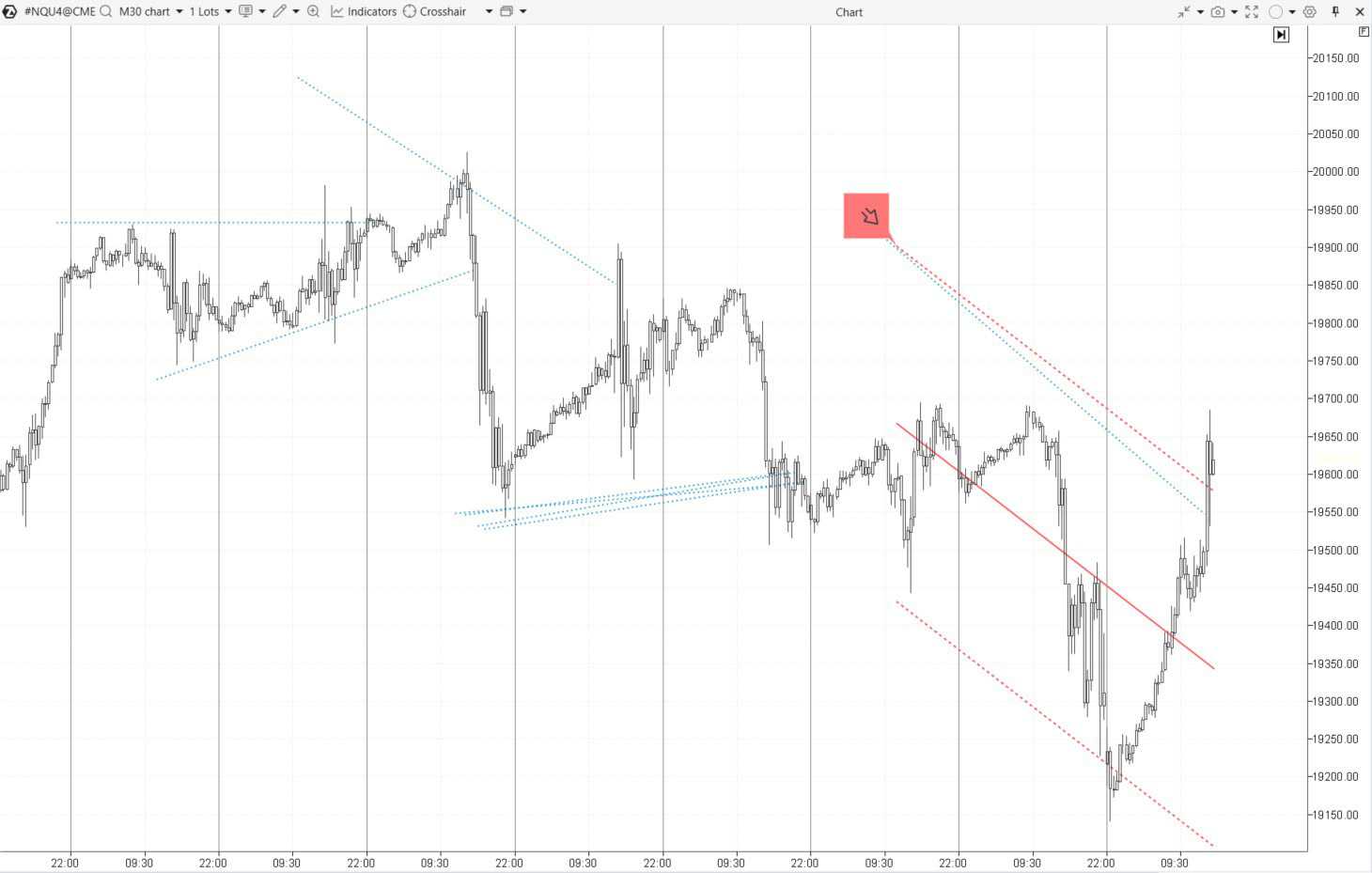
For example, look at the E-mini futures chart for the Nasdaq 100.
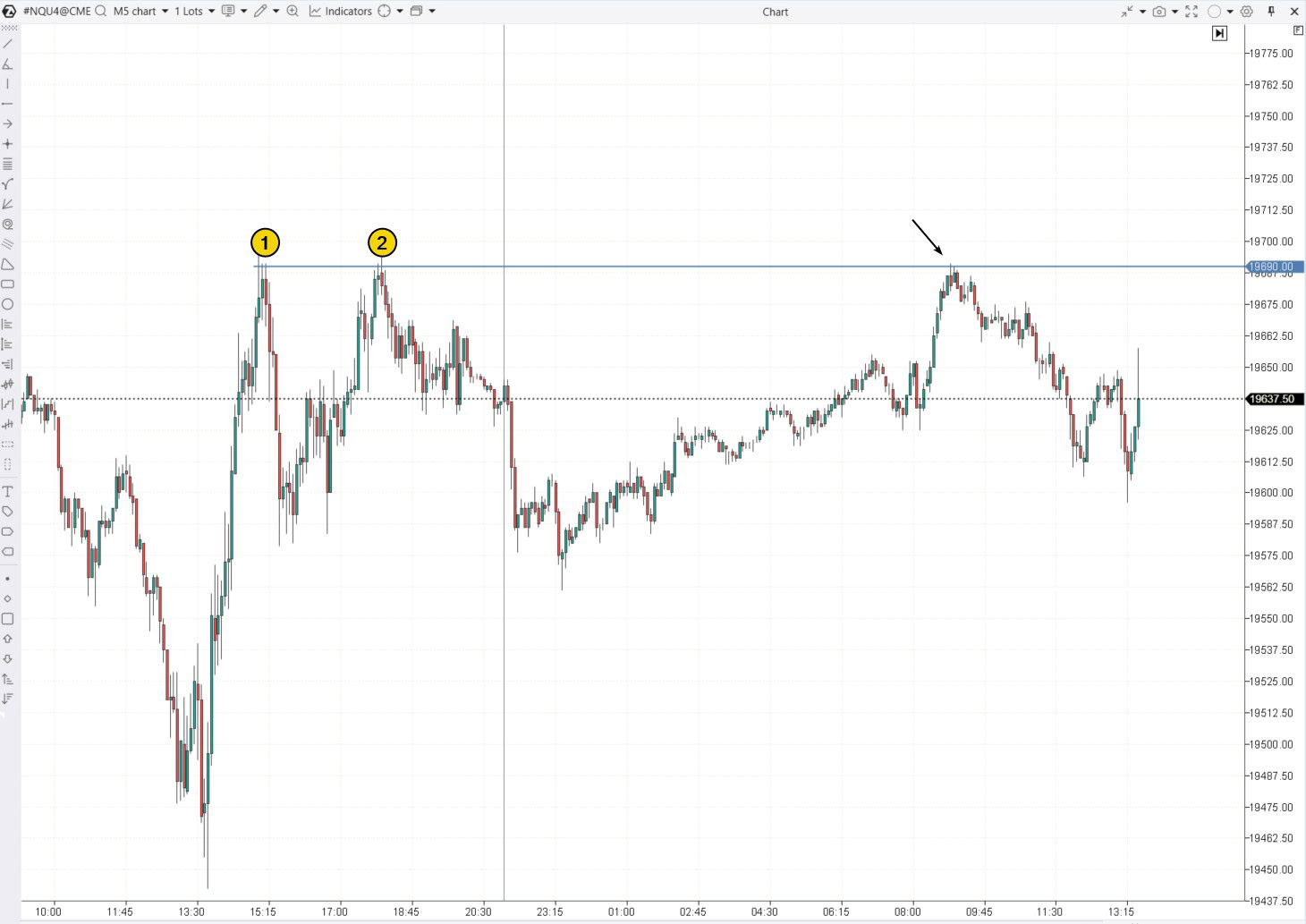
On the left side of the chart above, the price reversed downwards twice around the 19690 level. This suggests that this level may act as resistance, and the price could potentially reverse downward again from this point (as shown by the arrow).
Method 2. Using indicators
Online sources often recommend using simple tools like moving averages with periods of 50, 100, and 200, or Pivot points to identify support and resistance levels. However, the effectiveness of these methods can be questionable.
The ATAS platform offers more advanced indicators, many of which are based on trading volume.
What Is the Best Support and Resistance Indicator?
Here is a list of the top 10 indicators that can help you find support and resistance levels. This ranking is based on both personal opinions and data on how popular these indicators are among ATAS platform users. Remember, choosing and using indicators should be tailored to your personal trading style, and there is no guarantee of profitable results.
10. Fibonacci Retracement Levels
Fibonacci levels are based on the idea that markets often retrace to certain percentages after a major move before continuing in the original direction. The key Fibonacci levels (38.2%, 50%, 61.8%) are commonly used as an indicator that shows support and resistance levels where the price might pause or reverse. These levels are particularly useful in trending markets to find entry points after a pullback.
Although it is more of a drawing tool than a traditional indicator, its effectiveness is well-recognized. Richard Wyckoff also noted that bullish stock’s price often finds support around the 50% retracement level. He is the one who introduced the terms “support level” and “resistance level” into the trader’s lexicon.
Example: Fibonacci on the daily footprint of QQQ – a tool linked to the Nasdaq index.
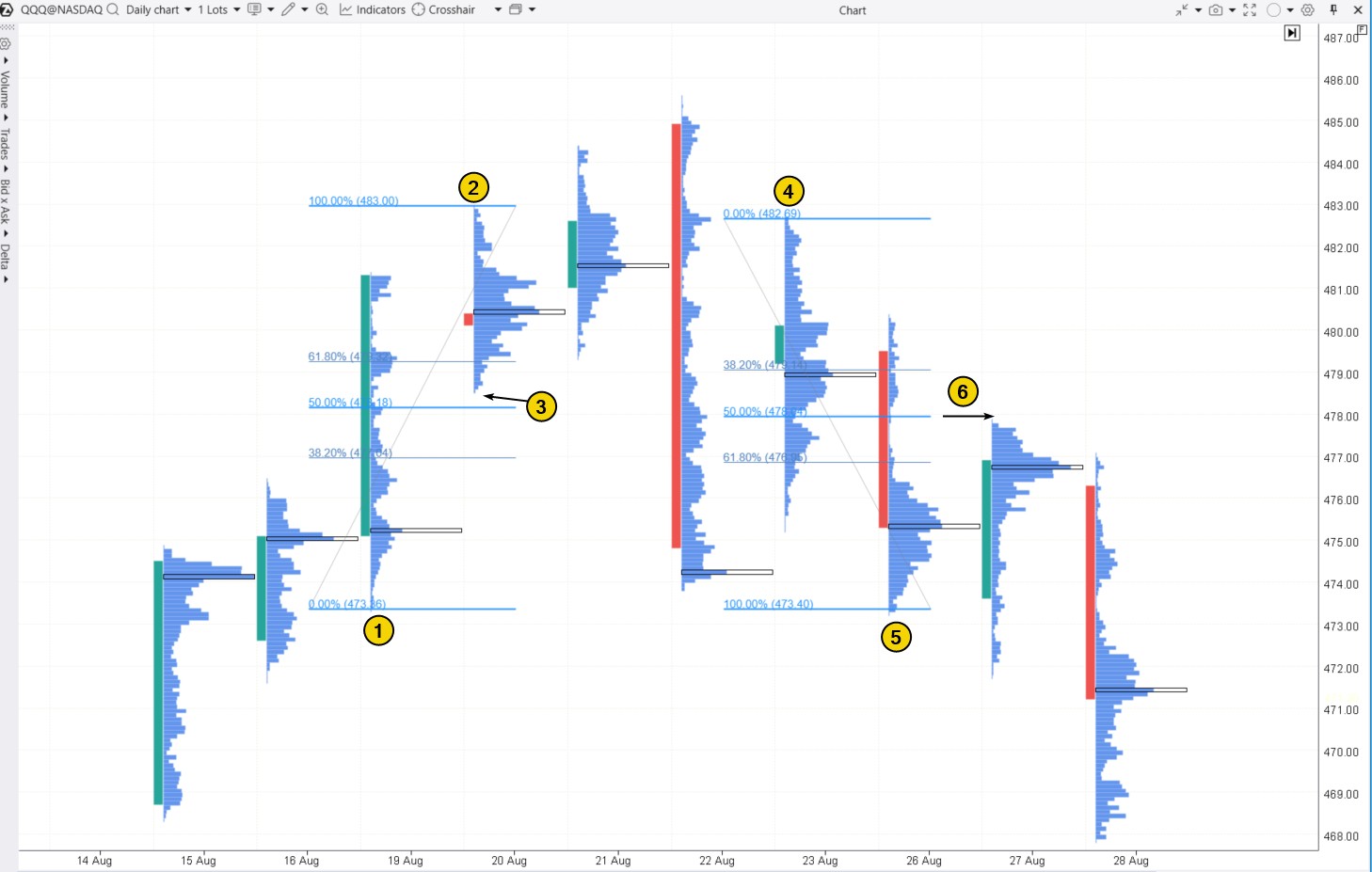
The chart shows:
- level (3), which is midway between levels (1) and (2) on the upward move, served as a support level for traders;
- level (6), located at the 50% retracement between (4) and (5), acted as a resistance level.
✔ Pros:
- Fibonacci levels can be easily combined with other tools. For instance, level (6) is confirmed by a thin profile, indicating strong selling pressure.
- They help identify the trend direction and its strength by assessing the price’s ability to complete a pullback near the 50% level.
- Fibonacci ratios are based on proportions frequently found in natural processes and structures.
✘ Cons:
- Fibonacci levels may not always work, especially during strong market fluctuations or extreme conditions.
Tip. To access the customizable Fibonacci drawing tool on the ATAS platform, press F8.
You might also be interested in:
How to identify support and resistance levels with Fibonacci ratios – read more in the article: Fibonacci and Trading
9. Support and Resistance Zones Indicator
This indicator on the ATAS platform is called Volume-based Support & Resistance Zones. As the name suggests, it identifies support and resistance zones based on volume analysis, covering multiple timeframes and taking into account long shadows on candles.
Example. On the 30-minute chart of gold futures, the indicator identified 3 resistance zones and 5 support zones.
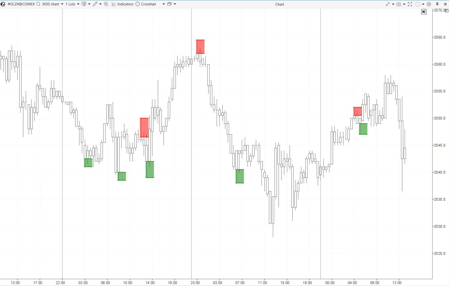
Zones are established after the candle closes, enabling traders to focus on price action on a lower timeframe for confirmation if the price returns to the zone soon.
✔ Pros:
- You can set up alerts and analyze multiple timeframes at once.
- Trading volumes are taken into account.
✘ Cons:
- If the indicator identifies a strong zone, the price might not return, giving a trader a chance to enter a position during a test.
Additional Information: Check the indicator description in the knowledge base
8. Linear Regression
Linear regression is a method used to identify the trend by representing it as a straight line on a chart. Dynamic support and resistance levels can be found by drawing lines that are offset from the regression line by a certain number of standard deviations.
Example. The Linear Regression Channel has been added to the the E-mini Nasdaq futures chart (below) and it shows:
- blue lines: channels that have been broken through and are no longer relevant;
- red lines: the current descending channel, where the central line represents the trendline created using linear regression, and the channel boundaries are set at twice the standard deviation (deviation = 2 from this central line).
Traders often expect changes in market sentiment near the boundaries of a channel, which can cause the price to revert towards the central line of the channel. In other words, the upper boundary can act as resistance, while the lower boundary can serve as support.
✔ Pros:
- It helps visualize the overall trend and its direction, as well as support and resistance levels using mathematical and statistical methods.
✘ Cons:
- Volume analysis is not taken into account.
- Linear regression is more effective in trending markets. It is less useful in ranging markets.
- It is important to set the correct period in the indicator settings to create a channel.
Additional Information: How to Set Up the Linear Regression Indicator
7. Margin Zones Indicator
Margin zones often align with support and resistance levels because when prices reach these zones, margin requirements can trigger large-scale position closing or forced liquidation, creating noticeable price reactions.
How to calculate support and resistance zones. To use the Margin Zones indicator, you need contract specification data from the exchange website, such as:
- minimum price fluctuation (i.e., tick size or tick value);
- margin requirements for holding a position overnight (maintenance margin).
Example. According to the CME website, the minimum price fluctuation is $10, and here you can find the margin requirement for short positions, which is $5,184.
Looking at the chart, we see that after some consolidation, the price begins to decline (1). This decline led traders to open short positions, expecting the bearish trend to continue. The market profile indicates that a large volume of short positions might have been opened at $71.90 per contract.
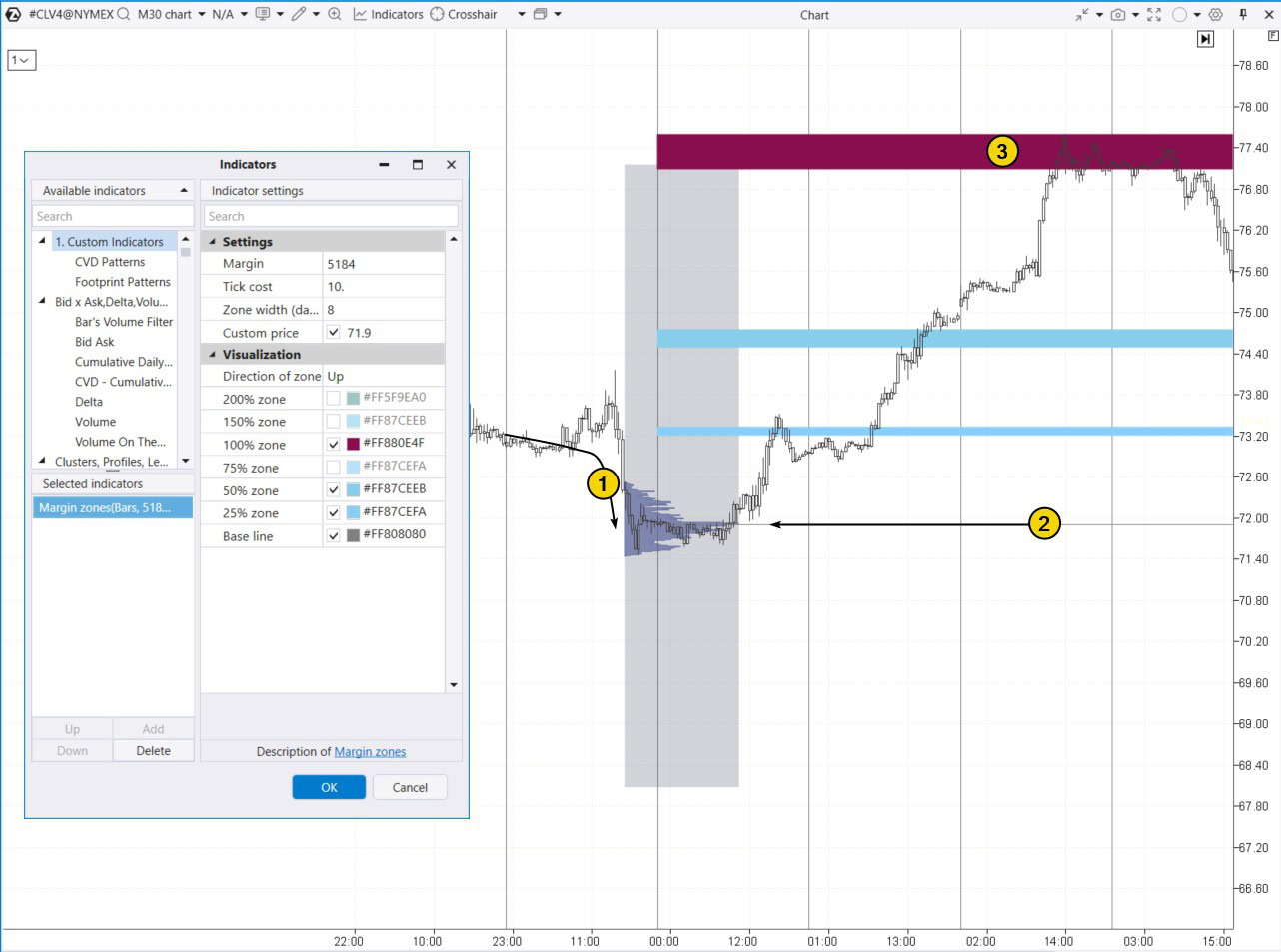
Enter the collected data into the indicator settings to determine the resistance zone around $77.40. As shown on the chart (3), the price reversed at this level — likely because large traders used the liquidity from margin liquidations to set up their own short positions.
✔ Pros of the indicator:
- It is based on market participants’ positions.
✘ Cons:
- It requires precise calculations and a good understanding of margin requirements, which can be tricky for beginners.
- It may give false signals in unstable or chaotic markets, where margin levels can be influenced by various factors.
Read more on this topic: Margin Zones Trading Strategy
6. Trend Lines
Trendlines are one of the simplest and most widely used methods for spotting support and resistance levels.
While not technically classified as indicators, it is often more effective to draw trendlines manually rather than relying on algorithms.
Trendlines can be used as:
- a basic trend indicator if you draw them through nearby lows (in an uptrend) or highs (in a downtrend);
- parts of more advanced technical analysis patterns, such as fan lines, trend channels, or chart patterns.
Example. On the E-mini futures chart for the S&P 500 index, three trendlines were used to identify support for the price on August 5, 2024. At that time, the price was dropping due to concerns about a U.S. recession, which were heightened by a stock market crash in Japan after the central bank raised interest rates to their highest level in years.
In the top half of the chart (daily time frame), you can see that between March and July, the price moved (as indicated by arrows) within a channel formed by lines 1 and 2. However, in early August, there was a bearish breakout. The low was reached on the 5th, and the 3rd trendline, parallel to lines 1 and 2 and extended downward by the 1-2 channel width, helped identify the reversal point.
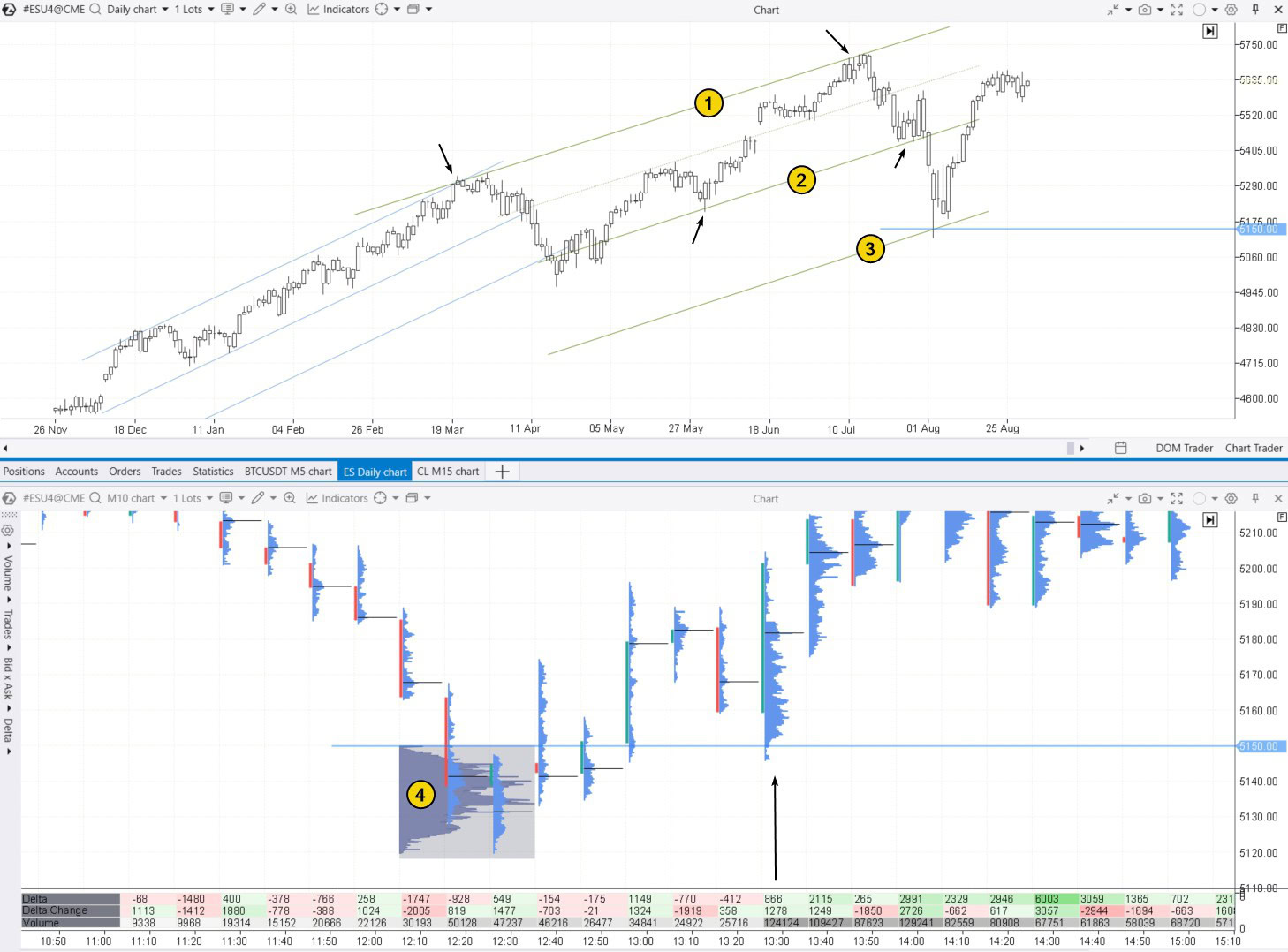
The lower half of the chart, using a 10-minute timeframe, shows a bottom forming just below the 5150 level during the European session. The climax was signaled by extremely high trading volumes — around 5,000 contracts per minute, along with the formation of a profile (4).
At the start of the U.S. session, buyers quickly seized the opportunity to buy the discounted contracts, causing the price to rise (as indicated by the arrow).
✔ Pros:
- Easy to use and understand, making this indicator suitable for traders of all experience levels.
- Trendlines can be applied across any timeframes and asset types.
- Trendlines can be combined with volume analysis or other methods to strengthen signals.
✘ Cons:
- Trendlines are subjective, as different traders may interpret and draw them differently.
Additional information: How to Trade with Expanding Channels
5. Fair Value Gaps
Fair Value Gaps (FVG) are sharp, impulsive price movements that occur on a chart due to an imbalance between supply and demand. Fair Value Gaps can serve as support or resistance zones since one side (buyers or sellers) has a significant advantage over the other.
A FVG pattern forms over three candles, with the price usually making a strong move on the second, widest, and most impulsive candle. The ATAS Fair Value Gap indicator can help identify this pattern on charts.
Example. On a 30-minute oil futures chart, a FVG pattern formed after a sharp price drop on a large bearish candle at 15:30, between levels 1 and 2.
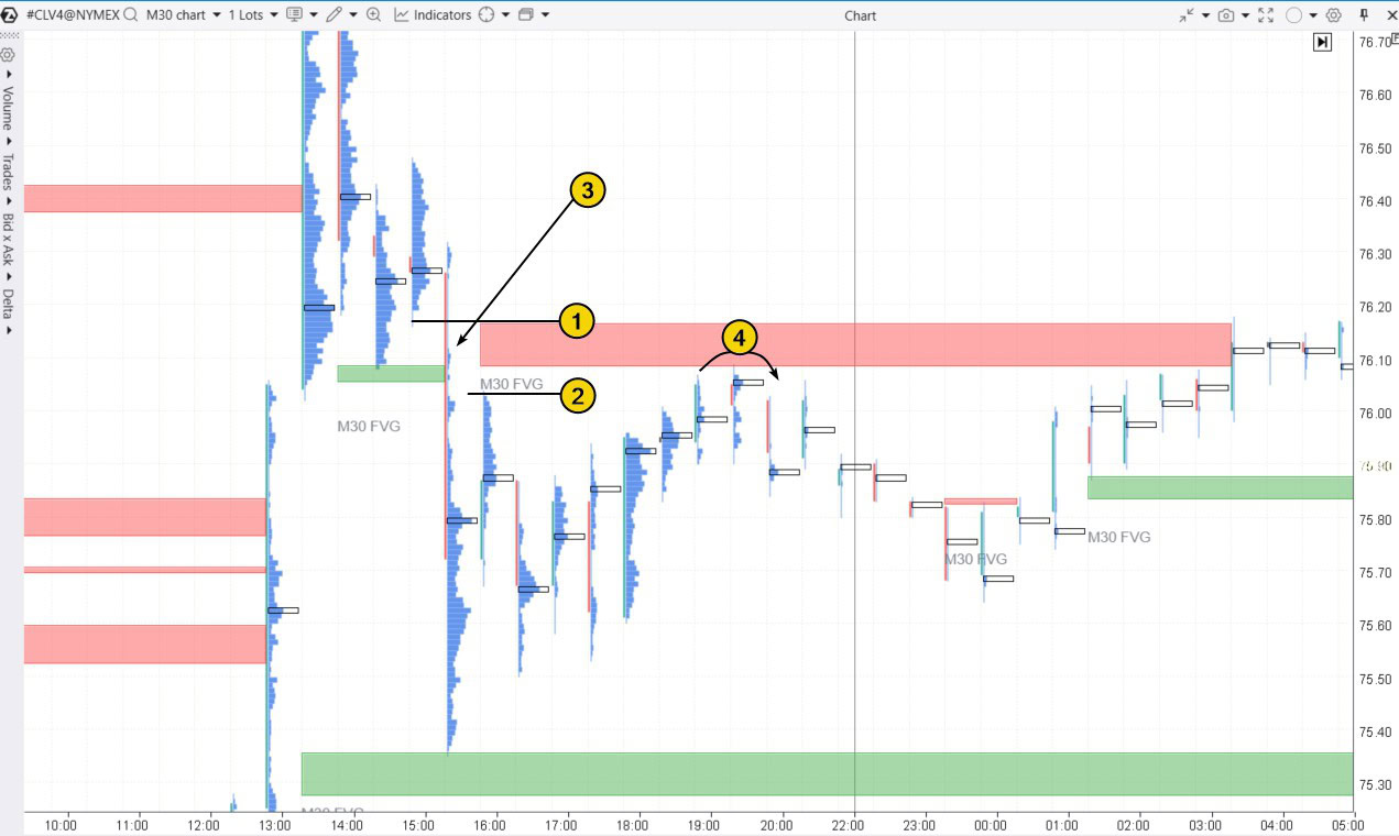
The thin profile (3) pointed to seller dominance, so it is no surprise that this area later acted as resistance (4).
✔ Pros:
- Interpretation is based on shifts in market sentiment.
✘ Cons:
- FVGs occur quite frequently, so traders need to consider the context, which can be challenging for beginners.
Additional information: How to Trade Fair Value Gap
4. Stacked Imbalance Indicator
Similar to Fair Value Gaps, the Stacked Imbalance indicator helps identify areas with a strong imbalance between buyers and sellers. However, instead of looking at the OHLC of three candles like FVG, Stacked Imbalance compares the Bid and Ask volumes within a single candle across adjacent levels, offering more reliable evidence of imbalance.
Example. On a 30-minute Bitcoin futures chart (data from Binance Futures), the Stacked Imbalance indicator with default settings detected six cases of imbalance.
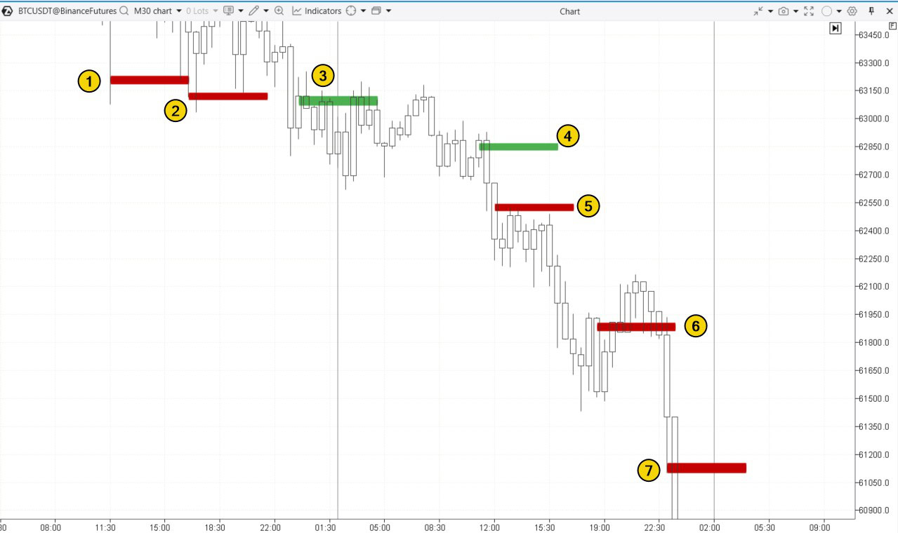
The first two signals indicate seller capitulation at the candle’s low, marking a potential reversal point.
(3) – buyers were active but unsuccessful. The bearish momentum stayed intact, and the level that might have acted as support ended up functioning more as resistance.
(4) – a bull trap in trading.
(5) – a resistance level where sellers clearly had the upper hand.
(6) – seller dominance at the candle’s high was enough to push the price down to the 61,500 support level, but not strong enough to break through it.
(7) – seller capitulation at the candle’s low, which resulted in a brief bounce during a broader sharp decline.
✔ Pros:
- It is based on real market data, analyzing trade statistics at intra-candle levels.
✘ Cons:
- The Stacked Imbalance indicator requires manual configuration, which can be tricky, especially across multiple markets.
- Indicator signals can vary in interpretation depending on the market context.
Read more on this topic:
3. Psychological Levels
Psychological levels are key price points that carry significant meaning for market participants:
- they are typically associated with round numbers (e.g., 1.0000, 100.00);
- historical record levels or yearly highs and lows also have a psychological impact.
These levels tend to attract attention because many traders make emotionally driven decisions around them, which can lead to losses. Prices often stop, bounce, or reverse at these points, making them important support and resistance levels.
Example. In early March 2024, Google Trends recorded a surge in interest in Bitcoin’s price. This coincided with the peak of excitement around the Bitcoin ETF, which had been approved by the SEC on January 11, 2024.
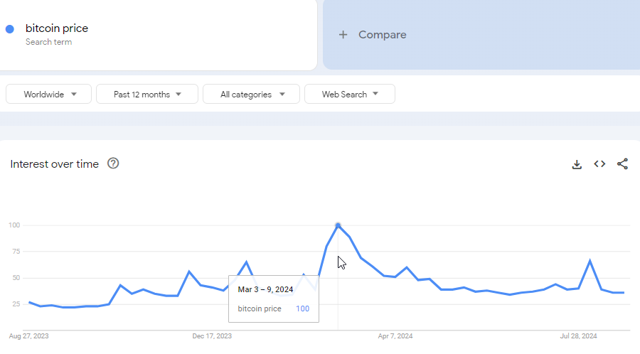
During this period, the chart showed a historical high, surpassing the previous 2021 peak by just 7% (marked as 1). A similar situation occurred in December 2017 when BTC futures were introduced on the CME, fueling excitement and driving the price toward the round level of $20k.
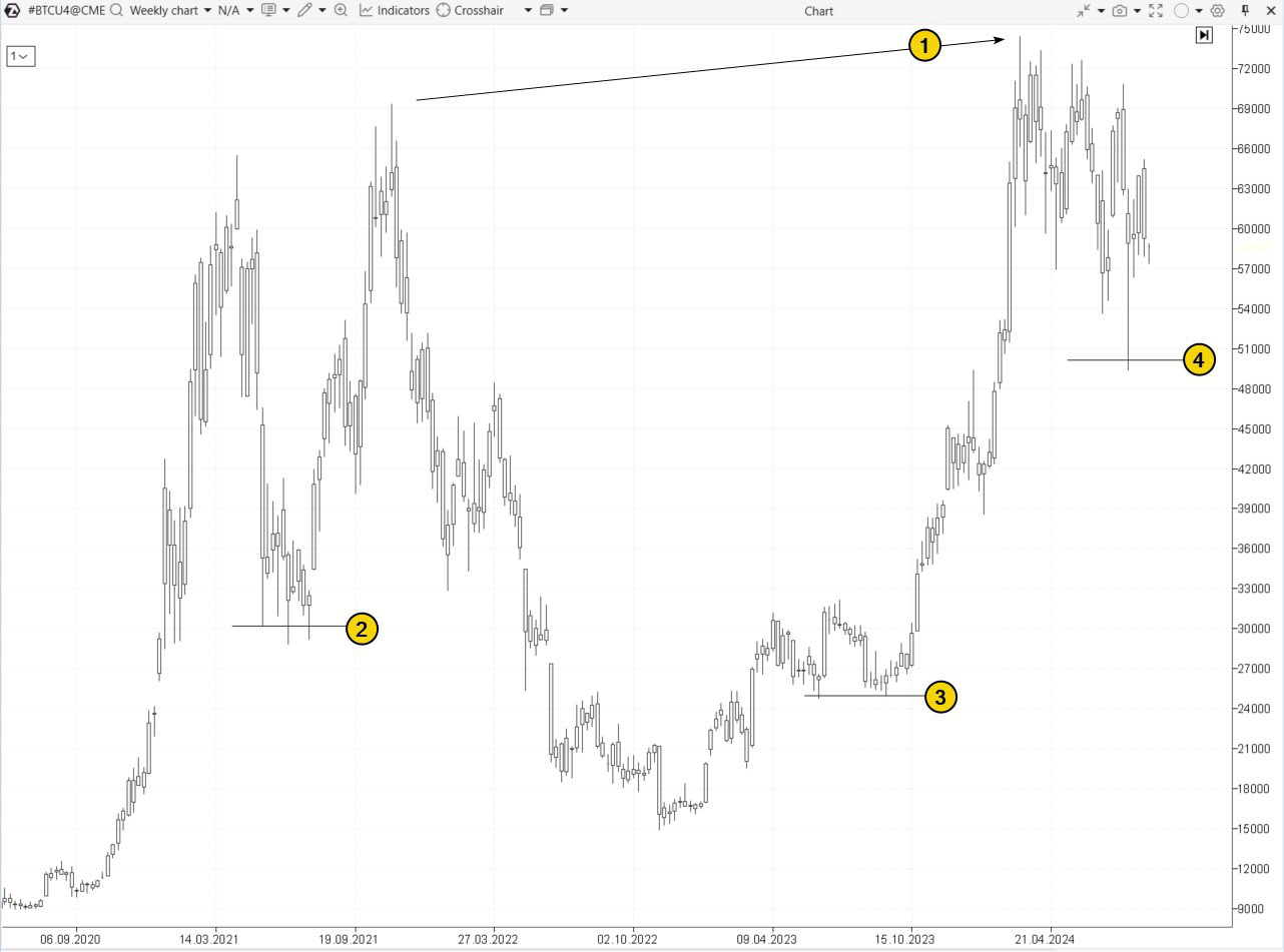
The chart also shows price reactions to round levels: $30k (2), $25k (3), and $50k (4). These levels are often followed by false breakouts, which traders can exploit by opening positions with the expectation that the price will reverse after the false breakout (triggering stop-loss clusters and drawing in emotional traders in the wrong direction).
Tip! To simplify working with round levels, use the ATAS Round Numbers indicator.
✔ Pros:
- Easy to identify.
- Based on market psychology. Highly effective in markets with a large number of participants, as many traders monitor these levels, which increases their significance.
✘ Cons:
- May produce false signals during strong trends, where prices can easily break through these levels without meaningful corrections.
- Often associated with going against the trend and media forecasts, which can create additional pressure.
Read more on this topic: The Magic of Round Levels
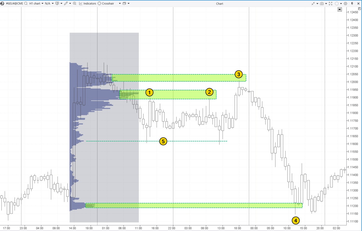
2. DOM Levels
DOM Levels (Depth of Market Levels or Heatmap) display real-time market activity at specific price levels, highlighting where large buy and sell orders are clustered in the order book. These levels often serve as crucial support and resistance zones because significant order volumes can either stop or slow price movement, or potentially be used for market manipulation.
Example. On the NQ futures chart below, the DOM Levels indicator reveals large buy orders (in green) and sell orders (in red). The brighter the color, the greater the order volume.
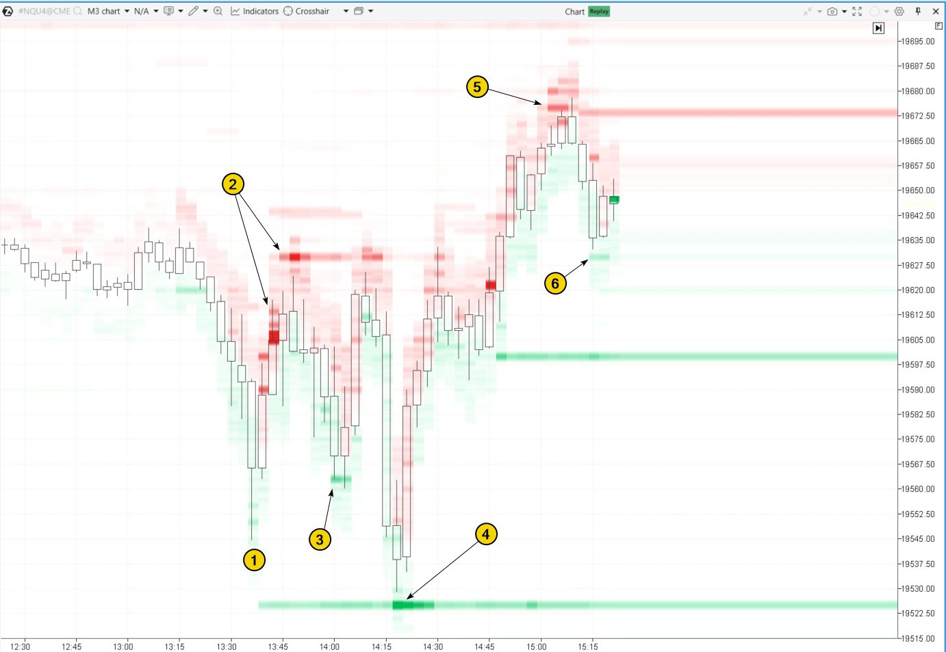
By tracking how the price interacts with the bright green and red levels, you can better understand the causes of its fluctuations:
- after bouncing off the low (1), price growth was stopped and then reversed by sell orders around 19606-19630, marked as (2);
- buyer activity (3) pushed the price back up into zone (2) again;
- and again (4);
- after a bullish breakout above resistance zone (2), sell orders around 19675 pushed the price back down;
- former resistance turned into support (6), as shown by DOM Levels data.
✔ Pros:
- Actual order data makes DOM Levels especially useful for day trading.
- DOM Levels help understand the intentions of large market participants and anticipate where major price shifts may happen.
✘ Cons:
- DOM Levels can give false signals or be manipulated, as large orders may be quickly removed.
- Fast reactions and constant market monitoring are required.
- Setup can be complicated due to the need for connecting to Level II exchange data.
Read more on this topic:
1. Market Profile
The Market Profile indicator shows how trading volume is distributed across different price levels over a set time period. It helps traders identify where the price has spent the most time and where the largest volumes have been traded.
Support and resistance levels often form at:
- Price levels with the highest volume concentration, known as the Point of Control;
- Thin profile levels, where one side of the market dominated;
- Sharp volume shifts (“steps”) on the profile, usually near the edges of the Value Area.
Example. A market profile was applied to the ES futures chart. Protrusions (price levels with high trading volumes) formed support and resistance zones:
This is why the price reversed downward twice (1 and 2) and once (3) from these protrusions.
Another protrusion led to a pause (4) in a strong intraday downtrend.
You can learn more about how minor protrusions (marked as 5) work in the article: Mini-POC Trading Strategy
To learn more about how “steps” work as support and resistance levels, check out the article: Footprint Patterns for Trading
Tip! When trading support and resistance zones formed by market profile patterns, you may find these ATAS tools useful:
- ATAS Maximum Levels Indicator. It displays POC levels from the previous day (or other selected periods).
- ATAS Dynamic Channel Indicator. This indicator creates dynamic POC levels and Value Area boundaries for a specified period.
- The TPO and Profile drawing object (activated with the F3 key).
✔ Pros:
- It provides a deep understanding of market structure and highlights key areas of interest for market participants.
- It is versatile enough for both day trading and swing trading across different financial assets.
✘ Cons:
- It requires experience to interpret the large volume of data effectively.
Useful articles:
FAQ
What are support and resistance levels in trading?
A support level is the price level where an asset tends to stop falling and bounce back up due to increased buying interest. A resistance level is the price level where an asset usually stops rising and starts to fall again because of selling pressure. Traders often use these levels to decide when to enter or exit trades.
How to add a resistance and support indicator to the chart?
To add a support resistance indicator like the Volume-based Support & Resistance Zones (or another indicator) to your chart: download and launch ATAS → open your chart → open the indicator manager (Ctrl + I) → select the desired indicator, click “Add,” and then “OK.”
Which indicator shows support and resistance?
There are many indicators that can help identify support and resistance levels. However, tools like DOM Levels and Market Profile are particularly useful because they provide a more accurate view of market conditions and highlight important price levels based on actual trading volumes, placed and executed orders.
How to mark support and resistance zones?
Typically, these zones are highlighted on a chart using horizontal lines or rectangles, covering a range of prices. However, it is important to note that support and resistance are not exact levels but rather areas that can vary slightly depending on market volatility.
How do you trade support and resistance?
Step 1. Read the basic articles on our blog:
- Trading Strategy with Support and Resistance Levels
- Analyzing Support and Resistance Levels
- Trading Breakouts of Support and Resistance
Step 2. Choose your approach for trading support and resistance levels:
- reversal from the level;
- breakout of the level;
- false breakout of the level;
- test of the breakout.
Which approach works best for you?
Step 3. Develop a trading plan and test it using the ATAS Market Replay simulator for traders. This module of the ATAS platform recreates real-time trading conditions using historical data, so you can practice without financial risk.
Step 4. Refine your trading plan and start trading with a real account.
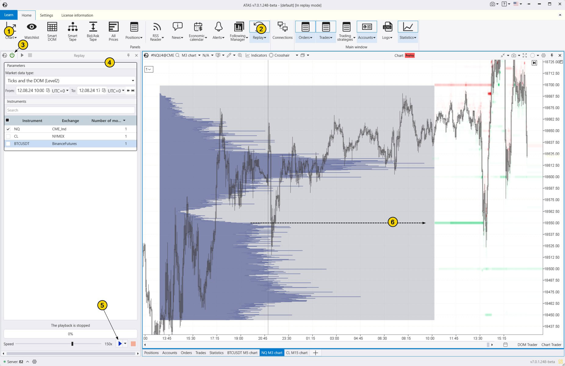
How to Launch the Simulator?
Download the ATAS platform for free, install, and launch it, and then:
- Open a chart of a financial instrument.
- Click on the Market Replay button in the main ATAS menu.
- Activate the Replay mode (the icon should turn green).
- Adjust settings like date and data type if needed.
- Start the playback and monitor when key support and resistance levels appear so you can open a position close to these levels according to your plan.
For example, the level marked with number 6 was identified using two of the best support and resistance indicators from the provided list. The importance of this level for traders is highlighted by the spike (or “step “) on the profile, as well as the large volume of buy orders visible through the DOM Levels indicator. This support level not only halted a sharp bearish impulse but also reversed the price back to the upside.
When practicing trading patterns in the Market Replay simulator, you can:
- adjust the playback speed, and pause;
- analyze footprint charts;
- use over 400 indicators. To identify support and resistance levels, you can use any of the tools mentioned above;
- use Chart Trader to apply exit strategies and other features to trade on the built-in demo account Replay, and then analyze your performance;
- use a variety of other techniques to trade support and resistance profitably.
ATAS enables you to load tick-by-tick data from cryptocurrency, stock, and futures markets, providing a comprehensive basis for analyzing price and volume interactions around key levels.
Conclusions
Traders often use strategies based on support and resistance levels because they help identify entry and exit points more accurately while managing risks.
Although identifying these levels can be challenging and prone to errors, various indicators can improve your accuracy. The best indicators for support and resistance are listed in our subjective ranking and described in this article
Level trading supported by indicators can lead to more informed and strategic trading decisions. Which ATAS indicator do you prefer?
Download ATAS. It is free. Once you install the platform, you will automatically get the free START plan, which includes cryptocurrency trading and basic features. You can use this plan for as long as you like before deciding to upgrade to a more advanced plan for additional ATAS tools. You can also activate the Free Trial at any time, giving you 14 days of full access to all the platform’s features. This trial allows you to explore the benefits of higher-tier plans and make a well-informed purchasing decision.
Do not miss the next article on our blog. Subscribe to our YouTube channel, follow us on Facebook, Instagram, Telegram or X, where we publish the latest ATAS news. Share life hacks and seek advice from other traders in the Telegram group @ATAS_Discussions.
Information in this article cannot be perceived as a call for investing or buying/selling of any asset on the exchange. All situations, discussed in the article, are provided with the purpose of getting acquainted with the functionality and advantages of the ATAS platform.